Marynel Vázquez – Misspellings
My focus in this project is the popularity of common misspellings (maybe typos) detected by Wikipedia collaborators (see the list here).
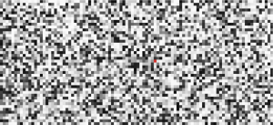
I considered 4423 pairs of words (misspelling and possible replacement) from the previous list, and represented each one of them with a rectangle. The lightness of the rectangle depends on the (approximate) amount of hits returned by Google when querying the misspelling.
When the user does not interact with the blocks that represent the pairs of words (does not point the mouse over any of them), the application enters in automatic mode. In this mode the display changes every once in a while to show a different pair of words. The idea is to be able to explore the diversity of words in a random manner, where the next misspelling is a surprise.. Is it something you usually type? Have you seen it a lot in the web? Is it really annoying?
The application also allows text input, and highlights those blocks that match with the query. This feature allows to visualize the misspellings in a more global way.
Development
Data was collected from Google. Different python scripts were used to query this data and to extract links and hits for the misspellings.
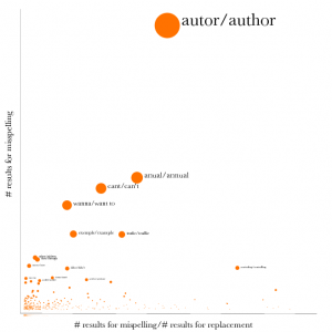
One of the first iterations of the project consisted in comparing the ratio of a pair of words (number of hits of the misspellings divided by the number of hits for the replacements) versus the popularity of the misspelling:

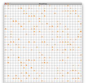
Another initial visualizations of the data showed the diversity of the results:

Each pie chart shows the amount of hits for a misspelling (orange) and the amount of hits for a valid replacement proposed in Wikipedia (gray).
From this experiments I realized two main things: Wikipedia did not provide as many information as I expected with respect to Google, and there is a lot of diversity in the data. This made me favor a more abstract view of the information:

With this view I tried to engage the user into discovering what mistakes people make when typing. The natural inclination is to go for the brightest or darkest blocks (the more or less popular queries), and here comes the surprise. The proportion of results for a misspelling/typo versus a possible correction might be completely unexpected because of the distribution of the data.
The idea of the string matcher came after having the grid. I thought that visualizing the spatial distribution of data according to their letters was a nice addition. Playing with this feature, I discovered that a’s and e’s where a lot more common than o’s. I thought might be a natural thing to know in English.. so I kept typing more and more. Who would knew l’s are more common than u’s in this data set?
Improvement
The visualization displays the titles and links of the 3 first results in Google of the misspellings. Sadly, I didn’t have time to extract the description of the links provided by Google correctly. I believe that adding this information would make the visualization more entertaining.
When the user searches the misspellings by typing, nothing special happens if only one misspelling matches the search. I think adding a special flag or something to indicate this particular situation would be a nice addition to the project.
Code
The processing project can be downloaded from here.
Comments from PiratePad A:
nice typo hound – searches for products that are mispelled
applescript is a nice solution to have in your toolbox, and i am interested in trading code, but i can show you some ninja tricks in php that will be extremely fast – 58 pages of html in under 20 seconds and still get past google’s blocks
when talking plz slow down :-) – can tell you are passionate, but cant understand, take your time!
nice design qualities, i do like the randomness for exploring – maybe an interface for searching for specific words
I don’t quite understand typohound. You could have explained that a little slower.
You should look at selenium to automate the browser. On the Mac it happens to use applescript on the back end, but it’s cross-platform and much easier to use. http://seleniumhq.org/
This abstract representation is way in the beautiful side of the triangle. Beautiful patterns, but does it add meaning?
Search functionality is cool, but not sure if it’s useful for finding patterns. It should at least be a prefix search.
Could you use this database to insert speeling errers into igsisting tekst?
Wow, I would never think of this as a dataset. Very cool. I like the different sized dots. What does the size correlate to? The static look is kind of cool but I wish it would reveal some conclusions about the data instead of just being random. Good combination of different data sources.
I love how it looks. For horrible spellers like myself, however, it would have been nice to place a label on the side that is the correct spelling vs. the side that is incorrect.ide that is incorrect at the very top. I like the amount of information you provide, especially allowing users to type in a word and open a word in the browser.
The idea that you can download wikipedia blows my mind.
This is super cool! I think that the “popularity” of a word/misspelling compared to another word/misspelling is less interesting that the ratio of correct:misspelled for each word. What I mean is that I am more interested in that banana is mispelled 1/4 of the time versus notebook is misspelled 1/3 of the time. I, personally, don’t care that banana (misspelled or not) is 2342342times more popular than notebook. I think that your screen shot of the tiny piecharts was the visually appealling (perhaps just due to the color combinations), I think it made explicit the idea of something:something, as opposed to using the value scale in your final version. I wish the final version the grid were organized some how, I found the see of random greyscale values overwhelming.
Since I cannot speel I don’t know if this project makes me happy or sad.
Good presentation of your workflow. I really liked the pie charts, going back to them may be worth your time. The grid style is cool, but it needs a strong layout for me to really enjoy it. Perhaps looking at a-z sorts or sorts based on the ammount of errors. The bar across the top is quite nice to compare the numbers.
There is no api to query google, other than using applescript? Spoof a browser using a script? Labeling the pie chart visualization would be nice. Perhaps sorting the words visually would be useful, the diagram just looks like noise at the moment. You’re already doing this by doing the mouse presses somewhat. Maybe seeing patterns across why words are misspelled? Perhaps group words that fall within similar locations on the querty keyboard? Even sorting by the number of mistaken spellings would be useful.
I like how in the grid, you can hover them and se the work and some text at the bottom. The screen looks kinda interesting, but I wish there was more to the organization. When you started typing the character masks, that was really cool. Making that text box more visible would be good. Instead of turning them red, you could have just made the others disappear.
There has to be a google search api no? Would be a lot faster than writing an applescript.
Google’s Custom Search API is here: http://code.google.com/apis/customsearch/v1/overview.html
I don’t understand the comparison between Wikipedia and Google, since they contain such fundamentally different kinds of information. I like how the search result information appears at the bottom of the visualization. This is a really interesting data set.
It would be interesting to somehow do a study on misinformation instead of just misspellings. Much more of an intangible data set but an interesting study of how we do things wrong.
I like how the visualization turned out. It’s kidna interestng to see hte mosiac.
Very interesting data to work with, clever! I enjoyed seeing the different studies you did with the data. I’m a little confused by the final visualization, although I like the interaction. The different levels of information that you integrated make it feel rich and give a nice context for what is being shown. What was the significance of the darkness of the boxes?
Like the greyscale mosaic. It’s mysterious and intriguing enough to start clicking around. It seems like words are spelled correctly most of the time though since the red:blue ratio says so. Maybe another display to exagerrate the errors would be more effective?
Comments from PiratePad B:
Fun fun fun. A really nice curiosity is revealed by the inquiry. Nice method of data scraping, too. Marynel is not mentioning how hard it is to get around Google’s anti-scraping defenses. Nice small intermediate studies. You did a good job identifying a problem for yourself!
I’m having a problem with the lack of organization in the noisy grid. Some ways of organizing this data would be helpful: sorting alphabetically, by popularity, by fault ratio, etc.
A treemap might be another way of showing the results.
You could also use color more effectively, rather than just grayscale.
The letter-based search is interesting, but seems like a patch to the fact that I cant just search alphabetically.
II would have liked to see more characterization and analysis of error types: omitted letters, extra letters, swapped letters, switched vowels.
Scripting a GUI browser seems like a really slow way of scraping Google – it’s unfortunate that there’s no better way to do it through an API!
The pie charts are really cool looking, but it could use a key.
Nice. Everybody has these differring interests and weird links.
Love those pixels. Looks like an automata.
You could integrate that opened window with the search comparator Golan showed during class monday.
Great explanation of process. Even through I wasn’t always clear about what I was looking at, I liked that you did a lot of exploration.
The chart of pie charts is an interesting visualization.
Perhaps once you’ve looked at a particular pixel, it will change colors so you don’t click it again…Stamping out ignorance one pixel at a time?
the fact you can click on the pixel and pull up the google result for word is cool.
I wish you could start typing a word and have this massive pixel visualizsualization jump to the right word. The randomness is visually appealing, but it really limits the amount mount of directed information gathering you can do in the visualization! OH HOT DAMN. Nevermind.
There there a realtionship between the black or white of the box, and the data? nice touch with the typeing.
A system of organization based on correct-dominant on one side and mistake-dominant on the other could also be interesting, though I am presuming there are enough mistake dominant comparisons. It seems like it could be difficult to be browsing randomly and stop when something catches your eye with such small pixels. The data is quite interesting and the interactivity is nice.
I’m in love with this visualization. It’s kind of wonderful seeing how badly these words get butchered and how often/where on google it occured… the amount of interactivity is fantastic. Keyboard input was a nice touch. I think it’s also very visually clean.
This is visually beautiful. You have an awesome amount of detail embedded in this too with all the interaction.