Paul-Infoviz
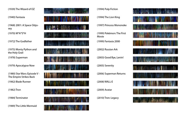
25 movies and their color palettes graphed over time:

At the macro level, certain patterns can be seen. Tron: Legacy seems to take its colors more from Blade Runner than from the original Tron. Disney’s Lion King and Miyazaki’s Princess Mononoke share natural themes, but render them differently. The Lion King uses short splashes of bold color. In Princess Mononoke, colors are less intense and more consistent throughout the movie, especially the natural greens.
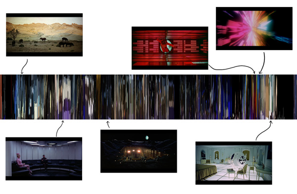
There is also a lot of high-frequency data; camera cuts and therefore color changes are more frequent than I realized. At the micro level, here is a breakdown of 2001: A Space Odyssey:

How it works:
One frame per second is extracted from the video file, scaled down to 60x30px, and saved as a PNG using ffmpeg like so. I wrote a C/OpenCV program to convert to HSV, do k-means analysis, and convert back to RGB. (k=5 seemed to be a good magic number in my tests.) This program is run on each frame, writing the five colors and the number of pixels close to that color to a text file. Then a Processing program reads the text file and renders the image.
It turns out that these steps are in decreasing order of time taken; acquiring the movies took the longest. Next longest was transcoding with ffmpeg, which I ran in scripted batches over a day. Color analysis with OpenCV took about and hour and a half for all 25 movies. Finally, generating the images happened in sleep-deprived minutes this morning.
This project would definitely benefit from more work. The color analysis is not as accurate to human perception as I’d like, and could probably be made to run much faster. I’d also like to analyze many more movies. There are some good suggestions for movies in the responses; Amélie is actually one I had on my hard drive but didn’t get around to using…I wanted to do The Matrix, but didn’t find a good copy online.
Comments from PiratePad A:
interesting that on a macro level, most films seem to use the blue/orange compliments, or dark and light
Superman Returns is really dark.
You should do The Matrix. Everything in the simulation is green, everything in the real world is blue. Sin City might be interesting.
How can you do physical output? I want Tron: Legacy wallpaper.
Pretty – the timelines reminds me of aurora borealis. I find this interesting since the overall form is really organic, yet the dataset/movies were made by humans. Great stuff.
A lot of these seem pretty dark. I think most scenes have more dark colors than our brains think about, we just sort of focus on the colored bits. Maybe the program should consider this and throw out a bit of the darkness. For example, the black in the crazy psychadelic scene in 2001 is only background and does not really characterize the scene.
I would like to see the different CSI shows compared through this.
http://www.youtube.com/watch?v=GeeyWvo1rNg
The emerald city is really great. This visualization provides a lot of insight.
It surprised me that that’s so much black. DIdn’t expect that at all. Very interesting topic. I wonder if ordering somehow by color instead of date would show a different aspect of the movies.
Having a legend on the axes would be nice, and maybe highlighting significant times in the movie that result in color changes.
This reminds me of what happens when I get bored of a video and just scrub through it to the end instead of watching. Your analysis of the colors is really good. I love how bright Pokemon is.
Nice concept. This really gives a new way of seeing a movie. It might be interesting to categorize the different movies by genre to make comparisons of the colors between them. I like that you looked at a broad range of movies. Enjoyed the different comparisons/studies that you made at the end. The simplicity of the visualization makes for an elegant solution. Nice work! Amelie might be interesting to see the colors of, or Godard films. Lots of interesting things to explore and compare. Or what about looking at films from different countries and seeing if there are any patterns there by country?
I think it’s very interesting how much black there is in the movies.. I think perhaps more interesting you should extract the colours from the collage and actually plot it.
Very cool, you had really good insight, i would like to be able to mouse over the slivers adn grab frames, thath would be huge, but maybe just a color swatch or something, to add a little interactivity.
It might be interesting to see the colors of each sample in each movie organized, so that reds, green, blues are charted in the same place, so you can see the colors over time more quickly (as opposed to how the are currently organized by position from where they are in frame of the still?).
Comments from PiratePad B:
You’re like a minute into your presentation and I’m already sold. These are gorgeous. Yeah – this is very cool. Where can I get a print? I’d be interested in seeing them brightened just a bit, but maybe it’s just the projector. I agree on seeing them printed; these would make a beautiful gallery show. (personally, I kind of want a copy of the Pokemon: the first movie infoviz) it’s really interesting trying to guess which movie is which; the fact that you picked rather cult-y movies that stick in the viewer’s (and pop culture’s collective) mind was a great choice. ALSO fun to see that Disney color palettes tend to be very similar to eachother throughout the years; Fantasia(1940), The Little Mermaid and The Lion King are all using the same blue in large quantities. I’d love to see a study of Disney throughout the years in this style.
Nice — see my page about the slit-scanning technique, and also see Jason Salavon’s work in summarizing movies:
http://www.flong.com/texts/lists/slit_scan/
http://salavon.com/Top25/Top25.shtml
http://salavon.com/TGFAT/Titanic.shtml etc.
It would be interesting to do some work attempting to distill actual color palettes — by (for example) k-means clustering in color space across the movies. In such a case, you would be attempting to derive a (atemporal) palette rather than a (time-based) timeline.
Pretty.
Maybe some text indicating movies.
You could give more area to the slit scans relative to the rest. The whitespace dominates (and not all lines are equal height).
Maybe not doing cross genre but, within the same genre, how does the palette change over time (if it does at all)?
Could you use these to tell which movies were influences for another movie?
The pixel mappings are beautiful. Just as a note doing it for a trilogy or all the star wars could be cool. Could be interesting to cross reference this with the soundtrack.Agreed
I would like to see these printed. Its interesting how you can start to see the movies that use short verses long shots. Nice comparison on the tron movies. It would be interesting to get some data of the most comon color in each movie. Also, movies I would like to see in this: Amelie, hero, the Fall.
This is really neat, it could be even more interesting IMO if you added even more context for all of them by comparing them to eachother more directly. I like that you’re showing us Blade Runner, Tron and Tron: Legacy together, because they’re all sci-fi. Drawing out information about genres or eras typical color palettes would be great.
Nicely done. Might be cool to manually select movies where you know one movie influenced the other, such as when a director claims a major influence from a certain film.
An interesting breakdown of style and color scheme of various movies. You have a nice variety too. Good job.