Honray Lin – Project 4
I built the twitterviz project to visualize a live twitter stream. Originally, I was looking at ways to visualize social media–either from facebook or twitter. I was poking around the twitter api, and noticed that they had a stream api that would pipe a live twitter stream through a post request. I wanted to work with live data instead of the static data I used for my first project (facebook collage visualization), so I decided this api would be my best bet.
The stream api allows developers to specify a filter query, after which twitter feeds containing that query will be piped, real time, to the client. I decided to utilize this to allow users to enter a query and visualize the twitter results as a live data stream.
I was also looking at Hakim El Hattab’s work at the time. For my project, I used his bacterium project as starter code for my project, using his rudimentary particle physics engine in particular. I decided to use javascript and html5 to implement the project because it’s a platform I wanted to gain experience with and also because that allowed it to be easily accessible to everyone using a web browser. I decided to visualize each twitter filter query as a circle, and when a new twitter feed containing that query is found, the circle would “poop” out a circle of the same color onto the screen.
However, I encountered some problems in this process. Since javascript has a same-domain policy for security reasons, my client-side javascript code could not directly query twitter’s api using ajax. To solve this, I used Phirehose, a PHP library that interfaces with twitter’s stream api. Thus, the application queries twitter by having client side javascript query a php script on my server, which in turn queries twitter’s stream api, thereby solving the same-domain policy issue. Due to time constraints, the application only works for one client at a time, and there are some caveats. Changing the filter query rapidly causes twitter to block the request (for a few minutes), so entering new filter strings rapid-fire will break the application.
Here are some images:
Default page, no queries.
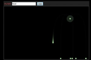
One query, “food”. The food circle is located on the top right corner, and it looks like it has a halo surrounding it. New twitter feeds with “food” poop out more green circles, which gravitate to the bottom.
You can access a test version of this application here.


Hi Ray, this is a good project — please document it asap, with a screencap video and a description of your process/project. Below are comments from the crit. -GL
——————————-
Good intro, laying out approach and problems addressed.
Would be nice if the particles collected into 2d piles. Also, perhaps add a mosue over that shows the text query over the source balls.
Slow down turbo. Very cool visualization, but I think it could really use a bit more piling. Maybe you need more surface tension on the bottom of the visualization.
I think it’s a cool visualization. You should experiment with the colors a bit.
Lots of work getting through these issues. Extensive explanation is very thorough
Use a different color ball whenever you change queries?
What if the balls accumulated in heaps (box2d piles) rather than a line?
Would be nice to mouse over the sources or tweets to see the texts.
Great start.
It would be nice to surface some more information in the viz — for example, is there a “smart” way to place balls? Also, could mousing over the balls show more information from the tweets?
You should have some collision at the bottom (bouncy ball).
Neat graphics touches in there. Very cool!
This would be 30x more useful if it labeled the sources. Also conider killing old particles so tha it doesn’t slow down over time
…jump into your project quicker
It might help to add a few visuals into your presentation for the build up to your project. I like the idea of visualizing tweets as these particles, and seeing them build up and occupy space at the bottom. Can you interact with the particles at all? It might help to add some type to the original source particle in the top, so you can keep track of what the different search terms are as you add more. Nice that you have it running on the web!
This should be combined with Wards’ BB gun project! really!
Yo: labels.
Some feedback about *what* is popping out would be good.
Is there any meaning to the placement of the source on the screen?
I like that the circles compress when they poop out a new tweet.
I wish the colors of the dots were more varied, I feel like you have a lot of grey goin’ on there. Is ths color randomized orrrrr…?
I do like your particle system, but it’s a shame it took up all of 10px (in height) of the screen.