Getting Closer

Using MongoDB and MapReduce, analysis of my dataset has finally become tractable. It’s still early, but I feel like I have the analysis framework mostly taken care of which gives me time to focus on the visualization.
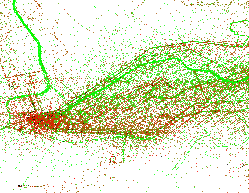
This simple (and ugly) visualization of downtown Pittsburgh and the surrounding area maps the average speed of buses to colors. Each pixel represents a roughly 500 foot square region. The color interpolates from red for the regions where the buses travel on average the slowest to green for areas where buses are moving quickly. For time’s sake, I only sampled around two percent of the data when creating this image. An image sampling the entire dataset would have fewer holes and less noise.
Next I’m going to work on creating more effective and aesthetic visualizations of this data and extracting new data through analysis. There are some low-hanging fruit here (bicubic interpolation of color values, map overlay) and also some more challenging directions I can take things like map distortion for isochronic maps.

