Category: Assignment-01

Minnar Xie-Looking Outwards-1

http://www.feld.is/projects/hearing-gras/

To Hear the Grass Growing is an installation that employs a sensor around the roots of grass to pick up the electrical pulses as the grass grows. These currents are used to generate sound that fills the room, amplifying the clicks and frequencies of the natural growth process. I love the poeticism of being able to make something so subtle and into something very tangible, and in this way allowing people to have a greater recognition of the constant unnoticed activity in our natural world. It reminds me of the recent research on the social life of plants that Professor Momeni was telling me about the other day, and how there is actually a lot of complexity in the way that plants interact with one another (ie: plants recognize kin) but mere human-eye viewing of plants aren’t able to really detect that on a surface level. The use of sensors in this project really arrives at something deeper for me.


I have really been interested in work involving biofeedback lately, in line with my project for my Hybrid Instruments Building course. I found this really cool project Mindchill, which uses a sensor that measures galvanic skin response (a way to measure emotional activity based on your skin’s electric connectivity) and uses that data to control whether a video feed of water either boils or freezes (ie: a stronger emotional reaction, the more the water boils and shifts state into a gas). The video is projected on a large screen in front of the participant.

There aren’t really good photos of the installation itself, but I love the notion of the participant creating a feedback mechanism with themselves. By placing the projection right in front of the viewer, the participant’s emotional state causes the video to react a certain way, which in turn influences the participant’s emotional state, and so on… I think an interesting possible expansion of the project is making it so that a group of people are all providing the emotional response, so the video is reacting to the collective emotion and the individuals all sort of emotionally merge in response to the feelings of others.

David Bowen’s Fly Blimps are also really really neat, a project which each balloon contains a little pod of flies that control the movement of the blimp by their collective movement. A sensor detects the light between the moving flies and sends this data to a microcontroller that then moves the blimp. I like the idea of exploring group behavior and movement in an abstracted way, drawing parallels between fly group behavior and human group behavior, especially the notion of how our seemingly inconsequential gestures as a result of just living can amount to the fate of our group.

Michael Importico – Looking Outwards #1

1. Measure of Discontent: Sigh Collector – M. Kontopolus – 2009

*images from the artists website – http://www.mkontopoulos.com/?p=586

Sigh Collector on Vimeo

This object measures the intangible tangible.  A sigh, an emotional, release is not only measured by this machine but made quite visible.  I like many things about this piece.  Firstly the concept is wonderful.  It taps into the human condition in a way this is fun a kitsch.  The aesthetics on both the object and the accompanying video make for a light hearted work that appeals to  my emotions as well as my gadget lust.

Is is useful? no, but entertaining and though provoking.

Is is scientific?  I don’t really think so, I have reservations about the prescision of this instrument, which rules out any scientific usefulness.

The use of technology is is quite interesting.  There is sensor reading and motor control working together to make this object function.  In addition, I consider the video to be an asset of this work, and should be mentioned as an element of this work.  The production of this video is wonderful and really tells the story of this work.

2. After Thought (2010) – Portable Testing Kit and Custom Video – Scott Kildall

Scott Kildall | KILDALL.COM | Artwork: After Thought

Again, the gadget whore in me loves this piece.  This work of art is disguised as a scientific instrument, and it does intact have much in common with scientific and medical technology.  It utilizes an eeg sensor to read a test subjects levels of stress while being shown a series of images.  During this time, the stress levels are recorded, additionally a custom video is them compiled from a bank of 200 video clips to represent the test subjects emotional status.

Art that creates art is an exciting direction I see really expanding in the digital age, and I see this piece doing that and going beyond.  The human interaction, as well and the balance of the biological and technological elements are what make this work special, and more interesting than the art making machines of the 1970’s.

3. Bill Smith – Nonlinear Pendulums 2011

nonlinear pendulums on Vimeo

I have no idea what to actually say about this work, but I will say that despite me not fully comprehending the concept/motivation/technology employed here, I am drawn to this work as one might be drawn towards an ancient alien artifact.  After watching the video, Im no better off in that regard.  I seems as if this object is controlling video streams from outside the workshop and plotting this data as well as displaying the video.

Plainly, this work utilizes many technologies in the name of art, but plays the part of some line crossing object of obscure origination and purpose.  The boundaries of the biological and technological and completely blurry as are this objects place in time and space.

I was not able to find much info on this work, and that does not bother me as much as it would with other works of art.  Actually, I enjoy the idea that this work is schrouded in mystery; which forces me to be purely objective allowing to to create my own mythology and meaning..  something I always enjoy.


Looking Outwards – Assignment 01

Ludwig Zeller: Introspectre – Optocoupler – Dromolux , Affective Objects 2011

http://www.youtube.com/watch?v=bPvPEMu5FtI&list=UUN8Aax8XICzHJzLScciViWQ&index=26&feature=plcp

When I first watched this video, I was immediately confused. The sounds, the camera angles, the close ups of the man’s face, then the man reading messages as the gaps between words became shorter and tempo faster, and finally, the final scene. To me, it felt like the last part didn’t match up as well to the others ones. In the first two segments, the man putting together a puzzle, and what looked like some kind of interaction between the man’s gear on his body and the metal object towards the end of the desk, it seemed as though there was some kind of research and testing going on, whether it be about scientific reactions or social reactions, more so on the scientific side. As for the last segment, the test seemed to be way more social, and pleasing. The audio was still abstract in all three, but the first two made me feel anxious, where the last one made me feel relaxed.

So then I looked it up; it was about information technology, which made sense. The “Introspectre”, the machine from the first scene, is one that forces you to concentrate by giving an audio of your brain activity, so that when you are about to “drift off into your thoughts”, or break concentration, you will hear a warning as the audio becomes increasingly abstract and anxious. The “Dromolux”, which was the machine in the scene with the man reading words at increasing increments of time, was about dementia, where the machine was trying to act as almost a catalyst to the disease, used as both prevention and treatment. The “Optocoupler”, which was the last scene’s machine, was to help with caffeine and alcohol. It’s trying to provide a depressant that will relax the mind digitally. This was a really cool piece in my opinion, but made me feel a bit anxious and out of body.

Sites Used:

http://www.ludwigzeller.de/project/new-needs.html


Hye Yeon Nam – Please Smile, Robotic Installation 2011

http://www.youtube.com/watch?v=C2-QiQzp67Q&list=UUN8Aax8XICzHJzLScciViWQ&index=10&feature=plcp

I really liked this one from the start. The robots, at first, seemed a bit depressing, but in the end, became almost whimsical and fun to me. Responding to a person’s smile, the robots seemed like they were just lonely and needed a little love and care. They have gestures for facial expressions a person makes, responding to movements, gestures, expressions, and especially a smile. When a person smiles, the robots all wave, where as, when the person does most other things, the robots mimic and point nervously. I thought that it was a very interesting way to show an interaction between robot and human, using hands instead of the face, and it made me question whether the artist did that purposefully, maybe trying to respond to, or make the audience respond to the sometimes forgotten and overlooked need for our hands, especially with technology and computers.

After looking up the installation and artist on Google, I found that this piece was a tool that the artist was using to “foster positive audience behaviors”.  That’s pretty cool… in some ways, could be viewed as controlling, but I had a positive reaction to it. Another cool thing was that the only materials used were a microcontroller, a camera, a computer, five external power supplies, and five plastic skeleton arms, each with four motors.

Articles Used:

http://www.hynam.org/HY/ple.html


Mihai Bonciu- Mirror, Kinetic sculpture 2011

http://www.youtube.com/watch?v=BJ9OkFQFs4U&list=UUN8Aax8XICzHJzLScciViWQ&index=32&feature=plcp

The camera angles were really nice and confusing, increasing the mystery of the object for me, the viewer. This video was probably my favorite in terms of how it was shot, making it seem like the factors of both kinetic sculpture and video became more separate and prominent, a feature I enjoyed. Though, once I saw the object, the robotic face, moving, I laughed, finding it both funny and confusing, and I believe it’s most likely because of my interpretation of the title of the piece, Mirror.  Before watching the video, strictly because of the preview picture and title, I thought that it was going to be a robotic face mimicked a person’s expressions, that it was going to be an interactive piece. First of all, the way the robot’s face was moving was in no way human-like. It was as if a person could do the wave using only their face muscles. With that said, it was really cool looking, interesting in an almost creepy and mysterious way, where all I could picture was a person trying to make those movements. Also, it did end up being an interactive piece, but not in the way I expected. Instead, the machine relied on the help of a human to make it move, which made me ponder whether this was a piece responding to some concerns about artificial intelligence, that the human race would still be in control over the technology.

Luo Yi Tan, Looking Outwards 1

Live 2D

Live 2D is a technology by Cybernoids that enables 3D animation to be applied to 2D images, and allows the user to interact with the image. So far it’s only been used in dialogue based games with limited movement, but I can see this expanding into full rotational movement in the future.  This technology will also make artists and animators think of their works in a different way, because they have to think of how 2D art moves in a 3D plane. This could possibly give rise to a new branch of animation (2.5D?).

The integration of 2D and 3D is really interesting to me because I’ve always loved animation, and this could be a way to bring a fresh new look to 2D animation, which we don’t see very much of in commercial movies anymore, sadly. It would also be funny to watch people bringing in 3D glasses for a 2D movie. This could also bring a different level of realism in video games, as it enables 3D humans to interact with 2D characters.

Generative Jigsaw Puzzles

Nervous System, a design studio founded by Jessica Rosenkrantz and Jesse Louis-Rosenberg, used the works of Jonathan McCabe, to create these puzzles. The puzzle pieces themselves are designed based on a process called dendritic solidification, with some pieces specially made to be shaped like small creatures like algae.

It’s a cool mix of biology and art with some engineering and math thrown in. Biology is my favorite science, so it’s really nice seeing it being applied like this. McCabe’s works also give a sense of unity to the puzzle, and they themselves are also created using a generative technique.

One thing they could do is the make the shape of the puzzle itself a dendritic pattern or at least something different other than boring geometric shapes. They could perhaps work with McCabe to create a technique that would be able to create generative patterns from non-uniform shapes. This would also make the puzzle harder to solve and probably harder to make, which could make a great challenge as well.

You can see the documentation of the project here.

The Exquisite Forest

This project is a collaborative online art project by Google and Tate Modern, which allows users to create short animations that are built off from a “seed”. Users can start from any branch on the story tree, creating almost infinite possible ways to tell the story. I find this project interesting because it is a very different way of storytelling, allowing a multitude of possible scenes and endings from just a couple of frames of animation.

The interface is very fluid and easy to use, and I had great fun browsing through the various animations that have been created. However, one thing I’ve noticed is that some of the trees look terribly ugly when users decide to continue the story from a single branch rather than work on the other branches. The designers should perhaps find some way to make lopsided trees look a little more aesthetically pleasing.

Unfortunately, since this project is based on Google App technology, it’s only viewable on Google Chrome. Hopefully in the future something similar can be made that is open to other browsers as well.

You can join in on the fun here.


Andrea Gershuny- Looking Outwards #1

Takahiro Yamaguchi + So Kanno’s “Senseless Drawing Robot”

Kanno and Yamaguchi’s creation is exactly what it sounds like: a robot that creates drawings devoid of any sensory input from its environment. Placed in front of a wall, it rolls back and fourth on four wheels while swinging a can of spray paint on a pendulum. The robot spray paints the wall at random intervals, creating a drawing on the wall.  What I love about this project is that it is a drawing created (mostly) without human input–after its construction and placement in front of a surface, the robot, though it does not know it, is creating art of its own (though, I suppose, Kanno and Yamaguchi own this art by virtue of creating the machine that created it). I like that this drawing’s creator is unaware that it is a creator, and I like that the drawing was born from a random combination of movements rather than the deliberation of a creator. However, I wish that Kanno and Yamaguchi had given the robot more “choice” and made the drawing even more random–for example, they could have had the robot randomly select colors of spray paint and change between colors at random intervals or had the robot randomly select a wall or space to paint on. (That may actually have been the case; it’s not apparent from the video.) I feel like they are so close to achieving art made without human intervention that, had they pushed the more random aspects of this piece and allowed for more possible combinations of placement, color, etc., the piece would have been much more elegant and striking.

Dominik Strzelec’s “Byzantine Geology”

http://www.dataisnature.com/?p=1594

To be completely honest, I have no idea how Strzelec creates these forms. The blog post linked above says that he uses “multiple generative processes… [such as] Belousov–Zhabotinsky reaction simulation coefficients to generate volumetric forms”. As far as I can tell (or as far as I can understand), a Belousov-Zhabotinsky reaction is a type of chemical reaction which is not thermodynamically stable and results in oscillating, color-changing liquids. Simulating reactions such as these, Strzelec creates three-dimensional forms with wildly varying, vibrant color schemes that look almost like psychedelic models of the Grand Canyon. In some of his pieces, Strzelec adds a floor underneath these generated forms, turning them from elegant computer-generated forms into “speculative archetecture”, bringing them from the abstract digital space to at least an imitation of the real world. While I do sort of like these forms on their on, as automatic computer-generated imagery, I wish Strzelec had not just stopped at simulating a floor but had pushed these models into real-life sculptures–I can just imagine turning these forms into sculptures, so large that people can walk through them.

Takeshi Murata’s “Pink Dot”

I came across Takeshi Murata’s work on The Creator’s Project blog. Primarily a video artist, Murata has two main branches of his work: mostly hand-drawn animations that rely on computers only to compile the frames, such as his video “Melter 02” below, and videos made using After Effects and other such programs which exploit glitches and flaws in digital video, transforming mundane and mass-produced media into a sublime combination of imagery (both recognizable and abstract), color, and sound. I am absolutely in love with Murata’s work and how it takes things that we perceive as banal or at least ordinary–like film–and crafts it into a sensory experience beyond the video’s intended purpose. My favorite parts of his videos are the ways he uses color, especially the eponymous pink dot in the above video, and how the sound in his videos is somewhat grating, like the video itself, but manages to still create a transcendent aesthetic experience.

http://www.youtube.com/watch?v=q6ucn3m7rN8

Looking Outwards Assignment 1 : Connie Dai

[youtube http://www.youtube.com/watch?v=_gk9n-2lBb8&w=640&h=360]

There are three record shaped objects with certain visual patterns that are read by a machine and then translated into different sound patterns that then through manipulating and overlaying said sound patterns create something that resembles music. This project is interesting to me because I am interested in how the records have on them visual representations of sound. In a way it is almost as if one can “see” sound. I am also intrigued by how interweaving a few simple repetitive sound patterns one can create a tune that carries much more complexity and depth than any of the individual tracks would have alone. Perhaps if there were more records or a greater variation in the sounds that could be created more depth could have been achieved. Though I do feel that the aesthetics of the piece dialogue very well with the song they managed to create.

[youtube http://www.youtube.com/watch?v=K_jWA_o-Cvg&w=640&h=360]

This is a collection of seemingly perpetual motion wheels made with lighted bottles filled with sand. The visual effect created by the different wheels overlaying each other spinning (seemingly) forever on their own is very striking to me. The way the lights wink in and out as they overlap has a hypnotic quality that I find visually compelling. Though I feel that this piece does capture the timeless quality it aims to posses the presence of the sand was not immediately evident to me (and really only became evident after reading the artist statement). In fact, while this is a piece that I find very visually beautiful and somewhat hypnotic the greater message it seeks to communicate was somewhat lost to me until I had it spelled out to me – though to be fair the idea of eternity is not really an easy one to communicate.

[youtube http://www.youtube.com/watch?v=PjgVeJkdBn0&w=480&h=360]

This is basically a printer that prints latte art into one’s coffee. This is interesting to me because as a machine it is able to produce elaborate patterns with incredible accuracy that cannot be achieved through traditional means (i.e. by hand). The very nature of it is interesting because latte art is has a few traditional patterns that are always used (leaves, hearts, or some combination thereof) and though it is the same variation of these few patterns there will never be two that are perfectly identical because of the human element. With this printer any variety of patterns are at one’s proverbial fingertips but each pattern will essentially be identical to itself creating a strange paradox of having a very numerous variety that is exactly the same.

RobbGodshaw-LookingOutwards-1

Föhnseher — Julian Oliver


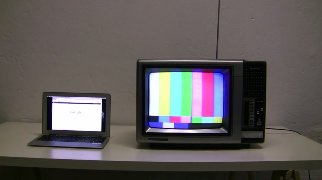
In Föhnseher, Artist by Julian Oliver integrates a salvaged television with a Linux computer that is constantly sniffing an open WiFi network for transmitted images. It displays these images on the screen over a video test pattern background. Those nearby who are connected to the network have their thought to be private traffic prominently displayed in the gallery.

I find the execution to be clean and responsive. I appreciate that all of the technology that does not resemble the old television is hidden from view. Perhaps inside the TV chassis  itself. The idea that we are sometimes broadcasting our activity to black hats and artists is likely disturbing for the viewer. The TV is as strong a symbol of publicity as our personal devices are of privacy and security.

An interesting albeit illegal method of scaling this project might include a mobile device that provides open and fast WiFi. In the same manner, images are sniffed and reproduced and converted to video signal. The signal might then be fed into an illegal television transmitter set to an unused channel. In this way, WiFi stealing neighbors would have all of their browsing habits broadcasted to the whole neighborhood on a mysterious and ephemeral channel.


Vimeo Embed Problems...
Föhnseher (Seer of Warm Winds)
from Julian Oliver on Vimeo.
source

DVD Dead Drop — Aram Bartholl


In this gallery installation, a unlabeled slot is cut into a blank white wall. Patrons insert their own blank dvd into the slot and it is burned with mysterious and evolving content from various digital artists.

This piece has a weirdness about it I find intriguing. Unlike USB Dead Drop, another Bartoll initiated project where USB flash drives are permanently embedding in public space, users of this installation will have no idea what they have received until they go home. DVD dead drop is also read only– giving the artist full control over what content the viewer receives.

The content Bartholl selected to be burned to the disc is not his own, but that of fellow digital artists. In this way the artist acts as nothing more than a novel and quirky content delivery mechanism. The experience of sacrificing a pristine instance of optical media to a hole in the wall for a few minutes would feel very strange. With no feedback one would likely begin to wonder when their disk would be returned. Imaginations would run wild with possibilities of content. Some users might grow to fear obscene content or malware.


source

Paper.JS — Jürg Lehni & Jonathan Puckey


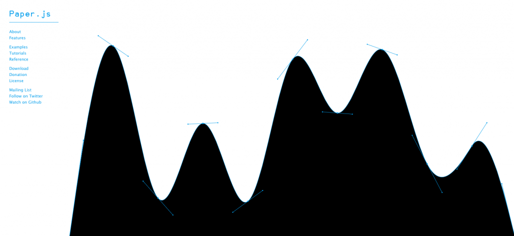
Paper.JS is a port of the popular Illustrator Plug-In Scriptographer to the browser using HTML5. The landing page is a very fun little example of its Bezier capabilities. It is lively, attractive, and editable. This reduces any barriers to engaging with the tool. Until tonight, I had never heard of it. I used Scriptographer a great deal in high school for making vector half tones of graphics for screen printing. I look forward to having enough java experience to use this tool to add some spiffy and subtle interactivity to my personal website.

Looking Outwards Assignment 1 – Rosey Denton

[youtube http://www.youtube.com/watch?v=gusJeslMbLc?rel=0&w=640&h=360]

This project is a fountain in Osaka Station City which uses falling water to display things like the name of the station, the time, and various designs for the enjoyment of the passerby. To me, it’s extremely interesting to watch the way the creators have used such precise timing to turn falling water into an art. I think that while this is a good start to a technology that has potential to be utilized in many places for a different kind of aesthetic pleasure, but perhaps the designers could experiment with some extra things like the idea of adding color to this using something like laser lights. I’m sure this fountain was inspired by other more traditional fountains, but now taken a step further by utilizing timing of the falling of water instead of just playing with a constant stream like many others have done.

http://www.talkingdogstudios.com/ar/faceball/

[youtube http://www.youtube.com/watch?v=jKIv3Pt6zjI?rel=0&w=480&h=360]

This is a video displaying a small group’s efforts with using Augmented Reality technology. Using a marker and tracker, you can display various things on camera – in this case, a copy of your own head. Though this technology is not widely known yet, I think it has a lot of potential to be utilized in things like interactive books and games and the way it combines reality and computer generated imagery is pretty neat. Though this is obviously something made just for fun, the project could be taken further in the future and there is a potential for AI to get mixed up with AR technology, which would lead to even more interactive possibilities. If you look around the web, a lot of people have toyed with AR, one of the more well-known would be Nintendo and their 3DS, though they are certainly not the first. AR technology seems to still be in production, but it seems like with the track they’re on, it won’t be long before it makes a bigger breakthrough into our everyday lives.

[youtube http://www.youtube.com/watch?v=BtbBHR8LC6Q?rel=0&w=640&h=360]

This group became known during their audition on the NBC show America’s Got Talent. They use lit wires in a dark environment to perform various musical-based skits. To me, it’s amazing that they can get such realistic-looking movement out of the creatures that they create with the wire and create the illusion that it isn’t humans operating everything.  I think that if they continue creating a wider cast of animals and make longer, more narrative story lines they would have a fantastic show to offer the general public. In the past, I have seen videos of groups that have done a similar feat using lit wire (Team iLuminate, WRECKING CREW ORCHESTRA, etc), but this is the first group that I have seen which goes past using just the body and creates different creatures using this light-in-the-dark technique.

Oliver – Looking Outwards – 1

Livehoods

Livehoods.org is an interactive website created by several researchers at Carnegie Mellon. The site shows a map of a city (Pittsburgh, New York, and others) and uses Foursquare check-in data to separate that city into “Livehoods,” which are designated using an algorithm determined by the relations between places where people check in. Livehoods turn out to be different than the formal neighborhood lines that separate, for example, Shadyside from East Liberty. It’s possible to see the connections between different neighborhoods by clicking on a location and then looking at the top 5 related Livehoods. I think that this site is very well done. It’s aesthetically pleasing and easy to use. Livehoods uses the Google Maps API, which creates a background map that most people are familiar with already, and then adds colored dots to represent the Foursquare data. Each Livehood is shaded in a particular color when the user scrolls over it. I think an improvement would be to also show the formal neighborhood separation lines, as well as the Livehood separation lines, so that the viewer could compare.


Vizify

Vizify is an online visualization tool that takes information from a user’s various social media accounts (Facebook, Twitter, LinkedIn, Foursquare, and Instagram) and creates an interactive visualization based on some of the data. I tried it out, and this link shows the result. Visually, I found the result to be impressive. It looks clean and it’s easy to navigate and interact with. However, some of the content could use improvement. For example, I use Twitter very rarely, and have only posted one tweet within the last year or so. Vizify used that one tweet to create a page of “Words I say a lot on Twitter,” which only had one word. I post on Facebook quite a bit, but the tool did not visualize words I say a lot on Facebook. It also didn’t seem to use any data from my Instagram account. I thought the tool did a great job of visualizing my Foursquare account data, because it separates my check-ins into categories which the user can click on and see in more detail.


Come To Your Census

[youtube http://www.youtube.com/watch?v=h34aNRbajPE&w=560&h=315]


The Australian Bureau of Statistics made datasets available, and those datasets were visualized by a group called Spinifex. Not only did Spinifex create interactive visualizations, they also managed to project them on a large building, which was connected to a touch screen that could be manipulated by the audience in order to look at different demographic statistics. The audience could also interact with a network visualization of some kind, though I couldn’t tell exactly what the network was. It appeared to be towns or cities, but I’m not sure how they are connected to each other. Other parts of the presentation looked more like short cartoons demonstrating various characteristics of Australia’s population. I like this project because of its ability to use interactive media to get people interested in census statistics, something that otherwise may be considered boring to many of them. In the U.S., much of our census data is available to the general public, but remains lifeless as tables on the Census Bureau’s website. One critique that I have of this project is that the building they projected on did not make the best screen – it had many windows that got in the way of the image. I would have preferred a more blank canvas.

Assignment 01

Due Wednesday August 29th:

One Blog Post containing Three (3) “Looking Outwards” Observations.
Browse blogs and other sources to discover three projects that you haven’t seen before. (Consider digging around the sites listed in the Links section of the course site, above. You can also look to other sources.) Also: consider selecting projects that are made by individuals or small teams, rather than large companies. In a blog post, embed relevant images or video of each project, and write a paragraph (~150-200) words about each project, in which you:

  • Explain the project in just a sentence or two;
  • Explain what inspires you about the project (i.e. what you find interesting or admirable);
  • Critique the project: describe how could it have been more effective; discuss some of the other possibilities that it suggests, or opportunities it missed; explain what you think they got right, and how they got it right.
  • Compare the project with related work or prior art, if appropriate. What sources inspired this project?
  • Please be sure to tag your blog post with our WordPress “Category”, Looking-Outwards.
  • Name your blog post(s) consistently, with the title YourName-LookingOutwards-1, etcetera.