Ju Young Park – Looking Outwards


Above is a visualization done by Burak Arikan and Ben Dalton. This work aims to explore the effect of the fashion system by creating a micro fashion network with the basic elements color and time. In the project, similar colors connected to each other form a large color network over time. I love this project how it creates such a beautiful image at the same time it contains useful data of fashion network. I think that a data visualization is better to output attractive images, and I am inspired by this one in creating my project 2.

[vimeo=http://vimeo.com/3912251]
One of projects in the exhibition, Terre Natale, Exit 2 is a data visualization of global immigration rates. This project immerses the viewer in a dynamic presentation of data documenting contemporary human movement. For the project, the viewer enters a circular room and is surrounded by a panoramic video projection of a globe which rolls around the room printing maps as it spins. This project it built for exhibition, seeking for a way to interact with viewers. In this way, viewers can comprehend the data set of global immigration rates more easily and quickly.
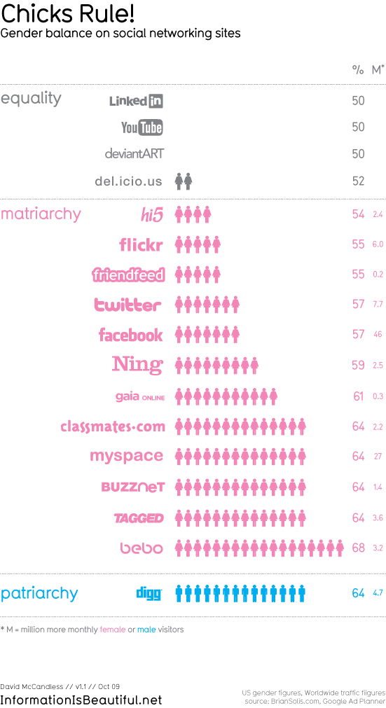
Who rules the social web? is one of the projects from ‘Information is Beautiful.’ I like most of works from them, and this one is just an example to demonstrate their ideas and missions. They literally encourage people to use data and create own design for make information beautiful. In the blog, http://www.informationisbeautiful.net, anyone can find data sources and project ideas easily. I personally find this useful, so I wanted to share it with people.