Ju Young Park – infoVis
For my information visualization, I decided to visualize text structure of fortune cookie messages in a manner of text clouds. I personally believe in fortune telling, and I have a habit of collecting fortune cookie messages in my wallet. Fortune cookie is a Chinese crisp cookie with a “fortune” wrapped inside. Since the “fortune” inside the cookie is randomly chosen, people tend to believe the words of wisdom written on the message. These days, fortune cookie is largely consumed all around the world, and it has become like a common “culture” or “custom” in many countries, especially, United States.
My purpose of the project was to create an interactive interface where people can see the texts used in fortune cookie messages and where people can look for a message that contains a certain word. In addition, my ultimate goal was to transform “information” into an “artwork.” In this way, I spent a lot of time developing final design that can be something attractive, beautiful, and engaging.
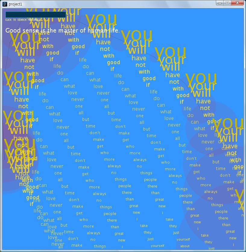
I have collected data from web, friends, and local Chinese restaurants. As a result, I assembled dataset of approximately 4,000 fortune cookie messages. With this list, I tried to visualize 50 the most common words used in the messages like a text-cloud. I generated this text-cloud using openCloud library in Processing. You can find online database of fortune cookie messages from here

I was also heavily influenced by Claude Monet’s Reflections of Clouds on the Water Lily Pond Series in building the final design.

For the design, I wanted the information of text-cloud of fortune cookie messages to action and look like a real “cloud” in an abstract manner. Therefore, I animated the texts to float over as if clouds float in sky. In order to represent background as sky, I filled the background with color blue. In China, color red represents “lucky,” and yellow/gold is considered the most beautiful color. Yellow also signifies “good luck,” so many people in China pair yellow with red for more luck. Therefore, I developed the final design with colors red and yellow.
[youtube=http://www.youtube.com/watch?v=A5zIf_T-AAQ]
I am pretty satisfied with final design of my project. I tried my best to employ the concept of representing text clouds of fortune cookie messages as well as meaning of “fortune” or “good luck.” However, I had hard time in collecting data, and since I dealt with texts in this project I obviously needed a lot fortune cookie quotes. My original goal was to collect around 6,000 fortune cookie messages, but this attempt failed. I do not think this project as a “final” form, because I plan to expand it more data and lucky numbers. But, I find this successful in a way that “information” has turned into an “artwork.”
========================================
Ju Young Park: Fortune Cookies
Please try not to read off of your slides. < - agreed, more pictures, less text Blue/Yellow/Red is not an ideal color scheme. Lots of clashing. <- but this is good if your going for Impressionist style, probably harder to read though The semi-transparent red was really very strange on the background. I don't understand what's going on in this video... Music not important/distracting The animation is a little confusing, doesn't help to visualize anything. I like the interactive part though, it's engaging. I don't have much insight. I think a standard wordcloud would have been more useful--the animation is distracting. Do an n-gram search on the dataset to find commonly occuring sequences of words. This will provide more useful data most likely than simply the most common words... Myabe you shuld have filtered out the most common words, aka "you", "will" ... it's hard to see the other words when those are so prominent and unchanging mayeb show more about the action verbs in the fortunes I do like the interaction quite a bit. We've seen very little as far as interactive visualizations go today. Really like the paralax effects going on, it's a cool visual touch. Not sure there was much exploration of the data here, but it feels whimsical. Good beginning point; we’re all familiar with Fortune Cookies, they have a familiar place in American (!) culture. I see you’ve begun with a tag cloud of the 50 most common words in the cookies. Did you filter out the Most Common English Words, so that we could focus on the actual content that is unique to Fortune Cookies? http://en.wikipedia.org/wiki/Most_common_words_in_English — otherwise we’ll just see the usual words, like “you”, which isn’t very informative.
You’ve spent a lot of time focusing on the colors you chose (red, yellow, blue), and making an animated movie with sound… but I don’t really get any insight into the overall space of Fortune Cookies. What about using some kind of cluster analysis? What about the Word Tree available in Many Eyes? http://www-958.ibm.com/software/data/cognos/manyeyes/visualizations/obama-nobel-remarks-world http://www-958.ibm.com/software/data/cognos/manyeyes/page/Word_Tree.html
I love the topic. I would love to have access to your data! I like that you described your inspirations and thought process. I think the data is really interesting but I thought the visualization was more of the experience of getting a fortune cookie.
Kudos for assigning color to specific meaning. The text visualization should size the text in different way to allow it to be bigger overall.
It would be nice if you launch directly into examples. Pictures! We are visual people! Your thought process of how you did it is good for after you demonstrate what you did, perhaps draw our attention in and then bore us with the details. What are the clouds doing? the balloon things?
I am confused why all of the floating clouds say the same thing.
why did the text input not change these clouds?
There’s so much “you” and “your” in fortune cookies I feel like it might be more interesting to filter those out so that I can focus more on the varieties of fortune messages.
The movement helps add interest, but it makes it hard to read the words, which is the point. The most common words at the top are readable but the more interesting ones farther down literally fly by.
What purpose does the search box serve? Are you supposed to search for the full text from words you see in the clouds?
The flying text is very mesmerizing, I really enjoy the subtle colors and background music. But it does seem like you missed out on opportunities to show more data about the word frequencies, instead of having just identical word clouds.
I like the side border. it reminds me of the little strips of white paper that have fortunes on them.
I like the fact that you set up your goals up front. Makes it clear what you were / are looking for.
Great data collection! Way to go for collecting 4000 cookies.
Lot’s of thought in details of design (colors). Impressive!
*** Yeah I like that there is meaning behind your design choices.
very thorough and detailed process phases!
Would present my art first, and then talk about it.. it’s hard to relate to it this way.
**yeah, I agree.
*** yea there is no reference
I like the music and motion. They go together for the most part.
I think I would have filtered out some of the more boring words like “you.”
Looking at the video.. not sure what’s going on there exactly. Is there some kind of relationship between different “strings” of cookies?
Are they just floating aimlessly in the air?
Yea its hard to read the words, or tell if I’m supposed to when they are moving around