SankalpBhatnagar-GraphingColor

What if you could see color?
What if you could do more than just look at color? To perceive it, understand it, analyze it, really see it, color needs to be visualized.
My name is Sankalp, undergraduate Mathematician + Designer at Carnegie Mellon and I plan to do just that. The first question we must ask ourselves is, how can we possibly visualize something already visual? The answer I found can be summarized in four steps: First, treat color as data. Second, interpret this data as information. Third, graph this information. Fourth, notice patterns in graphs.
“Treat color as data”
In order to treat color as data, we must quantify the the qualitative. To do this, we must reference basic color theory. Every color that we digitally see can be broken down according to the RGB model. This model yields three distinct values according to a particular color’s Red, Green, and Blue hues from any given blended color. For example, the color Black has 0 hue increments in Red, Green, and Blue and thus has an RGB value of (0,0,0). Whereas, the color White has 255 hue increments in Red, Green, and Blue and thus has RGB value of (255,255,255).
“Interpret this data as information”
To interpret this data, we need to increase the scope of color to palettes. A palette is simply a range of colors used by artists, designers, and other creatives. In design, palette consists of around 5 different colors. These colors are usually brought together for their contribution to a palette’s overall mood or theme. Because of the nature of palettes, designers tend to create various versions in pursuit of a specific quality. In fact, at Kuler, designers from around the world can submit their individual palettes with “tags” relating to the mood or theme they interpreted from the palette. Kuler even has the option to organize the available palettes by “Most Popular” (in relation to how many times that palette was downloaded), “Highest Rated” (in relation to how many stars out of 5 the palette averaged), and “Newest” (in relation to the palettes most recently submitted). This online tool is widely used by artists and designers and will serve as the perfect host for our information visualization.
“Graph this information”
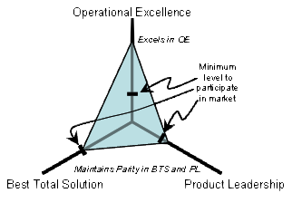
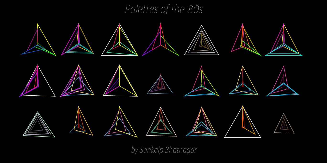
Graphing palette date requires an understanding of some geometry. Consider any color you’d like. This color will have a unique RGB value expressed as (r,g,b) where r, g, and b are any integer, distinct or not, from 0 to 255. To continue further with our project, we must convert these r,g,b values as coordinates. Luckily, if we frame our values using intermediate coordinate geometry, this conversion comes for free! If our graph has three axes 120˚ apart that share a mutual minimum value of 0 and distinct maximum values of 255, we can plot 3 points on this plane. Then, we must only generate a triangle with these 3 points as the 3 vertex points (an apex, a base right vertex, and a base left vertex). This triangle would look similar to this images (without all the economics jargon):
Now that we can conceptualize a single color, if we expand our vision to an entire palette full of colors, and their overlapping triangles, we can begin to theorize the possibilities of shapes that may emerge. However, to fully grasp the effect of the color palette, we must also represent that color as we usually know, by sight. Where filling each color triangle from each palette with its corrsponding RGB color could quickly lead to a clustered inaccurate graph, simply changing the stroke color to that color triangle’s particular RGB color will succeed in both efficiency and visual simplicity.
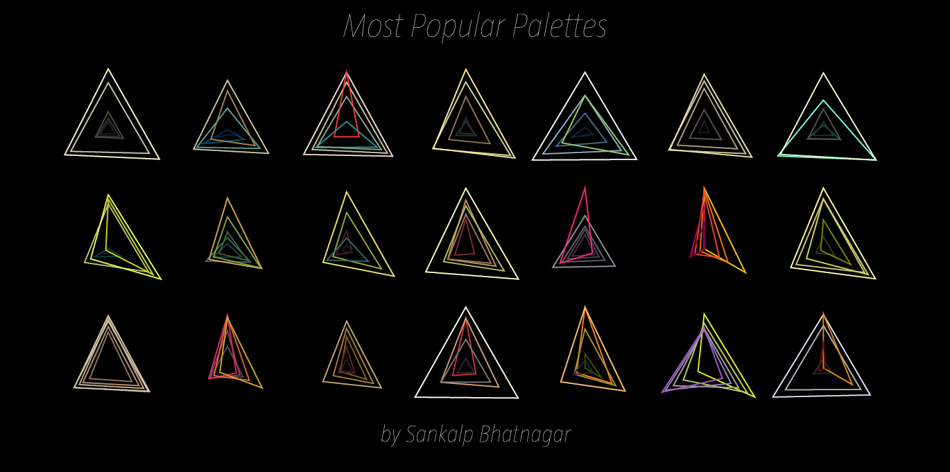
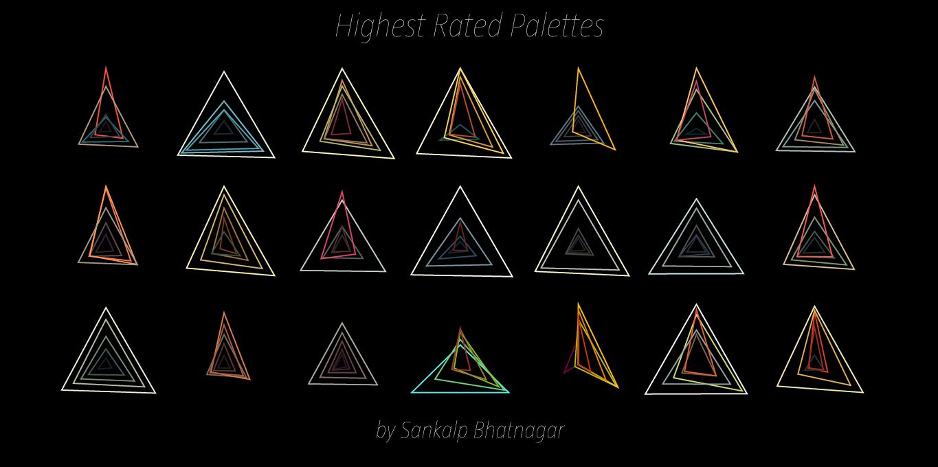
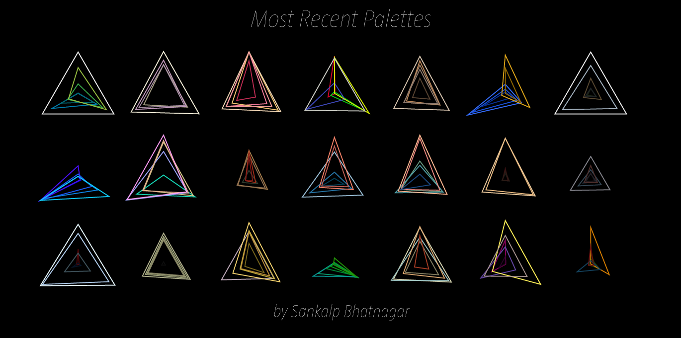
To efficiently graph these palettes in a way that was visually effective, I used the Vormplus colorLib library for Processing language. I also needed access to Kuler’s API, which I requested and received from their API Key Kuler Services page. With these tools, I wrote code that would use an array of every palette, with its own array of 5 color RGB values, of the top 21 palettes returned from Kuler after a given search to generate colored triangles as described above. Essentially, the program I wrote takes in 21 palettes and outputs each palette as a series of overlapping triangles, with no fill, placed in sequential order where the top left-most set of triangles represents the 1st palette Kuler returns and the bottom right-most set of triangles represents the 21st palette Kuler returns.
“Notice patterns in the graphs”
The following images (and below high quality .pdf’s) are results from several iterations of my program with various search queries:
Most Popular Palettes:
Highest Rated Palettes:
Most Recent Palettes:
Palettes of the Sun:

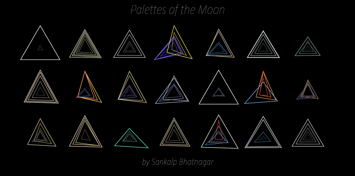
Palettes of the Moon:
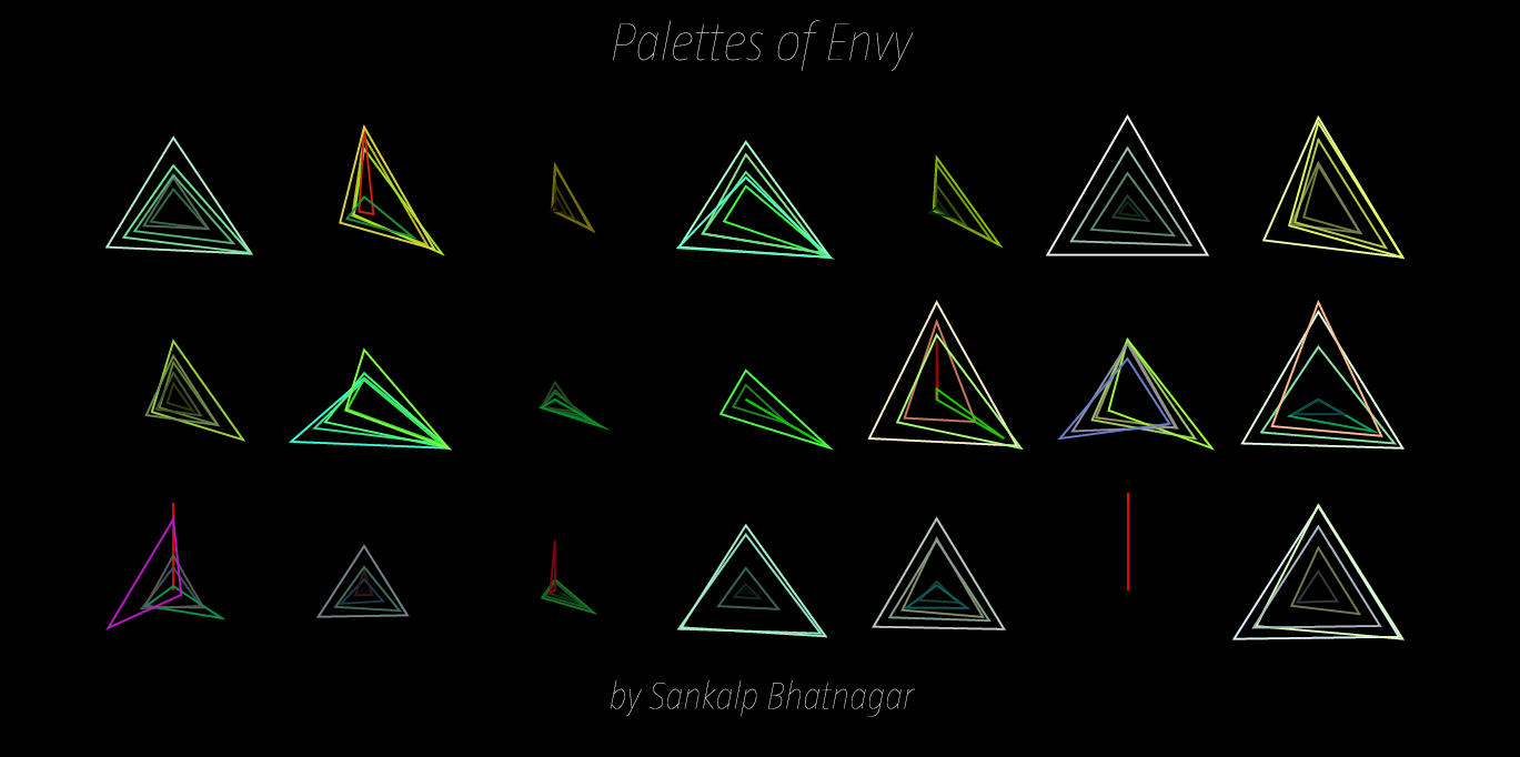
Palettes of Envy:
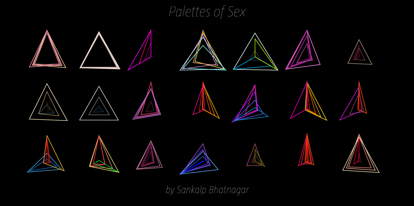
Palettes of Sex:
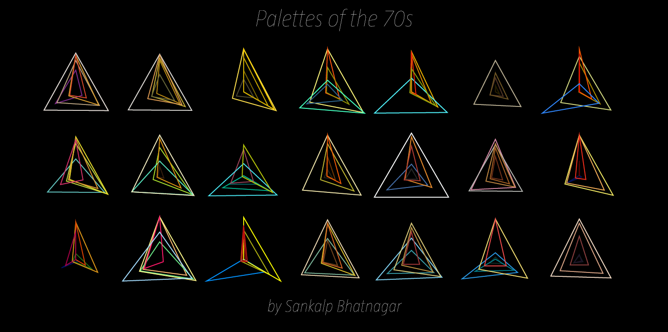
Palettes of the 70s:

This assignment really pushed my skills to their max. A lot of work and a lot of iterations of this project were made until I got this program working correctly. But in the end, regardless of how long it took, I learned a lot. Before this assignment, I had no idea what an API was and I had little experience with such large arrays, but after this project, I’m very proud of the programming skills I had to pick up quickly given the time constraint of 2 weeks. To me, this assignment represents persistence. Had it not been for Golan’s motivational advice a few days before this assignment was due, I would have given up entirely out of stress or intimidation.So thank you Golan.
========================================
Sankalp Bhatnagar: Graphing Color
could probably find another three axis graph than som econ one. the palettes over time would be nice as some sorr of progression or fade from decade to decade
I’d also like to see this data in graph form, showing what colors are more prominent for what terms, even the average colors for each term with all terms together on the same graph
also, would like to see more variation in the visualization type, experiment more
on the presentation: know your audience. you can be more brief.+1+1
Sankalp – the “know your audience” remark is accurate. Everyone here is a creative technologist (artist/designer/coder) who already is familiar with the RGB scheme for storing and representing color data.
Your scheme guarantees that white is always the largest triangle, while black is always a tiny dot in the center. The ‘concentric’ triangles are an interesting representation, but I would suggest a modification. I would use SOLID (not outlined) triangles, which are then sorted (back to front) from lightest ( = largest) to darkest ( = smallest). More generally, I wish I saw more experimentation ( —-> sketches thought through in a notebook, not necessarily implemented in code!) about how to visually represent color spatially. Also, I would have appreciated some research background presented into the Munsell color space and other advanced volumetric displays of color.
I think the lines around the triangles coulld be thicker for more contrast against the black background
The triangles are interesting but don’t provide information that the color itself doesn’t. This *would* be an interesting way to visualize color in a black and white environment though. On second thought, I suppose it does allow for better grasp of highlights and shadows. Hue is harder to distinguish at extremes of value and low saturation.
The final result is visually attractive but I’m not sure I learn anything from your visualizations. I would totally buy prints though.
I think the final result is beautiful, reminds me of HG Gilje. Could have used some better communication about what the skew/rotation properties represent. Very Tron. I like the final visual presentation style (3×7 grid). It matches the geometric theme nicely. Some more research on color schemes might have helped, especially after the interrum crit last week. It sounds like you still believe color IS rgb. It’s just one way of putting things on screens.
Like the results of the project, but I think it could be further evolved in understanding patterns or what motivates people to choose those colors?
Very cool collection of colors. It’s interesting to think about each pallet visualization as a pixel in itself. If you look at later work by the artist Chuck Close, you can see how his ‘pixels’ colors are perceived by averaging several colors. Check it out: http://www.cs.washington.edu/building/art/ChuckClose/
It is a great idea to visualize colors by using geometry. Nice choice of colors in your figures.
Nice detailed descriptions of your thought process. The triangles are also pretty, and very nicely layed out in the pictures. Could you have taken this data and approach further, though? Maybe with some sort of animation, or exaggerating the triangles so that colors with one particularly strong channel would be extremely acute? It seems like the ultimate test of your visualization would be: if the triangles weren’t colored, would your project still look interesting?
The sun/moon examples really show what this project is about. I wasn’t sure what was important about plotting the 3 axis until I saw those.
The geometery adds a nice additional dimension (literally?) to the normal display of color palettes as flat rectangles.
I don’t know what this says about the individual colors, but I think it’s a nice was to look at palette
Great examples.
What interests me is the overall gestault of the triangles overlaying on each other. At first glance, it’s hard to discern the organization or the logic behind the shapes, but I don’t think it’s a bad thing. Within each grouping, I’m not sure if the relationship between each color pallete is obvious by shape alone. For me at least, it’s the color that identifies them as a family, not the organization.
One potentially simple addition to make this interactive would be a text input that allowed users to search Kuler for their own terms and see those graphs. Could be a fun thing to add; I could certainly see myself entering random words for an hour or so to see what falls out.
this is really elegant. You should include some nicer/brighter process images, since your final pieces are
very polished. Could you find some way to draw some parallels in regards to shape?
The triangles look nice, and are laid out nicely on the screen. I am not sure I see more information, or can answer different questions from yoru visualization
vs. the original vizualization of Kuler. If we put 21 of those palletes, just as they were, instead of using the triangles.. would we not be able to see the exact same thing?
I think your design is very successful . I don’t totally understand the significance of the shape of the triangles. I’d have to read your blog post.