Varvara Toulkeridou – butterfly sorter – update
In how many different ways can you sort a collection? From how many different perspectives can you view an assembly of things?
A collection is a group of things related to each other in some identifiable way. The relationship might be through a topic, a place, a person, a type of object etc. Even though there is a specific motivation for gathering on the first place, what makes a collection dynamic is that one can reorganize the same data in alternative ways and make different sense of it.
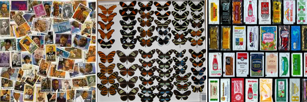
The motivation about this project came from the ‘Pink project’ by Portia Munson. The pink project comprised a series still life installations created out of the artist’s collection of discarded objects, all of which are varying shades of pink and are objects used by females. The discarded items assume new meaning when seen out of the perspective of the common color and the connotation with gender as well as through the way they are organized in space.


Portia Munson, Pink Project, 1994
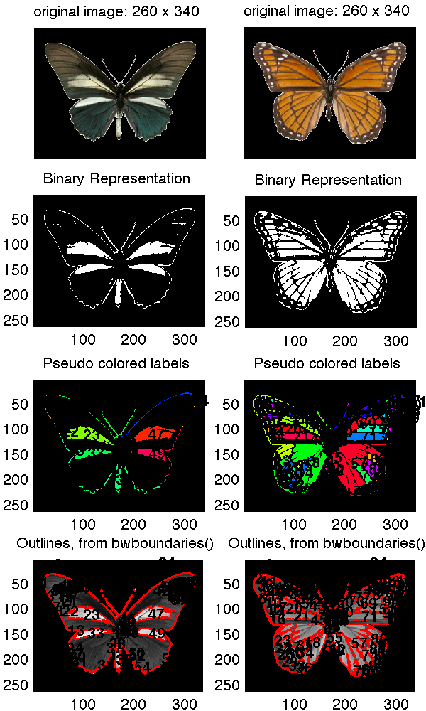
The data set I am using for the project, comes from a collection of images of butterflies provided by an iPhone app made by Hunter Research and Technology. The collection is composed by 240 images. Each butterfly is shown in plan on a white background; the images I extracted are 260×340 pixels in size. The only data accompanying the images is the name of each butterfly. The sizes do not reflect the real life size of the butterflies; they were probably all brought to the same scale before being used in the iPhone app. I later found that the original images are coming from the following website: http://butterflies.aa6g.org/ where also a description of how the butterflies had been photographed can be found.

- perimeter of the butterfly outline
- area of the overall shape
- number of detected boundaries on the surface of the wings
- the image’s average value
- the image variance
- color histogram
From the results I got for the images I noticed that the values do not vary significantly. This, I believe, is also reflected on the slideshow: in most of the cases the reason for transitioning from one butterfly to the other is not observable. My impression is that given the collection under consideration (same family of things with similar characteristics) the linear ordering might not make that much sense in terms of results.
Also, it might have been wrong on the first place to compute the image statistics without taking into consideration that a significant amount of the image pixels were those of the background. So I run the histogram analysis taking a different approach:
(1) I considered all three color channels
(2) I masked the image in order to compute a histogram only on the butterfly shape
(3) I computed the similarity among all pairs of butterflies and got the corresponding sorts; more specifically given the histogram vector for each image I computed the distance matrix between all pairs of butterflies.
The results seemed more reasonable. Thus, taking the three points mentioned below under consideration, I repeated the image processing and extracted the following image descriptors:
- perimeter and area – considered together in one descriptor
- color histogram
- edge histogram – horizontal, vertical and edges on the two diagonal were considered for the computation of the edge histogram
- average value – the average value was computed separately for each channel
- standard deviation – the deviation was computed separately for the columns and rows of the image matrix for each of the three color channels
- color histogram – 10 bin color histogram for each r g b channel
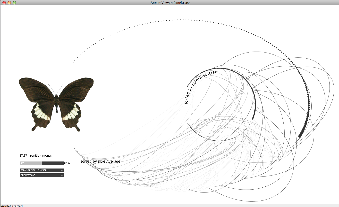
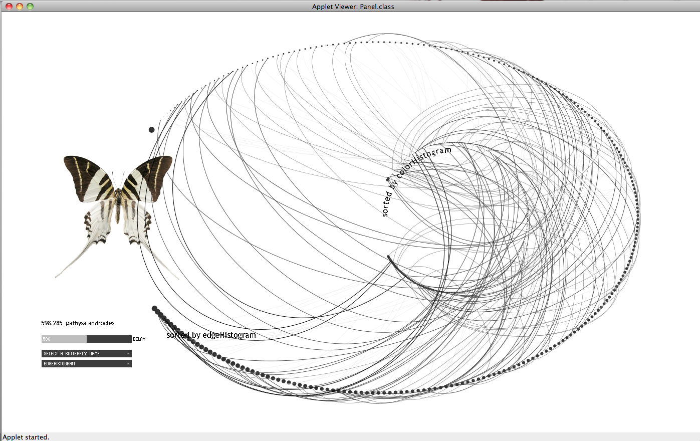
The following images are from my first attempt to visualize the data. I thought that it might be interesting to observe what kind of relations may occur among two different sorts. In the applet below I represented the sequence of a given sort e.g. by variation with a sequence of dots where each dot represents a butterfly in the sequence. By following the movement of a curve in time representing another sort e.g. by number of blobs I can compare how similar or not is the distribution of the butterflies with regard to the first sort.
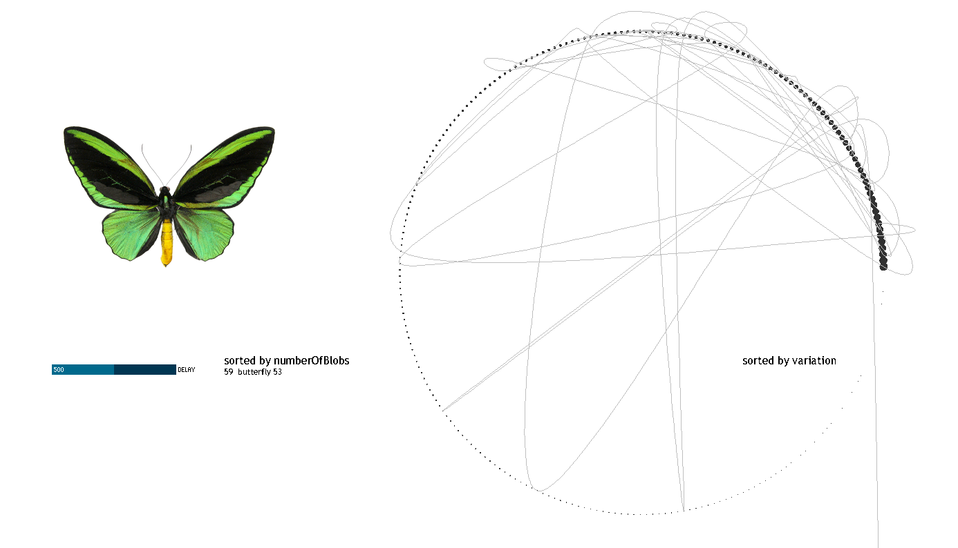

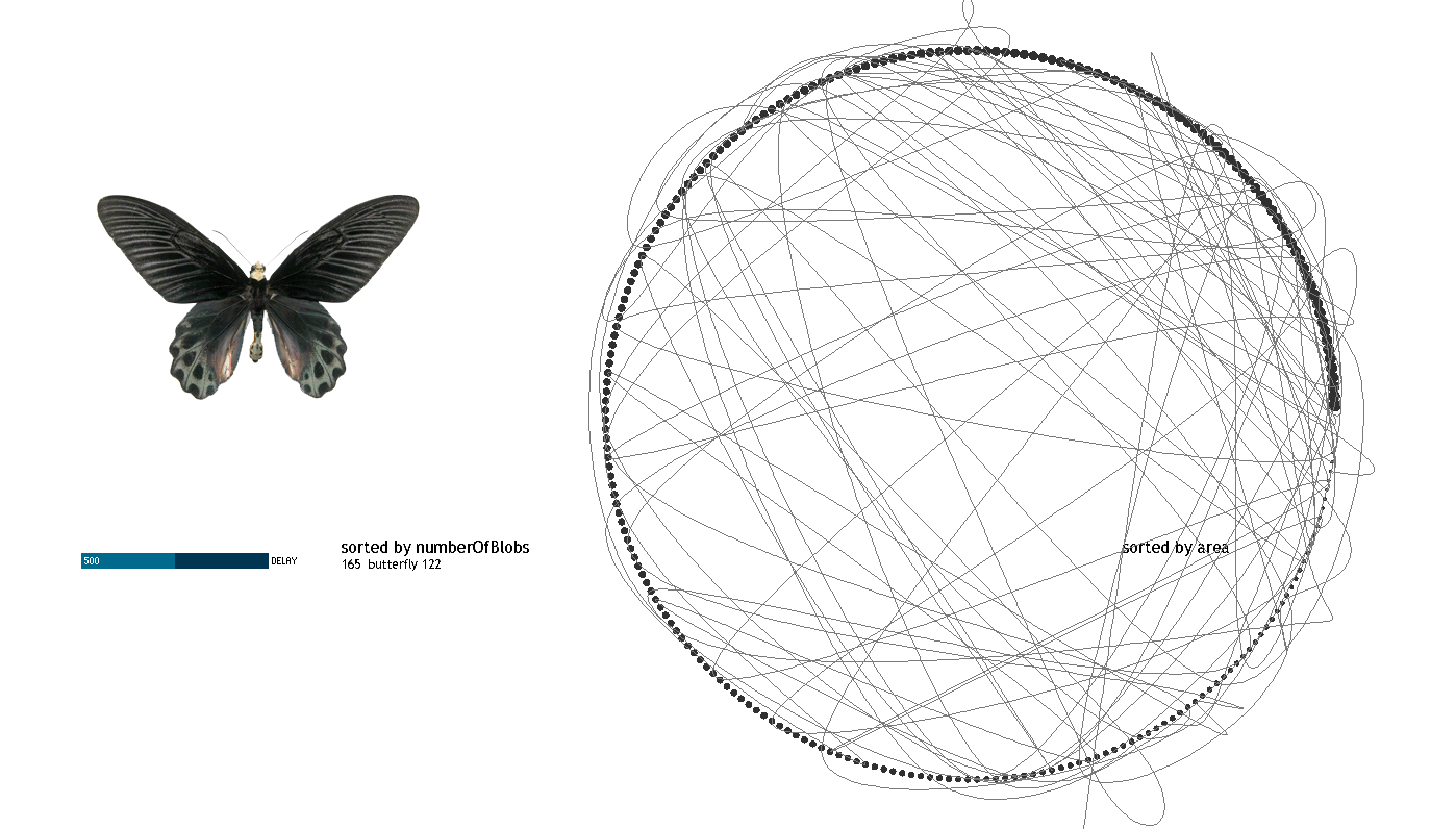
I consider that this attempt does not work in communicating the objective of the visualization. I redesigned it following the rules below:
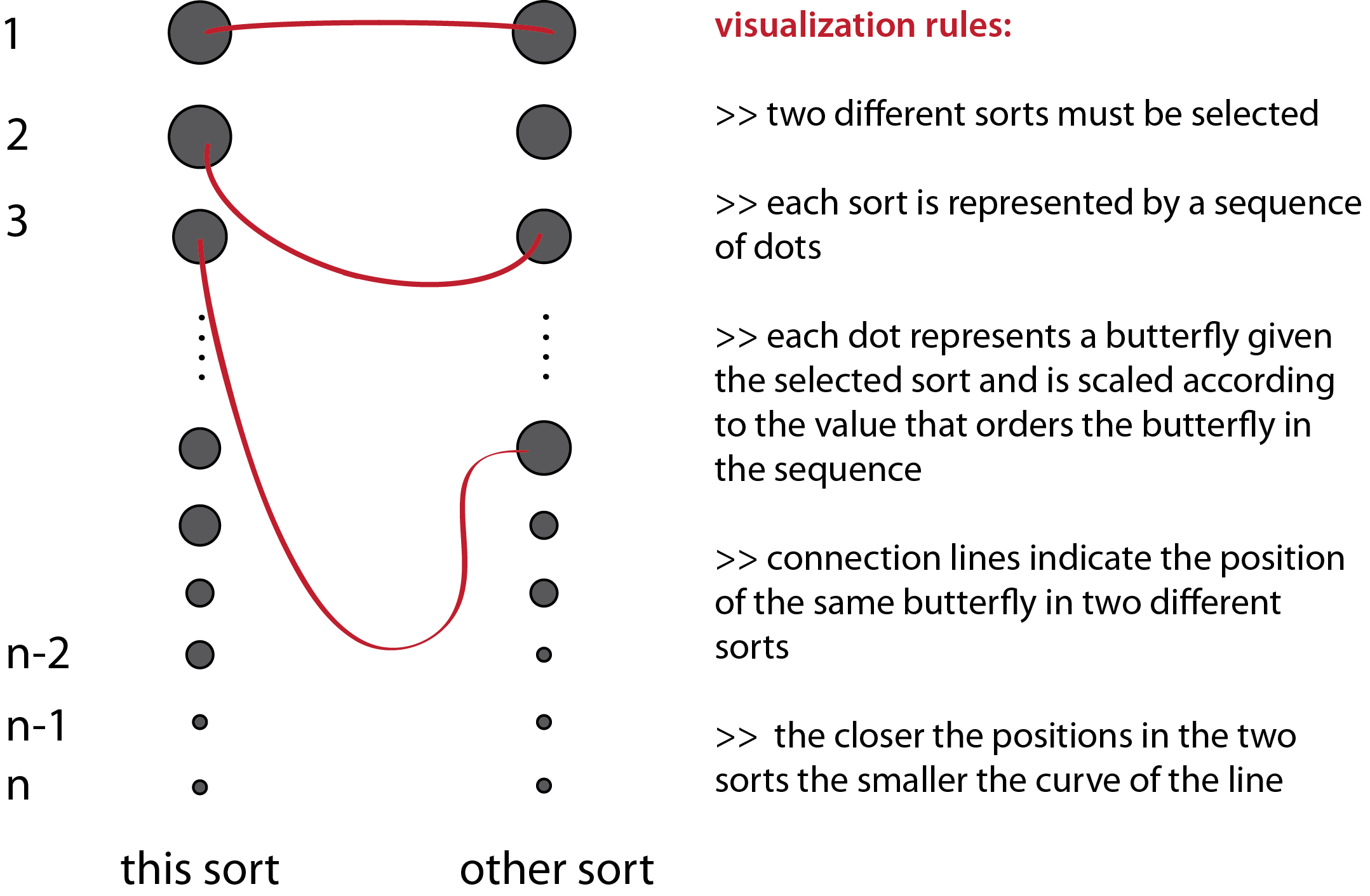

======================================
Varvara
It seems like the image set you obtained has all of the pictures normalized already, such as with size. I wonder if your approach would have worked better with a different set of butterflies.
the delay slider is a nice touch (i am confused what you mean by delay) (the slider that controls how fast the image sequence is played.. slow for inspection; fast for gestalt overview)
Did you also try large grid-style layouts allowing the butterflies to be sorted by two different metrics? Also golan’s idea of arranging by name/taxonomy might have some promise… Arrange them in tree layout. Great project, beautiful dataset…
i think the visualization is really pretty and i like your method of trying to visualize 2 variables (or more). I think the swirling is unnecessary: just the final image is good i think. Instead it would be great to select different butterflies quickly. I also think the color sorting needs to be better: i saw 2 similar butterflies (by color) that weren’t close . If there is a database of features (like the type of wings) that might be helpful. Overall super awesome. :)
Golan+1, I had the exact same experience. I didn’t understand my data until I had already visualized it (and was out of time), and only then did I begin to imagine how to do it better.
the design of all of your (early) visualizations are great! i love the simplicity
** I diagree. while I think the design is beautiful, i think it is not clear exactly what are we seeing.
i like how your visualization is easy to understand.
I would try isolating the image of the butterfly from the interface, it makes for a beautiful animation on its own
swirling line eye candy giving me eye diabetes.aaaaaahhhh
The correlations between the two circles is really pretty, but I don’t understand what it’s telling us.
i am confused why it is swirling and why the heavy dots dissapear, but I like it. truly beautiful!
I really like your graphics! Clean and simple. This was truly an exploration of not only sorting the data, but different metrics of comparison. The comparison is really interesting, albeit kind of difficult to understand. Even if I don’t understand it immediately, it still looks mighty cool!
I think it’s ok that the butterflies’ sizes were normalized. It allows us to focus on other features, such as their color, texture.. and all of the things which you extracted!
**or pattern texture would be awesome
this is an awesome dataset and great starting point for an investigation, I have to say!
So you created an interaction in which the user selects a butterfly, and then sees the other butterflies sorted with respect to that main butterfly, with both a context view (all of them sorted) and a focus view (the most similar, made large & visible). COOL!
I’m not convinced that what you produced is the “final word” on how best to visualize this data, but it is an EXCELLENT start, and a great investigation.
I think the arc lines are difficult to understand — they are a second-order visualization after the core premise of similarity.
i like the fact that even after you had something that displayed the butterflies, you kept search for a more meaningful way to display your dataset
**yea it is interesting, but sometimes it is hard to keep things simple when you think about how to make it meaningful, the results look pretty though i don’t know if i would get it without explanation
pretty! really great visuals. ready for publication in a museum or coffeetable book.
what’s the big idea?
While process explanation is good, I think there was too much, or rather too much too soon in your presentation. I think some of the process would make more sense if we had seen the final product sooner.**agreed
Wow. What an extensive investigation.
wow final visualization is beatuiful! I love the flowing of the lines
**Me too. Beautiful. But I don’t understand it.
Excellent job creating a visualization that really allows people to explore the data.
The arc-based visualization is great, but how are butterflies really important to the project? It seems like the project is mostly about coming up with a way of visualizing sorted images, so it would’ve been great to see other sets of images, like food or faces or something.
^^True, there is nothing butterfly-specific about this visualization