Nir Rachmel | InfoVis

by nir @ 7:51 am 7 February 2012

Location based, time based, dynamic mood board

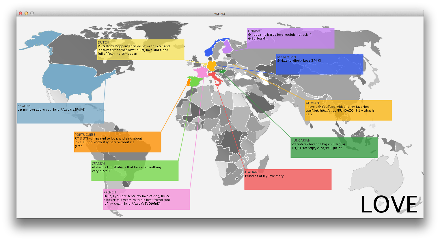
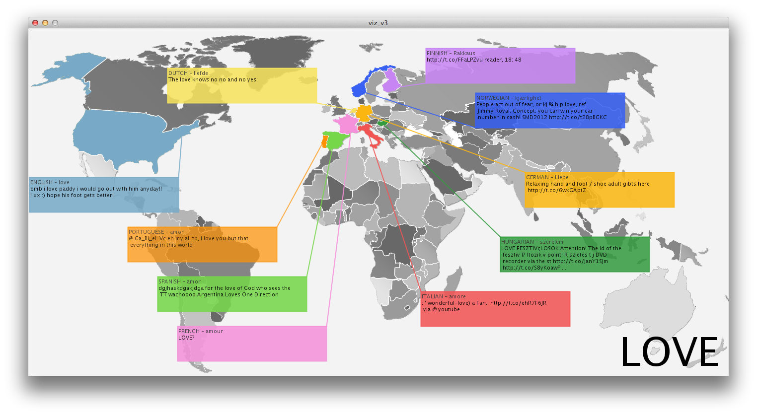
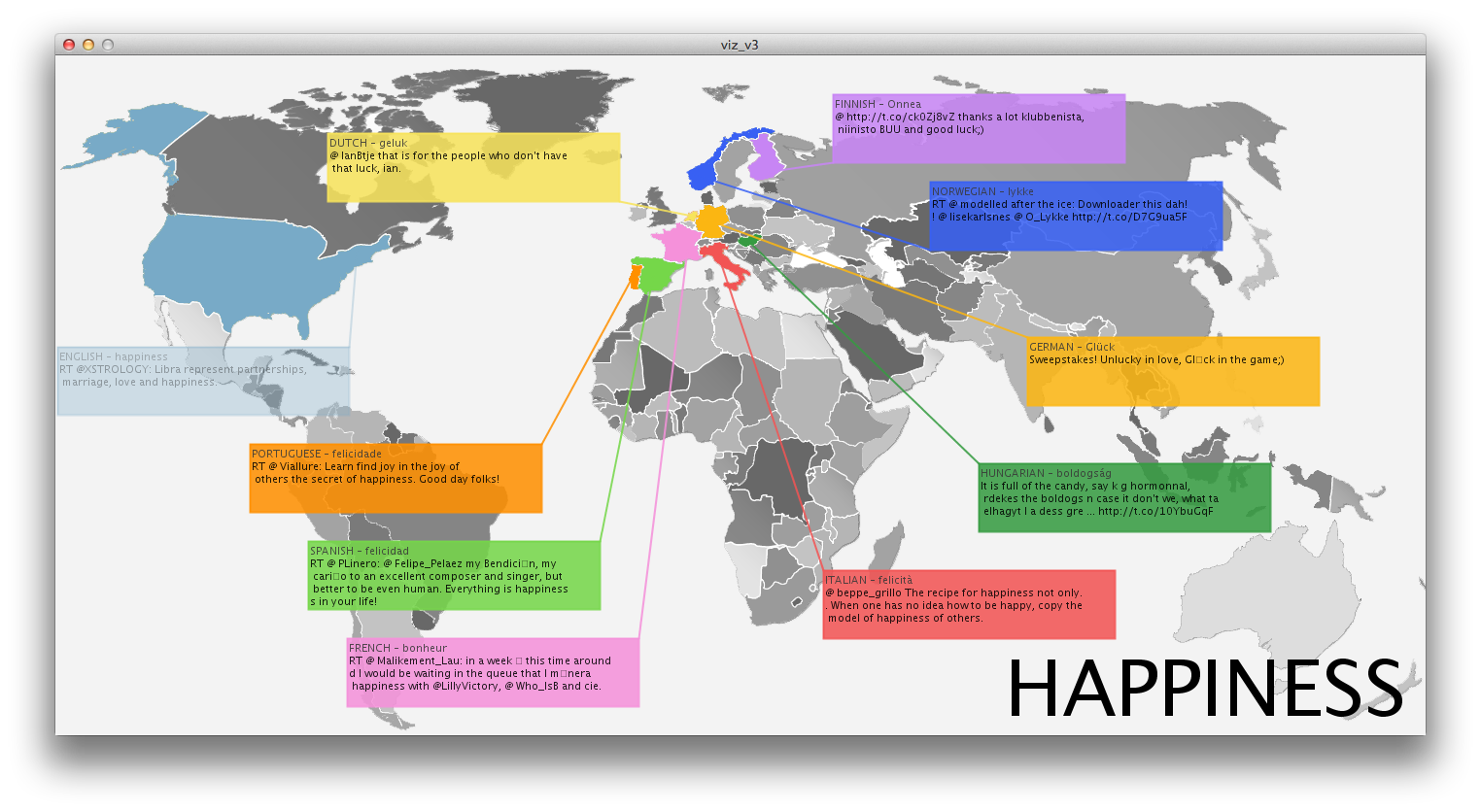
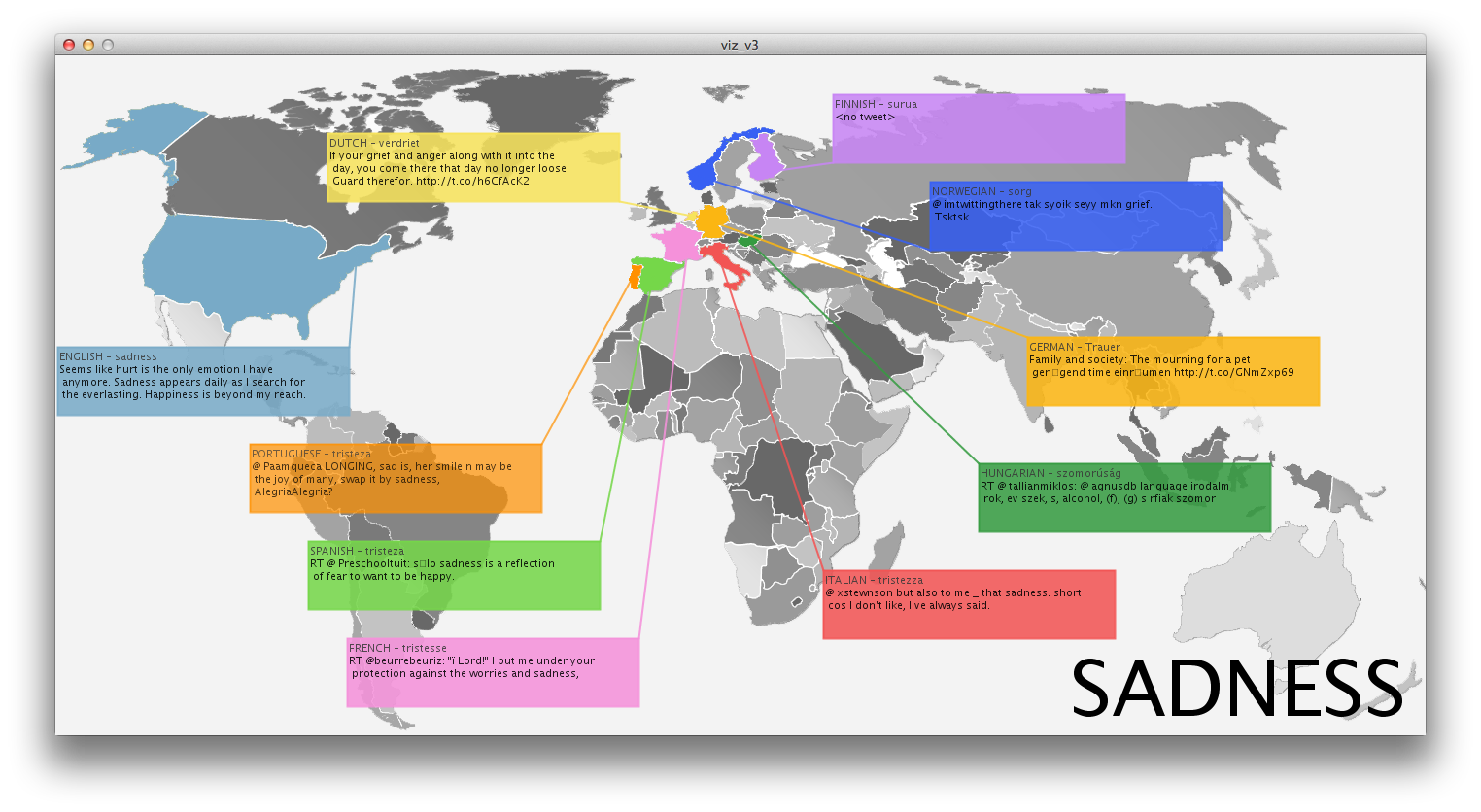
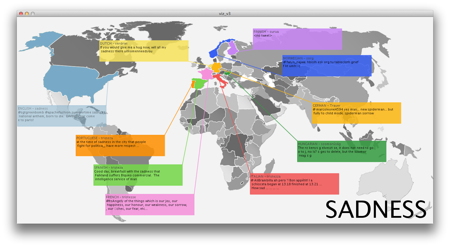
Inspired by instagram photo stream of several friends, I thought it would be interesting to display an aggregation of photos from users that can be associated to the same time and place. This can provide an alternative to the official, polished photographs we get on a daily basis from endless sources. While many people share their instagram photos, they are actually pretty private moments, many of the times. The fact that people share their photos triggered my idea that it would be cool if people could search this database in a way they couldn’t until now (Instragram doesn’t offer such an interface).

Instagram photos for example:


In order to obtain the data, I had to hack into Instagram’s API and understand how to make queries using authentication. Also, they limit the amount of photogrphs you receive per query (around 40), so that required for me to break down queries in the code to several smaller ones in order to get the maximum amount of pictures I can.

Last, in an attempt to put some order in the chaos the photos create as they appear and re-appear, I used openCV to try and analyze the photos. What interested me was to differentiate photos that have people’s faces in them from photos of scenery. As can be seen in the example below, openCV does a fair job in these situations, but remote from being perfect. In general, photos on the left hand-side of the screen would be “without photos” and the week after wards, they did.

Currently, the search for queries is done via a separate python script whose output is fed to the processing application that does all the magical graphics. In order to make this application more engaging, I would add some controls to allow the user to perform search in an easy and intuitive way, rather than have to run a separate script.

Xing Xu-InfoVis

by xing @ 7:45 am

Data visualization of people dancing

When I started thinking about visualize data, I tried to use the data from a picture, text or numbers. But seldom, people realize it is interesting to visualize data of the movement of body. Kinect helps to collect the data of the joints. To make the project more fun, I got the idea of data visualization of people dancing.  Thus the first step is to collect the data. I am really familiar with using Unity wrapper for Kinect. Thus I collect the data of 20 joint from the body including their position and speed. Later, I started to invite people to dance. I have no idea about how the visualization will look like and is there a big difference between people when they are dancing differently. And I used Processing the visualize the data by changing the intensity of color.


Here is some of  the data I collect:(0.1, 1.1, 0.6, 0.0)(0.1, 1.2, 0.6, 0.0)(-0.1, 1.3, 0.6, 0.0)(-0.2, 1.4, 0.7, 0.0)(-0.1, 1.2, 0.6, 0.0)(-0.2, 1.3, 0.9, 0.0)(0.0, 1.3, 0.8, 0.0)(0.0, 1.3, 0.8, 0.0)(0.1, 1.5, 0.6, 0.0)(0.2, 1.4, 0.4, 0.0)(0.3, 1.2, 0.4, 0.0)(0.4, 1.2, 0.4, 0.0)(0.1, 1.0, 0.6, 0.0)(0.1, 0.7, 0.9, 0.0)(0.0, 0.4, 0.8, 0.0)(-0.1, 0.4, 0.8, 0.0)(0.2, 1.1, 0.5, 0.0)(0.2, 0.7, 0.4, 0.0)(0.0, 0.4, 0.5, 0.0)(0.0, 0.4, 0.5, 0.0)vel(0.0, -0.1, 0.0)(0.0, -0.3, 0.0)(0.5, -1.7, -0.2)(1.0, -1.3, -0.1)(0.5, -1.6, -0.1)(0.8, -1.3, -1.4)(3.1, -4.1, -2.4)(2.6, -5.2, -4.3)(-1.2, -0.1, 1.1)(-0.8, 0.3, 1.2)(0.0, 0.0, -0.1)(1.1, 0.2, -0.5)(0.3, -0.4, 0.2)(0.3, -0.7, -0.1)(-1.5, -0.4, -0.2)(-3.6, -0.5, -3.6)(-0.2, -0.1, -0.3)(0.0, -0.1, -0.1)(0.0, -0.1, 0.0)(-0.1, 0.0, 0.0)pos


Dave’s dancing visualization                                                    Eric’s dancing visualization


It is interesting to see the difference between these two picture. Because the dancing styles are very different, Dave dances like in a club and Eric dances tap dance. The common thing is that the legs and arms are the strongest moving joints of the body. But tap dance is more tender and the major body does not bear too much movement.

Presentation slides:

https://docs.google.com/present/edit?id=0ATFNJZOdZrYuZGd3ZjVmcl81Zjh4ZmtxY3g&hl=en_US


Duncan Boehle – Info Visualization

by duncan @ 7:29 am

My info visualization project – Sleep – is my attempt to display data from my own sleep patterns in an evocative virtual diorama.

The idea originally came from data I already had; I’ve been using an app on my phone called Sleep as Android, which tracks accelerometer data throughout the night in order to set an alarm in tune with my sleep cycles. The app keeps a graph of my movements throughout the night, and after looking at a few weeks worth of data, I thought it would be cool to try to exaggerate the motion data in some way. I didn’t stray far from a direct representation, since my next thought was to replicate my room and body in 3D to observe the effects of the motion. As I started to think about what this representation could show, however, I realized I wanted to make it more abstract, and instead focus on the effect of the accumulating sleep debt, using the exaggerated sleep activity to show the destructive nature of restless sleep.

I personally hadn’t heard of many data visualizations that used ragdoll physics in order to make a point, but some of the flairs were certainly inspired from other things I had experienced. The noisy distortions in video and audio were very much inspired from some of the more experimental instrumental rock artists I listen to. In fact, the song I sampled for the instrumental clip is Providence, from Godspeed You! Black Emperor.

Initially, I knew that the idea in my head was too ambitious to come across seriously, but I wasn’t sure how hard it would be to make a point at all. The moment that most people see the ragdoll flopping around, it inspires hilarity, rather than seriousness. I didn’t want to counteract it with a bunch of heavy-handed metaphors or confusing interactivity, so instead I decided to rely on a few simple visual and audial elements to convey the desperation of sleep deprivation. I think these elements – the oversized clock, the blood stains, the dim noisy lighting, the distorted room, and the complete chaos at the end all work very well to visualize mental breakdown.

The point of this project was info visualization, however, and I may have taken too many liberties with that terminology. The only data being visualized is the sequence of random forces propelling the ragdoll, but this information isn’t even completely necessary to make a point about a lack of sleep. Although it is a convenient way to demonstrate harm, I could have used a different type of visualization that really only focused on the sleep movements, and found more interesting results from them.

You can check out the Unity project on my website here, or you can watch the YouTube video of the project below:

[youtube=http://www.youtube.com/watch?v=D_hMDVep_dU&w=600]

Here’s the presentation version of this summary.

KelseyLee-InfoVis

by kelsey @ 6:00 am

Comparing International Tweets

[youtube=http://www.youtube.com/watch?v=cbdOCodVFMI]

For my project I wanted to compare a singular word across different languages. I started imagining comparing antonym pairs across languages, something that I had been interested in since seeing Chris Harrison’s visualizations, which involved antonym pairs and words associated with each of the words. But after obtaining and playing with the data, I found that without context the words weren’t very interesting, so my idea evolved into comparing how people speak about a singular concept(/word) in different languages. For example, using the word ‘Love’ I wanted to examine if there were cultural differences when an English speaker and a Spanish speaker spoke of love. While words may be translated across languages, the cultural significance can vary and in that way examining how thoughts on a singular topic, originating from multiple languages would be an interesting project.
I started by using Bing Translate to accept a query word and traslate it from English into a bunch of other languages. I would later have problems with character encoding and so my final project sticks to only comparing across 10 languages (including English). With the translated word, I then searched the term using the Twitter API. I felt that long excerpts of text, while more meaningful and with more context, was not a great strategy for a visualization. With the Twitter character limit I could achieve a similar affect that would be more easily conveyed visually.
With the Tweet, which I specified as originating from a certain foreign language and containing that translated word via Bing Translate, I scraped the tweets and then fed them back into the translator to see what the sentiment was in English. While this may not convey the exact meaning, and while this system is flawed because Bing translate doesn’t always work, it did provoke a lot of thought.
In this example, I quered ‘love’. After every round of Tweets, these same languages would be fed with new Tweets, after seeing 3 Tweets in each of the languages it would recycle.


In the process of creating this visualization I took some liberties, assuming that if a tweet was tweeted in Italian that it was from Italy, etc. to allow the visual impact of comparing countries across the globe to really take effect. The visualization starts as a colored map, with Tweets slowly fading in one-by-one until all 10 languages are represented once, and at that point the Tweets begin to fade one-by-one, until the screen is again empty. At this point, the screen will repopulate and continue to loop until all of the scraped tweets have been seen.
I ran this query of ‘love’ many times through running the Processing application, often getting different results as new Tweets became available. While I do not have the screenshot now, I remember reading a tweet from Spain about God’s love, which seems to reflect the deep Catholic culture there. In another instance I found it interesting that Italy also celebrated Valentine’s Day.
  • English – love – omb I love paddy I would go out with himanyday!!! Xx :) hope his foot gets better!
  • Dutch – liefde – The love knows no no and no yes
  • Spain – amore – “The time that has been given to us in our life is precious to discover and perform good works in God’s love” (Pope Benedict XVI)
And after creating the application I especially enjoyed reading people’s more meaningful tweets, a Spanish speaking Tweeter said, “love is priceless, however many find it hard to want to”. Compared to many of the English derived Tweets that I read, this was more heartfelt and genuine, truly respecting the word for it’s meaning as opposed to trivializing it with overuse.
While it did not seem like any one language’s derived tweets were particularly indicative of the langauge itself, there were definitely connections between the language the Tweet was spoken in and the culture from which it originated, and by being able to compare and contrast them to other cultures or even to other Tweets within the same culture, the resulting deliberation becomes that much more meaningful.

Happiness

  • English – happiness Astrology: Libra represents partnerships, marriage, love and happiness
  • Portuguese – felicidade – learn find joy in the joy of others the secret of happiness.
  • Spanish – felicidad – Happiness is to realize that nothing is too important

[youtube=http://www.youtube.com/watch?v=SCm9RUSzcNQ]

Sadness

  • English – sadness – Seems like hurt is the only emotion I have anymore. Sadness appears daily as I search for the everlasting. Happiness is beyond my reach.
  • Spanish – tristeza – Sadness is a reflection of a fear wanting to be happy
  • Portuguese – tristeza – at the time of sadness in the city that people fight for politica…have more respect


Self Critique

I would say that my intended, getting to understand how people who speak different languages perceive the same word/idea was successful. The Tweet length is the perfect size for a visualization and through these tweets culture definitely shines through. A few things that I wish I had time to improve are, integrating eastern languages as well as Hebrew, Arabic, Russian, etc. There was a problem with the character encoding that I couldn’t solve in a reasonable amount of time and so I gave up on that. It was really interesting though, that because Chinese/Korean/Japanese characters stand for a whole word, the translations are quite a bit longer and more meaningful, this would have provided a really interesting contrast against 140 letter Tweets.
I would also have liked to implement some way to parse out less meaningful Tweet. At times the Tweets weren’t very indicative of anything, at times being dominated by a link or mentions, being able to sort these out and still have a sizable pool of tweets (and doing so in a timely manner) would have been nice.
In the future I would also like to implement a query box, so that the hardcoded word can be modified by the user.

EvanSheehan-InfoVis

by Evan @ 1:21 am

The Narcissism of Minor Differences

My data visualization project represents traditional Irish tunes visually to highlight their similarities. The idea for the project came from something my mother says to me regularly when I’m home visiting and playing the fiddle: “How do you keep all those tunes straight? They all sound the same to me”.

There are many sources of tune data online. Originally I’d planned to scrape some from thesession.org, but my friend, Pete, actually had a database of tunes he’d scraped several years ago from a variety of sources. So he just sent me a SQL dump of that and I was off running.

Measuring Similarity

The first question was how to measure the similarity between a given pair of tunes. Because the tune data online is typically stored in an ASCII format called ABC Notation, calculating string distances seemed the best solution. I tried both the Hamming and the Levenshtein distances and settled on Levenshtein because it supports comparing strings of different lengths.

Visualizing Similarities

I tried several ways of visualizing the melodies to highlight how few differences there were between pairs of tunes. Above is a more visually pleasing variant of my first attempts. I started by representing each note as a rectangle. Each row represents a tune. When a note is identical between that tune and the starting tune, the note is drawn. If the notes are different, that space is left blank. This gives you a picture of where the tunes are similar, but now how they differ.

My second attempt (the first image) overlays all tunes similar enough to the original. Again, each note is represented as a rectangle and only common notes are drawn. Each rectangle is mostly transparent in this visualization. Because all the tunes are drawn on top of each other, the darker the rectangle, the more often that note appears in that position in this set of tunes. Although I think this results in a rather attractive, barcode-like image, it doesn’t say much about how the tunes are similar.

Finally (at Golan’s suggestion) I represented the tunes as line graphs; plotting the notes in order horizontally and according to pitch vertically. Now you can see where the tunes overlap and how they differ when they don’t overlap. The important feature this rendition highlights is when a phrase is repeated between two tunes but out of phase with the original. Previously, common phrases were not visible unless they occurred in the same place in both tunes.

At this point I had to add some interactivity because simply plotting all the selected tunes on top of each other was too noisy to glean any useful information. So I faded out most of the lines and allowed users to select a single tune for comparison using the up and down arrows.

In the above side-by-side comparison, you can see that there are two identical tunes (the top pink bar on the left, and the top line chart on the right) with different names. A common occurrence in this style of music. The next most similar tune appears to have many similar phrases, but not in the same place as the original. Thus, on the left, it doesn’t appear to have much in common, but on the right you can see similar contours slightly out of phase with each other.

Critique

I think this is an interesting start, and the line graphs give me confidence that there are some interesting similarities to explore between tunes. I think a more interactive visualization might be more compelling; something in which users could explore the data more freely. The limited interactivity (see the video below) was mostly just a convenience for me to quickly generate artifacts for the presentation.

[vimeo=http://vimeo.com/36328177]

It’s also worth noting that my calculations of similarity are not correct. I simply treated the ABC data as strings, but that doesn’t result in a correct comparison because in many cases multiple characters are required to represent a single note. For example a low b is represented as “B,”, so the distance between the phrase “GB,D” and “GbD” should be one, because there is only one note—and thus one substitution—difference. However, simply comparing the strings “GB,D” and “GbD” results in a Levenshtein distance of two.

The fact that there are still so many similar looking tunes despite this oversight on my part is what encourages me that there is more to explore here.

Technical Details

I started out storing the data in a SQLite database, but it quickly grew too large and I moved it to a MySQL database. I used Python to perform the distance and longest common substring calculations on the tune data; that code can be found here. The visualization was performed in Processing, and that sketch can be found here. A zip file of the entire project—including a dump of the MySQL database—is available here (the SQL dump was too large to upload to WordPress).

Project2::InfoVis::zackJW

by zack @ 11:55 pm 6 February 2012