His and Hers Colors by Stephen Von Worley
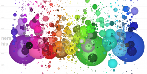
This piece utilizes a colorful and playful aesthetic to present information gathered from a survey about colors. Men and women selected colors that appeal most to them, and then those colors were graphed according to gender, with the amount of people who preferred the color indicating the size of its representative sphere, and its location being indicative of the gender preference. From the layout it becomes obvious that women tend to prefer a larger variety of colors with longer names whereas men prefer simpler colors, or those with shorter, earthier names.
Foodmood by Affect Lab, Jana + Koos, and Ai Applied
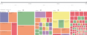
Foodmood is an interactive site that scrapes Twitter for tweets about food and the mood of the tweet, and compiles this information by country. The end result is a representation of a country’s attitude towards a food at any given time. The countries themselves can be sorted by income, weight, or selected individually. The site utilizes a simple, easy-to-understand aesthetic when presenting this multitude of information, which makes side-by-side comparison of countries easy.
Wind Map by Hint.FM
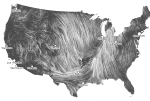
Wind Map is a simple concept with a visually stunning execution. The site scrapes information about wind speed and direction from the National Digital Forecast Database and uses it to map the flow of the wind across the country in real time. I especially like the flow in the west, where what would normally be straight smooth lines are curled and warped by the Rockies.