When I talk about Computer Club, I often introduce the club as having racks of servers squirreled away in Cyert B-level, happily grinding away at running a variety of services. But there hasn’t been a good way to communicate to people the scale and activity of our systems. I plan to construct a real-time visualization of the status of the Computer Club machine room, making it available directly from our webservers so that anyone can see what’s going on in real time.
I plan to collect data from as many of our servers as possible and aggregate it in a database to drive a web-based infographic. I was inspired by the Planetary project by Bloom, which visualizes the user’s music collection as solar systems in a galaxy, and saw that Computer Club’s infrastructure has a similar three-tiered structure which makes it ideal for such a visualization.
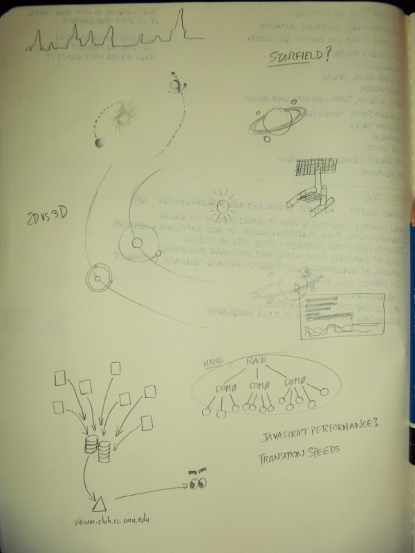
I anticipate the challenges in this project will be in incorporating the “smaller” data, such as active users and processes, into the visualization without either introducing clutter or making them invisible, and ensuring that the data maps in an intelligible way.