For this project, I ran through data on 499,000+ hotels, sorted out usable data for hotels in the US, plotted them in TileMill, and plotted the 10 most populous US cities and the 10 recommended places to visit in America.
Through this interactive map, one can see how the US has a large number of 1-2 star rated hotels and how the hotels are generally grouped along the most touristy or populated places. Interesting things to note are the specially marked cities that have few hotels around them and that many 4-5 star rated hotels are along the Eastern seaboard and the coast of southern California.
Things I’ve learned:
– how to find multiple ways to install software
– countless different installations may not work
– I liked using both programs together to make something work. It gave me a breadth and slight depth into different softwares and super deep insight into how to just “make it work”. This is something that I often find myself doing and will always do in the future. Not only can I spread my knowledge across multiple applications, but I can also learn how to use different applications more often rather than stick to one for a really long time, move on, and forget it forever.
– TileMill breaks down at about 700,000 data points. It can handle larger amounts of data when they are in shapefile form (as opposed to CSV format). This is why I did not include Alaska.
Vimeo: https://vimeo.com/87141850
Github: https://github.com/chanamonster/US-Hotels
Extra sources:
10 Places in the US to visit
List of US Cities by Population
-
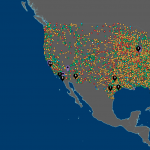
- Final version
-
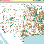
- Early stage
—————————————- Unnecessarily Detailed Details —————————————-
This is pretty literally what I did. Feel free to not read it:
1. Attempt parsing given CSV in open frameworks
2. Clean CSV of poop values
3. Successfully parse clean CSV in open frameworks
4. Attempt transferring CSV values into 2-d vector
5. Repeat step 4 for a few days
6. Look into alternatives and pick TileMill
7. Find out that TileMill cannot handle 20MB+ CSVs
8. Break down CSVs and successfully import data
9. Find out that TileMill dies with so many data points (Harris approximated point of death at 70,000)
10. Figure out that data as a shapefile will be more efficient
11. Attempt to use QGIS to convert to shapefile (thanks, Maya!)
12. Find out that QGIS needs 6 other programs, and matplotlib hates my computer
13. Download and attempt a million other matplotlib or qgis substitutes (optional: sketchiness)
14. Attempt to use Geotools to “CSV2SHP”.
15. Get owned by Geotools’ deceptive simplicity and decide that minimizing the data set to work on tilemill still counts as large dataset manipulation and beats not turning anything in.
16. Cut down the data in OpenFrameworks to all of Europe, then just Thailand, US, and Australia individually after Europe was also too large. Settle on Continental US + Hawaii.
17. Work until “done”
NOTE: I will be going back and 1. figuring out why matplotlib despises my computer 2. how to use get CSV2SHP to run, for my sake and for the sake of others. I don’t want anyone else driving themselves mad if they need alternatives to QGIS.
~~ Notes I wrote when I started this project a few weeks ago — I’m keeping them here for blogging habit purposes ~~
I fiddled with the idea of having a 3-dimensional globe with plots of all the hotels on it. Then depending on the price or ratings, the extrusion of the point from the “surface of the earth” would differ, creating a very 3-d pointy map. I realized after a while that this would be very complicated to do, especially considering I have no previous experience with openFrameworks, and possibly hard to read.
I then transferred to the idea of having a flat map with grid lines of latitude and longitude, no continents outlined, then the points plotted on the map. This would convey the global matter of established and impoverished countries, since 1st world countries would be full of points and distinguishable, but 3rd world countries would be less outlined. This is similar to the Verizon commercial campaign that has been on for a while.
For interactivity, besides from the points being colored based on a certain characteristic (stars, price, what have you — and possibly have this choice available to the user), hovering over certain areas of the map would create a sort of “flashlight” where you could then see the true outline and area of the country/continent.
NOTE: I transferred away from this idea 50% due to time, 50% due to someone else having finished a similar mapping idea before I could (Hats off to you, Maya!)