More Documentation Coming Soon…
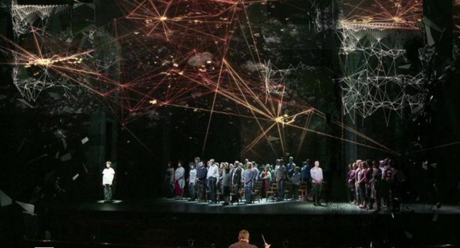
This Visualization pulls data from a national database to show all Priests in America that were either accused, sued, or convicted of sexually molesting their patrons. This was used as data to help tell the story in the play Phaedra’s Love by Sarah Kane.
The goal I set out for with this project was to use data visualization in way that was also performative. This goal was brought upon by the idea the data visualization is thought to be (by many of us in the school of drama) as stagnate and lacking of the raw human ideology/ emotion that you get from interacting and experiencing something straight from another human being. But although it is thought that theatre is able to accomplish this goal already, the materials used to help portray these humane worlds is usually faux visuals, that although are very conceptual in their meaning, aren’t real, thus don’t truly connect the audience back to the a theatrical story telling experience. One that enlightens the audience about not only our own lives, but our world around us. Thus this is where data visualization can come in handy. If combined with theatrical story telling, both forms (science and art) can come together to create a heightened experience that is actually based a raw data from the world in which we live. Which in my opinion is able to heighten the stakes of the play’s reality much more.
Inspiration:
59 Productions: Photo from the production of Two Boys the Opera.
Info Data Visualization is simply just stating the facts (Simple and true) in a way that is visual. I decided to find a play that could benefit from the cold and hard nature of data visualization to help tell it’s story. After much searching, I landed in the world of playwright Sarah Kane. Her play Phaedra’s Love, features a conflict in our society about morals and beliefs. With this the main character, Hippolytus, a vulgar/sloppy prince that doesn’t live by societal order confronts a Priest towards the end of the play. The conversation they have makes the audience question of societies beliefs/ morals and ask us to examine who exactly is the hypocrite in this situation. Is it someone who lives life in a societal examined horrible manner, but owns up to it and doest try to hide it. Or is it someone who calls themselves Holy, and confesses their sin while asking for forgiveness from God after the commit sins, and still expect that they are pure?
From this Journey, I decided the make the informational data a character in the play. Particularly replacing the physical form of the priest with the info data visualization. This visualization focused on a database of Priest in America who have either been accused or convicted of rapping one of their followers. These Almost 5000 priest would be represented in a single moment to help Sarah Kane’s world ask this question of the audience. I believe that using the data viz in a Theatrical context also enhanced the power of the data to call serious attention to our surrounding society.
The priest in the scene are represented by glowing orbs of light. Each orb is colored according to which category the fell in within the database.
This included those that were…
- Accused
- Acquitted
- Arrested
- Charged
- Cleared
- Convicted
- Indicted
- Not Guilty
- Police Report
- Reinstated
- Sentenced
- Settled
- Sued
Screen Grab:
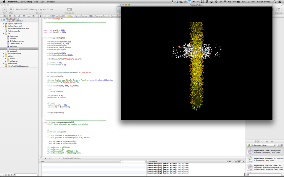
After, when the scene gets to a heightened conflict point between the Priest and Hippolytus, the glowing orbs suddenly (on-cue) conform together into a cross.