Interesting Toolset & Project: Circos
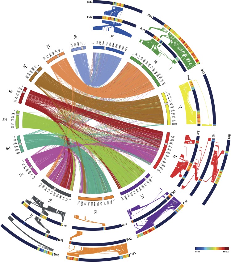
Example from http://www.ncbi.nlm.nih.gov/pmc/articles/PMC3877785/bin/pc_114553_f2.jpg
Circos is an interesting visualization tool/graph used in computational biology for showing connections between data. Because the objects are arranged in a circle connections can be drawn between all data points. Connection weights can be determined by color or stroke width. Further data can potentially be arranged around the circle as well.
I would potentially like to use these graphs for the visualization project.
XKCD: Congress
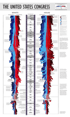
I am a bit of a history buff so I love this chart. It presents a nice macro view that one rarely sees on historical data yet it also keeps all the micro details that make history fun. I enjoy seeing the connection between events and political power shifts. In terms of pure visualization, the use of the ribbons creates a nice sense of flow. The real enjoyment I get from this graphic is seeing how much he crammed in.
Interesting Dataset: American Heritage Time use Study
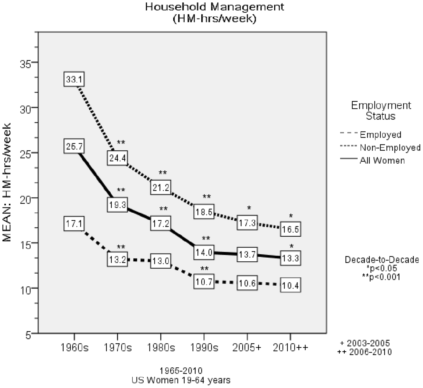
45-Year Trends in Women’s Use of Time and Household Management Energy Expenditure
For the past 50 years a study has been collecting time use journals from homemakers. This has created a rather interesting historical peek into role of the homemaker. This data has so far been used in academic settings (as with the paper referenced above) but it could be a strong baseline for comparison to present day time journals.