This is a collaboration piano playback tool using Yamaha’s Disklavier to receive MIDI control signal, and it’s also a visualization of the currently playing notes using walking figures projected above the piano.
The intention of this project is to boost teaching and learning throughout the piano pedagogical process. Here is the video:
The artist of this work — Xiao Xiao — has made several novel applications using Yamaha Disklavier, including MirrorFugue, Perpetual Canon. Here are the videos:
In my opinion, Xiao Xiao’s series work involving Disklavier intends to help pianists have better experience when composing, performing, as well as the most important part, improvising. Her work helps musicians to create their musical work on different layers created by themselves or others, and helps them to collaborate with various people.
Shadow is a collaborative movement piece that uses three drones equipped with LED spotlights to cast light and shadow on a lone dancer. As the piece progresses, the drones move across the space, turning their lights off and on, causing dramatic changes in the performance visuals.
I really like this piece. In drama, we often worry that the inclusion of media will be distracting, or merely serve to contribute nothing to the piece but spectacle. In this case, however, the media is used to excellent effect. The 3D movement of the lights serves to create a performance that’s dramatically different than a traditional piece, and notions of computation are crucial to the synchronization of the three drones. Light can have an enormous impact on how the audience experiences a piece, and using drone tech to experiment with synchronization and movement is a culturally rich endeavor.
I don’t know what I would criticize. It’s a really great concept, so I think if anything, I’d like to see it explored further. It would be interesting to see what effects would be created with 10 or 100 drones. And maybe this is a little cheesy, but it’d be interesting to use this tech to make a dance piece about drone strikes and culpability. I’d at least like to see it tried.
This piece is a joint effort between Elevenplay, a Japanese dance company, and Rhizomatiks, an art studio focused on using media and data in their work. The project is the beginning of a series of collaborations between the two, exploring the use of drone lights in dance.
OccultUs is a performance piece that integrates the physical world with the virtual one. The audiences member sits surrounded by noise-making gadgets with an Oculus Rift headset, and is led through a virtual space with audio accompaniment by the gadgets that surround him.
I’ve been itching to learn more about virtual reality, so I found the piece and its aims really interesting. Currently, consumer virtual reality is a mindblowing experience yet still has a lot of limitations, and so combining the virtual world and the physical one is a great idea. Furthermore, I think it’s important to experiment with the new platform, and discover what’s possibly from an artistic perspective. That being said, I’m not sure how compelling the installation ends up being. Audio for virtual reality is already very possible, and it’s not clear physical sounds really count as marrying the two worlds. I would love to see this idea taken and applied to sense VR is not as good at replication, such as touch, or trying (I know it’s hard) to integrate visuals from the room into the VR experience.
This piece was created by Simon de Diesbach at ECAL with the support from Alain Bellet, Gael Hugo, and Christophe Guignard, and attempts to immerse the user by combining the virtual and the physical world, “two distinct realities”. The installation seems inspired by the advent of the Oculus Rift, and the potential of the young technology.
For a while now, I have been interested in zines. I’ve always thought that the internet and zines were very closely related. Both spread ideas, are low-cost to the consumer, and have unique limitations in design.
I found a couple of online zines, some more successful than others. Here are two and what I think does and doesn’t work:
I zoomed out in my browser to capture the following screen. This zine is awesome, with animations, videos, photos, and short writings all displayed on a single page. To me, it feels like a zine, and really incorporates a similar aesthetic. That is where this zine differentiates itself from a blog or artist website.
I found this zine to be less successful. With links to all of the content, it was certainly less creative in its layout. Even though the content was hosted on this site, it feels less related, simply because of the navigation to new pages, none of the content can be viewed together.
Is this new media art? I think that the first definitely qualifies. It is using the browser as a medium, and really considering its strength, limitations, and of course, the SCROLL. The second, not as much. Just using the web to store and display the work. Here, the site is not the work, it is just a vehicle.
I am interested in web browser environments and an online zine-making is an awesome approach to content generation.
Starting to think about my final project. I’ll start where I always do, thinking about cities and maps and infrastructure.
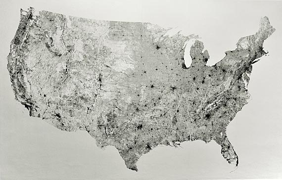
All Streets, Ben Fry. It is what it says: just a map of all streets in the US.
I like it because it’s pretty, it looks well-executed, it’d make a nice wall map, and it shows us some things about the US: the west is more sparsely populated, cities are where the black spots are, you can zoom in to see more detail (e.g. around the SF area). But I am really kind of more frustrated with it, because it doesn’t show us anything we don’t already know. I guess this map might be useful to an immigrant or tourist, but still, wouldn’t they just look at a political map? I feel like (and maybe this is an unrealistically high standard) info vis projects should show us something we didn’t know before.
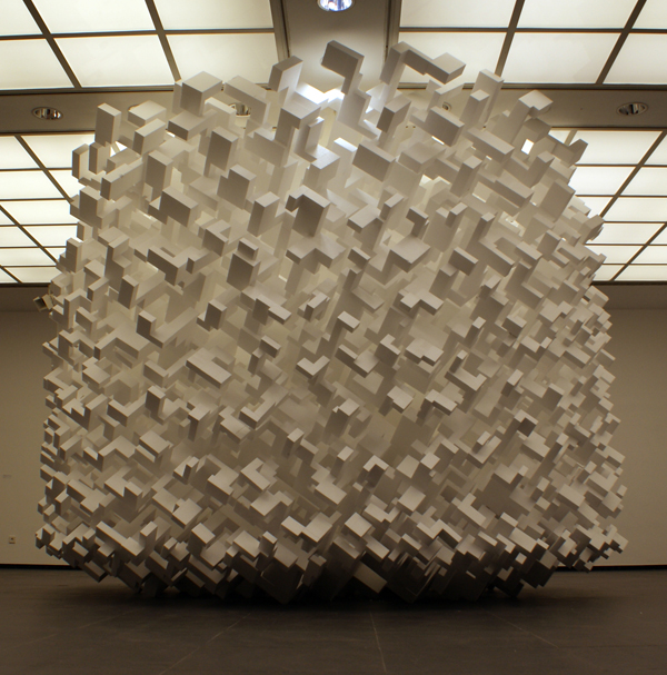
John Powers, well, all his work really. Maybe Fat Bastard 2010, if I have to pick one.
This looks like a generative form, and it’s got a lot of right angles, but it really looks like a city. Kind of Metropolis-esque. But it’s an out-of-control city, buildings just flying all over the place. I feel a little overwhelmed looking at this, the same way I do when I see a huge metropolis like Tokyo or Delhi. I’m also inspired by Pedro’s last project– looking at all the buildings in a more abstract way. I’d love to see a Fat Bastard Pittsburgh with all the buildings in Pittsburgh balled up like this (with one block being one building, instead of whatever it’s supposed to represent here), and then the same thing with New York or whatever else.
Multi Robot System for Artistic Pattern Formation by Disney Research (2012)
While this project doesn’t feature a particularly artistic title, it does demonstrate a novel concept for multi-robot coordination. The basic idea is simple: show a picture and have a bunch of small mobile robots scuttle about to imitate the picture. The result can only be described as a swarm – a multitude of miniature 2-wheeled contraptions fuzz about until a formation resembling the picture emerges, It really reminds me of orientation day for freshmen at Carnegie Mellon University – a bunch of students stand in formation to show the letters C, M, and U. If you ask me, the biggest way to improve this project is quite obvious: add more robots. And when I say “more,” I mean a lot of robots, so they look a bit like Miles’s KeyFleas. And also, a more artistic title would add a nice touch.
Papillon: Expressive Eyes for interactive characters by Disney Research (2013)
Papillon, meaning butterfly in French, was of particular interest to me because one of the biggest things I am doing with my own robots is creating expressive faces. Using a light projector against a round surface is a novel idea of showing eye expressions on a toy. However, this method does have some limitations. While this does allow the shape of the face and the eyes to be more round and humanoid, it might look a little weird to have a really humanoid eye and see the pupil move without the sclera (background whites). Also, the individual “cells” on the eye are very easy to see. Not necessarily a bad thing, it does have the possibility of making the robot unbearably cute. As a comparison to my own robots, I’ve done two things to create expressive eyes: the first one being 3-color LEDs, and the second being an Android phone. Using the first method, emotions were emulated with different colors on the LED; for example, blue meant happy and red meant angry. Using the second method, I had a far greater range of expressions available, as using an Android phone gave me full control of several hundred thousand pixels; I could actually control the shapes of the eyes as well as the color. I think Papillon combines the best of both of my methods, making it possible to have expressive shapes while still retaining the same glowing aura of an LED.