Data visualization things that I found interesting:
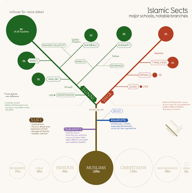
Islamic Sects. This one is just practical. You get a sense of what the groups are, how they differ, and how big each one is. It’s a little weird that I could almost draw this chart for Christianity, and maybe Buddhism, but before seeing this I’d only heard of Sunni, Shia, Wahabi, and Sufi. Other things I learned: Wahabi looks like an offshoot of an offshoot. I guess I’d have thought it was bigger. What didn’t it do? I wish it had more info about each subgroup. Just by looking at it, I have no idea what the difference is between Hanbali and Hanafi, say, except that they are biggest in different places.
Nexity – My Neighborhood. They tried to give you a new way to look at a new house/apartment by rearranging things in the world based on how far they are. For example, the place below has 15 sports bars, 15 cocktail bars, etc within 30 minutes, and you can easily see how far they all are.
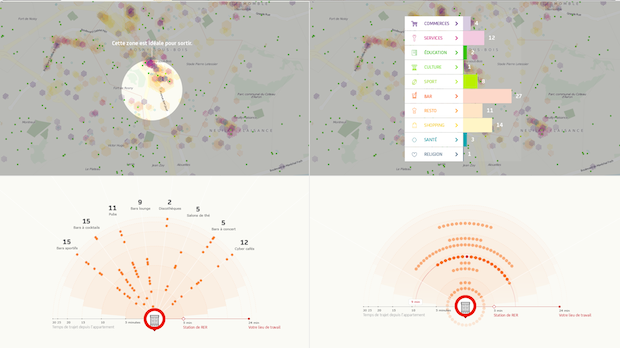 This would be useful if you were moving somewhere new, sure. The downside is, I still don’t really feel much from this. I guess if one place had a lot of bars nearby, you could see that, but it doesn’t really feel like it. On the other hand, it’s a great aggregation of a lot of useful info at the same time. (if I moved here, where would I buy groceries? where’s the post office? etc.)