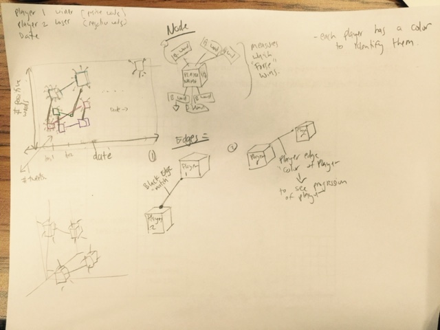
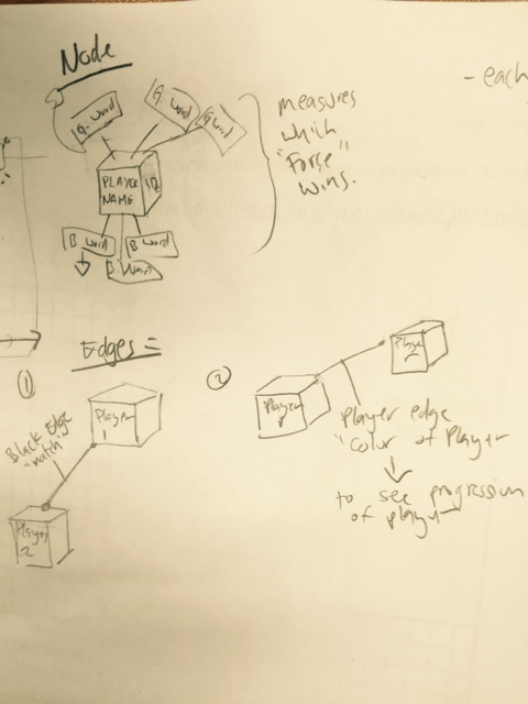
Visualization Sketch
For my visualization assignment I decided to collect all the tweets from the women’s USOpen and AUSOpen tennis tournament. I have what date they played, who won the match etc.
With this information I decided to try and se if twitter was predicting the winner or at least in favor of the winner (or loser). To do this i decided to have my visualization have three main axes:
- X = date of the match (to show progress)
- Y= number of positive words in tweets (make positive words float them upward :) )
- Z = number of tweets mentioned in.
Each player will be assigned a unique color. This way we can track the player along the date axes, see if she is getting popularity etc.
The way the words are going to be displayed are the positive one will be floating upwards, to give the sensation that they are balloons making the player go high. And bad words are in the bottom simulating weughts pulling them down.