USOPEN Women’s Twitter Popularity -webGL/Three.js
Live App: http://womenstennis.fusion-sky.com/
I am a big tennis fan and decided to see if the tweets a player gets in a game reflects in the persons performance. In other words, I wanted to see if the fans were tweeting players hopes up (or down) and predicting the outcome. many interesting patterns were found, which made me very happy! :)
I initially tried to use Tamboo but couldn’t use it because Twitter API only allows you to get tweets that are 30 days old. Given that the USOPEN had been a couple of months back I did a parser to parse “Topsy”. After finishing my parser, I had to parse the data multiple times to get all (or almost all) the tweets one player got during the day of her game. It took a long time…
After aggregating the data, I cleaned it up using some text analysis libraries. (Total around ~15,000 tweets) Once everything was done, or as done as it was going to get thanks to lack of time, I started visualizing it.
I decided to use webGL and Three.JS because I really wanted to learn it.
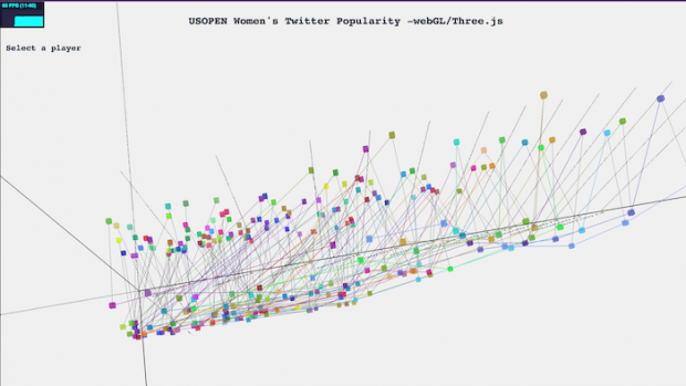
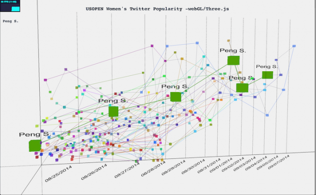
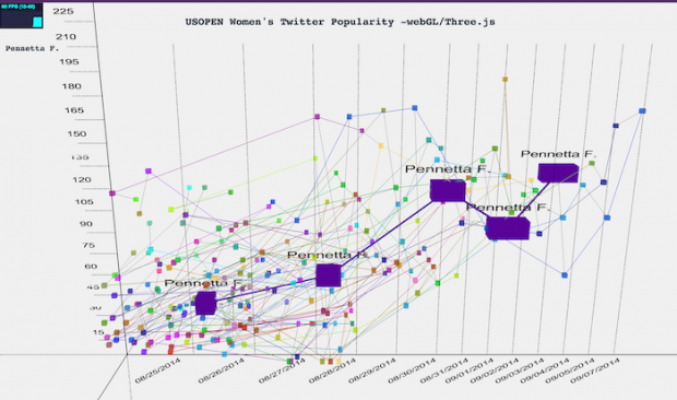
The bar in the bottom represents each day of the USOPEN. The players that played that day appear inside the bars. The Left bar represents the amount of tweets they got. If the player lost that match, it is also reflected in the Z axis.
There are 128 players in total, and each one has a “unique” color. This way you can see her progress across the graph. Each player is also connected with her self so it is easier to follow (the connection is again with the same color as the node). And then, in a dark blue, each player is connected to her opponent.
——————
After critic day, I decided to select this project for improvement. I redid the visualization by rethinking how I wanted to display the data. I decided to give more emphasis on what was happening in each game by focusing on the winner/loser data and their tweets.
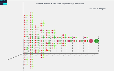
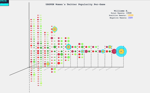
With this in mind, I made a bracket time visualization with the winners in the right in shades of green, and the losers to the left in shades of red. The size of the circle represents the amount of tweets that player got in that game. If you hover over the player you get to see more information. The orange circle represents the amount of positive tweets and the purple the amount of negative tweets. The rest are neutral. Apart from the extra information; all the games of that player glow up for the user to see the success of that player.
You can still navigate the interactive visualization with the arrow keys and the mouse (zoom, etc.)
I really liked my final iteration, I think re thinking it and really focusing on the data was crucial. But I couldn’t have done it without the feedback I got :)
Live App: http://womenstennis.fusion-sky.com/
Code can be found:https://github.com/mariale888/Tennis_Visualization_WebGL
