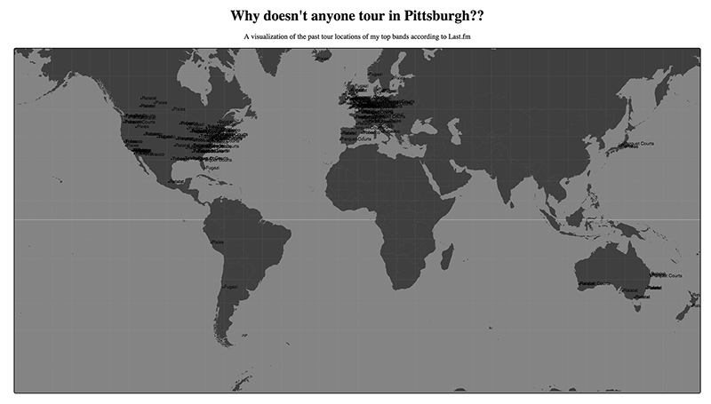
UPDATE: I finished my data visualization. I made a visualization of the past show locations of my top bands according to last.fm. Here it is with the coordinates plotted to a map. (yay)
Click to see gif

It turns out one of my issues in making the map was that my json file had a few errors. (it turns out it’s really hard to see these errors at 4 in the morning).
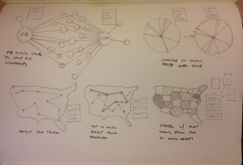
OLD: My data visualization is still a work in progress. I spent far too much time trying to decide what to visualize and therefor had little time to try and visualize it. I am working on creating a visualization of the past performances of my top 10 artists in the last 12 months according to last.fm. Maybe I can use this to predict where my favorite bands are likely to perform next. Maybe it will influence by relocation decisions when I graduate (probably not). Either way I thought it would be a fun way to learn D3 (spoiler, there is no fun way to learn D3). Here’s what some sketches.
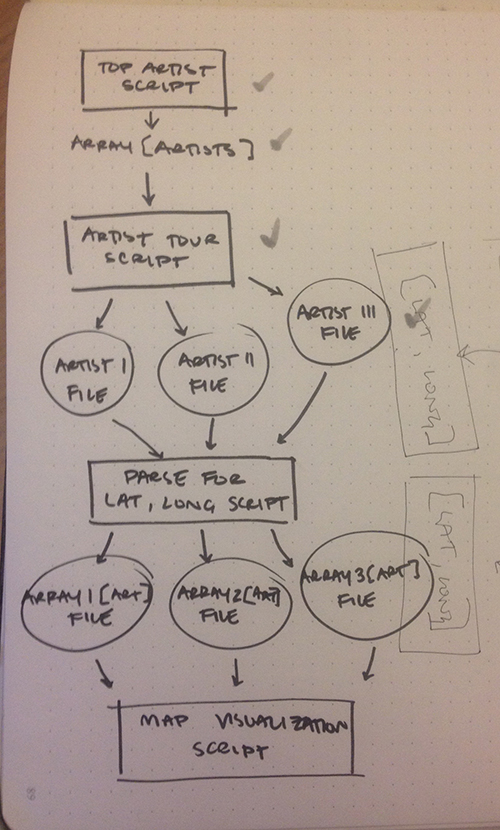
So far I have scraped last.fm for my top 10 artists in the last 12 months according to the number of plays. I used this to further scrape for all the past performances by those 10 artists. I used that data to find the location (in latitude and longitude) for those performances. The next step will be figuring out how to load my json file of artists and coordinates into a D3 world map as points on the map. I have been unsuccessful thus far.
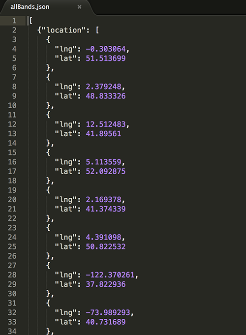
Either way, here is a picture of part of my json file, I suppose it is a visualization of sorts, though maybe only appreciated by computers.