Information/Data Visualization.
To begin, I’m going way back, to look at some analog information visualization by a handful of pretty cool women.
f spectral classification
First, Florence Nightingale. Florence was a English social reformer and the founder of modern nursing. She was also a statistician who was able to produce clear and informative diagrams about soldiers deaths. In one (shown in video), it was very clear to see what percentage of soldiers were dying from preventable deaths:
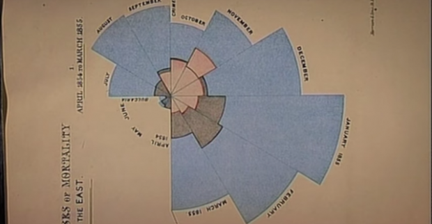
Her diagrams, though not at all digital, highlight the importance and impact of good data visualization. By clearly displaying vital information, she was able to share her findings clearly. I’m sure this is one of her practices that allowed her to have the impact on nursing that she did. Her work reminds me of the importance of clarity. It also reminds me that we can do even more (so much more) with programming and bring to light data trends unrecognizable by the human mind.
Secondly, and another non-digital example, the group of women, known as “Pickering’s Harem” who mapped out the galaxy. One woman of the group, Annie Jump Cannon is credited with the creation of spectral classification which included the generation of this interesting visual: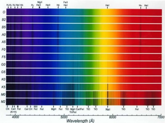
I find it interesting that these visualizations came as a product of research as opposed to doing research in order to have a cool information visualization project. I think that screen-based data visualization can sometime rely heavily on an interesting interface, and the content comes secondary. Maybe I just have an aversion to screens. However, using the computer to generate data visualizations can lead us to see trends unrecognizable by humans.