-

- Bento Rodrigues Dam Disaster
-

- Chennai Floods
-

- Gaza Conflict
-

- Nepal Earthquake
-

- Paris Attacks
-

- Refugio Oil Spill
-

- ShenZhen Landslide
-

- Shoreham Airshow Crash
-

- TianJin Factory Explosion
I created this project to visualize the colors of tragic events happening in 2015. I handpicked 9 events from 2015 that has a lot of media coverage so I have sufficient data points to draw accurate results: Nepal Earthquake, Paris Attacks, Gaza Conflict, TianJin Factory Explosions, ShenZhen Landslide,Refugio Oil Spill, Shoreham Airshow crash, Chennai Floods, Bento Rodrigues dam disaster. I collected images from Instagram corresponding to each event, and for each set of event images, calculate the top 100 colors, then show these colors on a grid. The purpose of this was to see if images from social media correlate strongly to the actual images happening, and what does it look like if I juxtapose these grids of colors of disasters next to each other. Would people be able to guess/relate events to colors with some context?
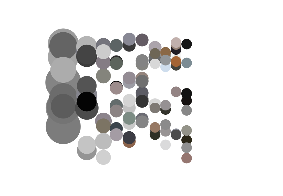
I looked at other ways to visualize colors like circles with radii that scale to how common the colors are. I didn’t really like how they play out, thought the grid is a more neutral way of showing the colors without any artistic decision affecting the perception of these results.
Future direction: we had some discussion in class about what can I do with these color palettes. I think instead of using these color palettes to make cynical remarks about the way our world is so idiotic and awful and insensible towards current events and tragedies happening around the world, I want to create peaceful, tranquil artifacts with these colors, somehow, that acts as memorabilia to these events.