I chose to work with the set of meteorite strike data. it struck me that not only did I not already know what to expect from the visualizations, but I couldn’t recall ever having wondered if this data existed.
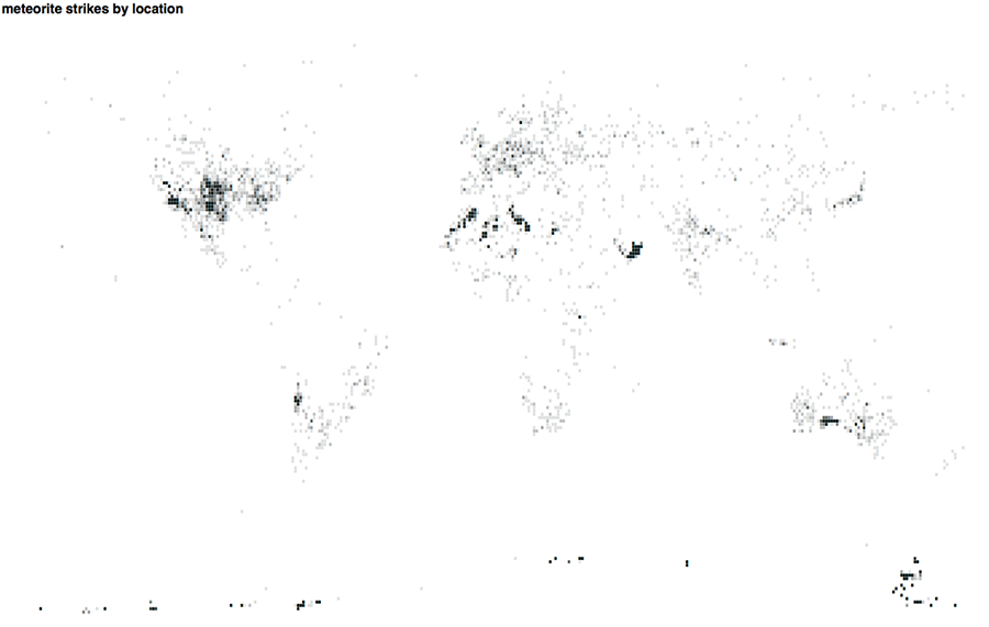
http://www.dansakamoto.com/iacd/gauntlet02/blockMap.php
For the second visualization, I chose to graph the data by time. The x axis corresponds to years while the y axis corresponds to number of recorded meteorites.
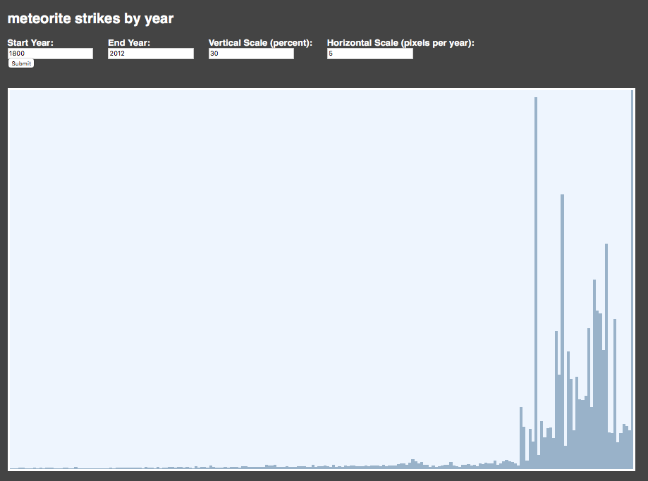
http://www.dansakamoto.com/iacd/gauntlet02/yearGraph.php
The most striking difference between the two visualizations for me is the difference in sense of totality. Presented with the map, I feel less confronted with questions about how the data was collected, and more with questions about why the hotspots exist. Looking at the graph by time, however, the history of technology and astronomy leaps out. A huge sudden spike beginning only years after the first men land on the moon. The space race and the cold war appear in the divide between data and lack of data.
Code: https://github.com/dansakamoto/iacd-gauntlet-02-map-visualizations