Irene Alvarado – Gauntlet – Maps
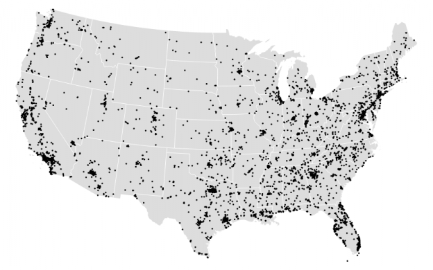
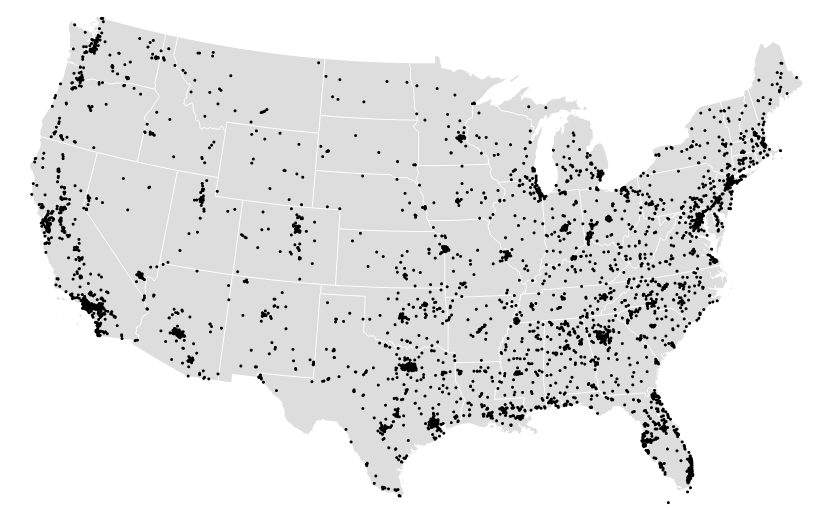
First map visualization
This was a really great opportunity to become familiarized with D3 and GeoJson, as much as I would have loved to have more time to expand my map. Again, I wanted to use the police-involved homicide data that I used for my Twitter bot (found here) to view where police related deaths had occurred in the US.
Given the rural or suburban images I had seen in my twitter bot I assumed most points would show up outside of the major city areas, but I was either wrong or the zoom I set on the map was too far to tell the difference. A lot of deaths actually appear very close to major city areas.
Perhaps the most surprising part of map-making was how much time it took me to clean up the data. First, I found a topoJSON file of the US divided into states. Then I transformed my spreadsheet of geocoded latitude and longitude data into geoJSON format. Finally, that got transformed into a topoJSON file. But I had to play with the scale a bit to get the points to appear correctly on my map. Why the two versions? Mike Bostock has an answer, “In truth, they’re siblings: TopoJSON is an extension of GeoJSON that encodes topology. Combined with fixed-precision encoding for coordinates, TopoJSON is usually much smaller than GeoJSON… In addition, the topology information in TopoJSON enables automatic computation of boundary lines and other interesting applications, rather than requiring additional storage.” (http://bost.ocks.org/mike/map/).
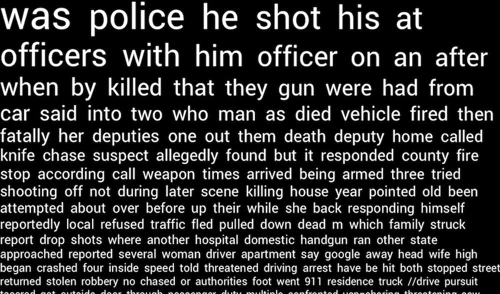
Second visualization
For this second visualization I actually took my original data and got rid of the map component. Again, the points I visualized in the first exercise were just showing up as data – my map was basic and didn’t add too much more to my understanding of the data set. Instead, I choose to use space and order to visualize the descriptions of police-involved homicides. The data I had collected included rich descriptions of each death which merited some exploration.
I created this project in Processing by just visualizing the words the appeared the most often in the text at the top left of the screen. From there, less popular words were shown with a smaller font and in decreasing order. I trimmed the data a bit to get rid of propositions and common words such as: “a”, “to”, “the”, “of”, etc. I chose to keep pronouns and a few select propositions because they help the text read more like a story or possibly coherent sentence rather than a random collection of words.
The visualization wasn’t too surprising, unfortunately. The words are all sort of what you would expect from a homicide or crime scene. “police”, “death”, “gun”, “deputies”, “threatened” – anyone could have guessed that these words would appear.
Github link: https://github.com/irealva/d3-map-police-deaths