Sam Lavery – Looking Outwards 2
http://mbostock.github.com/protovis/ex/cars.html
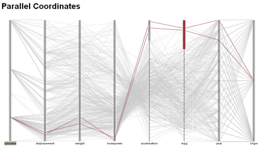
I am a big fan of visualizations that condense a massive amount of data into a beautiful, interactive form. The above is a visualization of cars using 8 variables such as engine cylinders, weight, year, mpg, etc. This multivariate information tool was created at the HCI institute at Stanford. I think that this visualization is very informative and also aesthetically beautiful. By dragging the parallel columns you can create ranges in every variable, highlighting only the cars that fall within every range specified. This is endlessly entertaining and I found myself losing track of time as I interacted with it.
[youtube http://www.youtube.com/watch?v=WIbRqAM7QNM]
http://www.connect2congress.com/blog/
Connect2Congress is a project by Peter Kinaird, a Phd student at the HCII at CMU. While this is not a polished visualization (he is working on an improved interface), it is very successful in presenting a lot of information graphically and in a short amount of time. Similar to the baby names graphic, this interactive visualization is appealing because the user can manipulate and explore the data to learn more about what they are interested in. It is very easy to ask Connect2Congress specific questions about the voting habits of our elected officials. I hope that visualizations such as this gain popularity during this year’s election cycle.