Billy Keyes – Looking Outwards 2
I’m on the look out for information visualizations this week.
Keyboard Frequency Sculpture
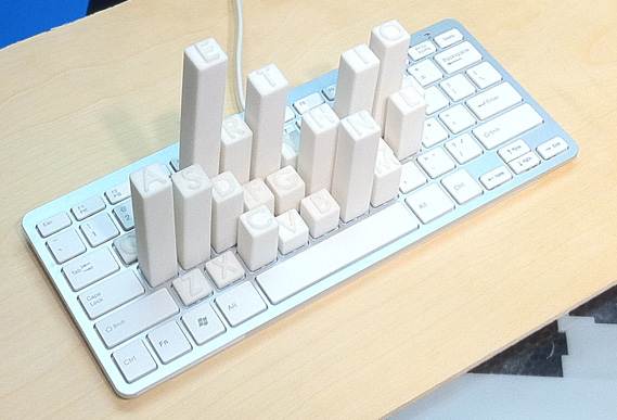
Mike Knuepfel made this clever, simple visualization of the letter frequencies of the English language (as reported by Wikipedia). The physicality of this piece (literally) makes it stand out, given that the data are common and could be visualized in many different ways. By building on top of a real keyboard the inefficiencies of the standard QWERTY layout are made obvious; you can imagine laying your hands on top of the sculpture in a way that you wouldn’t do with a bar chart, heat map, or other 2D representation. Some commenters have called out the project for depicting letter frequency and not key frequency as might be implied by the setting. But while key frequency would be interesting (especially for gamers or Photoshop users), I don’t think the use of letter frequency detracts from the result.
Binary Subdivision of the World
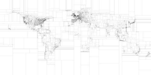
This image by Eric Fischer divides the world into boxes that contain an equal number of geotagged tweets. The result is, for the most part, not surprising: areas with low population density require larger boxes to contain the same number of tweets as areas with high population density. What I liked is how clearly the shapes of continents are outlined by the changing density of boxes. This visualization would be unremarkable if it was overlaid on an actual map of the world; the fact that the world map emerges from a non-topographical data set makes this effective. Also of note: Eric wrote this to figure out the ideal way to query geo-APIs of web services like Picasa.
Drawing Water
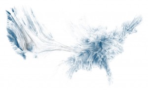
Last, another piece which shows geographic shapes derived from non-traditional data. David Wicks’s Drawing Water depicts a theoretical flow of water from locations of rainfall to locations of consumption. While sources and sinks are based on actual consumption and precipitation figures, the paths are generated. Again, I think this disconnect from reality makes the piece more effective. We all know, to some extent, how water flows through streams and rivers to feed lakes and reservoirs and by removing this element, Wicks lets us focus on the where of flow rather than the how. It appears that an interactive version of Drawing Water exists, and I wish there was a better video demonstrating how the interaction works.


