Looking Outwards
http://www.onehourpersecond.com/
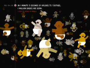
I absolutely love this. I believe the most successful data visualizations are those that combine an innately interesting comparison with very arresting visuals. Though I cannot say this particular project has jaw dropping eye candy, the execution and the use of full screen comparative illustrations worked really well. I think with these data visualizations, it comes back to the creating that level of depth. If the same visualization was about data that was more literal, the impact would not nearly be as great. This is pretty much obvious, but sometimes it’s easy to get caught up in the visual “cool” factor of data visualizations, concerned more about the visual complexity and “ooooh” factor than where the real beauty lies in the data. I guess finding the data in the first place is the true hunt.
Whooaaa. This is actually pretty neat because I actually saw this at an art festival in The Hague while I was abroad in the Netherlands, but totally forgot about it. Firstly, the interface is wicked neato. I wish I had the skill to fuss over details like how the visualizations fade in and out or other ways of representing the data kinetically instead of the usual static poster-y infographic. It’s incredible how kinetic visualization adds such a powerful dimension to information, in fact judging by where communication design is heading, kinetic visualizations should be incorporated into the regular cirriculum. Anyways, this kind of stuff is definitely pretty cool.
Another gnarly one hailing from my homestate of California. In kind of an ‘aw, shucks’ moment, I had a similar idea for this project. However, instead of taking videos of the sky for a year, I desired to take snapshots of the Pittsburgh sky, color average them, and see if there’s any kind of link to the choice of key words in the Twitterverse during that hour. Anyways, I think this is another example of taking an overlooked aspect of our life and changing the way we perceive it. In a sense, I guess that’s what the basic foundation of what art is supposed to do, expose us to different perspectives and change the way we think in an ever so subtle way leaving us with new refreshing thoughts. I guess what I need to figure out is where my abstract thinking and my (not)awesome programming skills intersect.