EvanSheehan-InfoVis
The Narcissism of Minor Differences
My data visualization project represents traditional Irish tunes visually to highlight their similarities. The idea for the project came from something my mother says to me regularly when I’m home visiting and playing the fiddle: “How do you keep all those tunes straight? They all sound the same to me”.
There are many sources of tune data online. Originally I’d planned to scrape some from thesession.org, but my friend, Pete, actually had a database of tunes he’d scraped several years ago from a variety of sources. So he just sent me a SQL dump of that and I was off running.
Measuring Similarity
The first question was how to measure the similarity between a given pair of tunes. Because the tune data online is typically stored in an ASCII format called ABC Notation, calculating string distances seemed the best solution. I tried both the Hamming and the Levenshtein distances and settled on Levenshtein because it supports comparing strings of different lengths.
Visualizing Similarities
I tried several ways of visualizing the melodies to highlight how few differences there were between pairs of tunes. Above is a more visually pleasing variant of my first attempts. I started by representing each note as a rectangle. Each row represents a tune. When a note is identical between that tune and the starting tune, the note is drawn. If the notes are different, that space is left blank. This gives you a picture of where the tunes are similar, but now how they differ.
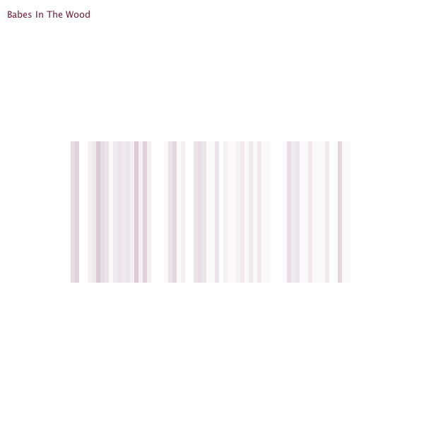
My second attempt (the first image) overlays all tunes similar enough to the original. Again, each note is represented as a rectangle and only common notes are drawn. Each rectangle is mostly transparent in this visualization. Because all the tunes are drawn on top of each other, the darker the rectangle, the more often that note appears in that position in this set of tunes. Although I think this results in a rather attractive, barcode-like image, it doesn’t say much about how the tunes are similar.
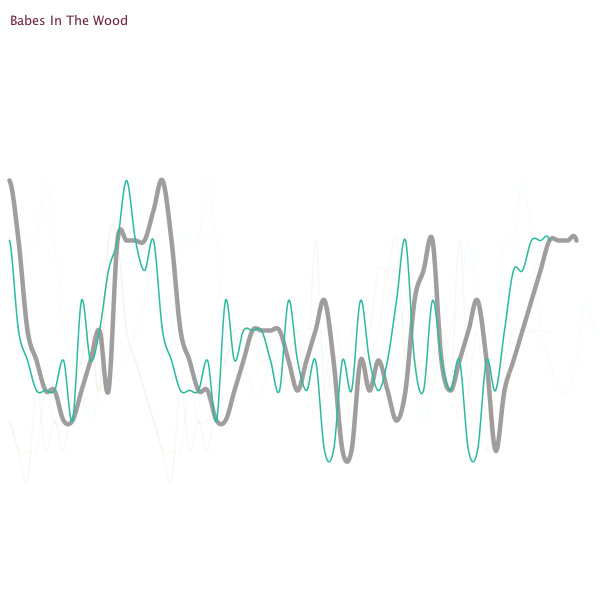
Finally (at Golan’s suggestion) I represented the tunes as line graphs; plotting the notes in order horizontally and according to pitch vertically. Now you can see where the tunes overlap and how they differ when they don’t overlap. The important feature this rendition highlights is when a phrase is repeated between two tunes but out of phase with the original. Previously, common phrases were not visible unless they occurred in the same place in both tunes.
At this point I had to add some interactivity because simply plotting all the selected tunes on top of each other was too noisy to glean any useful information. So I faded out most of the lines and allowed users to select a single tune for comparison using the up and down arrows.
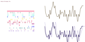
In the above side-by-side comparison, you can see that there are two identical tunes (the top pink bar on the left, and the top line chart on the right) with different names. A common occurrence in this style of music. The next most similar tune appears to have many similar phrases, but not in the same place as the original. Thus, on the left, it doesn’t appear to have much in common, but on the right you can see similar contours slightly out of phase with each other.
Critique
I think this is an interesting start, and the line graphs give me confidence that there are some interesting similarities to explore between tunes. I think a more interactive visualization might be more compelling; something in which users could explore the data more freely. The limited interactivity (see the video below) was mostly just a convenience for me to quickly generate artifacts for the presentation.
[vimeo=http://vimeo.com/36328177]
It’s also worth noting that my calculations of similarity are not correct. I simply treated the ABC data as strings, but that doesn’t result in a correct comparison because in many cases multiple characters are required to represent a single note. For example a low b is represented as “B,”, so the distance between the phrase “GB,D” and “GbD” should be one, because there is only one note—and thus one substitution—difference. However, simply comparing the strings “GB,D” and “GbD” results in a Levenshtein distance of two.
The fact that there are still so many similar looking tunes despite this oversight on my part is what encourages me that there is more to explore here.
Technical Details
I started out storing the data in a SQLite database, but it quickly grew too large and I moved it to a MySQL database. I used Python to perform the distance and longest common substring calculations on the tune data; that code can be found here. The visualization was performed in Processing, and that sketch can be found here. A zip file of the entire project—including a dump of the MySQL database—is available here (the SQL dump was too large to upload to WordPress).
========================================
Evan: The Narcissism of Minor Differences
Great research topic — fantastic data set, and great backstory (motivation, interest). I think this is a great project, but it needs to be done with a dataset that has durational (note-length) data. Would be good to see 2000 faint lines overlapped, to see the basic structure.
These squiggles only become intelligible in relation to each other. Showing (as in the keyframe of your vimeo) one doesn’t help. Overall, I’m having a hard time understanding your graphics. I would ask you: if you were preparing this for the New York Times, what would you do?
The overview image (gray bars) is a little dull: hard to read (no axes, no labels) < -- I agree here, a bit too abstract … it would be interesting if you could layer the songs and have an mp3 (see this example http://www.youtube.com/watch?v=v2pXfAK8r1k)
I’d like to see an averaging of the line graphs to show the general pitch movement trends
The squiggle charts are great! Still need axes, labels (very faint). It’s really interesting to see that there’s a phase shift in some melodies.
^^+1
The cross-correlation function would allow you to calculate (or normalize out) the phase shift between melodies. There HAVE to be good ways of visualizing phase shifts!
have you looked into bioinformatics toolkits/methods? There are a lot of tools designed for analyzing/displaying similar strings of data
great summary
Awesome project. The stacked line graphs are definitely the most successful visualization. The bar graphs would work better if you used the same color for all of the similar segments. It would be really cool if you could incorporate recordings into this somehow. Seeing and hearing the similarities at the same time would be really sweet.
nice colors. I want to see a bigger sample than two though. Nice presentation style, I get it.
I’m digging the stacked graphs. I want to hear a tune and see how it lines up with a graph though.
“I was also working with polkas because it was easier to parse”
Have you thought about including the tunes as audio in some way? Maybe as the user mouses-over each line the audio plays back?< -this I like the different ways that you expressed the levenstein distances. The barcode type ones are really interesting aesthetically. abstracting it to that level and then printing them out to compare would be interesting. I also like the line graphs, but it expresses something different, and because they’re usually associated with statistics, I feel like part of my own bias taints my perception of this visualization. It is true that line graphs are more informative and clear to comprehend, but I personally prefer the stacked graphs MORE. The second layout of stacked graphs look more beautiful (aesthetic-wise). Even if the second one more abstract to understand, I hope you to stick with it(stacked graphs i mean). Beautiful at first glance, very simple, elegant What's in a name? Would be interesting to be able to hear for oneself the differnces/similarities in songs that essentially graph the same. How Irish are you? personal story would be nice haha Visual metaphors: barcode, DNA Gel Electrophoresis-y. I don't like the line graph as much because it seems like an obvious visualization form, it requires less exploration. Though it is interesting to combine both methods to describe each other. The line graph is nice- smooths lines, and nice colos, it is easier to understand that the bar graphs interesting information about the names of tunes being the same- are the name simportant to the songs? could you bring this in? could you add some context to the graph so that we know Y= pitch- otherwise they are just some pretty lines right? could you put all of the line son top of eachother and let a user roll over (have non-selected ones faded out & highlight the selected one) how long are these songs? could you click on a line and hear the song? I really like the way the barcode and other grid layout look, but I understand how the line graph adds more useful information. I wonder if you could visualize the same information in the line graph integrated into the other displays. You talked about songs being out of phase; you might want to look into methods for cross-correlation (http://en.wikipedia.org/wiki/Cross-correlation). This would probably let you estimate the “time delay” between songs or sections of songs. Having a number for delay might help you integrate the time data into bar graphs, or you could remove phase data before calculating similarity.
I agree with Golan too, it would be nice to have rhythmic data included because rhythm is an important part of Isrish music (for me, anyway, as a listener)
I liked all the different tunes stacked on top of each other although I understand that there was little information there but I wonder if stacking each tune and then run lines between similar notes, etc. I think this could be pretty cool. Great job!
interesting idea with nice introduction using the mother’s quote.
is this based on music or words? tunes, to me, means music.
***yeah. would have been nice to hear one example of an irish tune.
Great! I finally know what Levenstein distance is.
*** agreed.
The line graph is definitely more useful at portraying the data, but I think the bar graph has a really nice aesthetic quality that gets lost.
I liked the simplicity of the “barcode” graph.
would it be too painful to hear 2 tunes overlaid?
** I think that’d be interesting
I like the inclusion of the pitch graph as well.
***the point about the pass being slightly different is cool
for a presentation, if you have a video, personally, I’d like to see it.
Seems like you really immersed yourself in the problem and that you selected something that appeals to you and you care about. Would love to see if you take Golan’s challenge and make is awesome for the New York Times.
**definitely.
I think this is a very interesting and specific set of data. I thought what dan said about averaging was a good point.