Joe Medwid – InfoViz
A Sexual Network Visualization
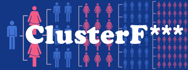
ClusterF**** is intended to visualize the folk wisdom that, when you sleep with someone, you’re sleeping with all of the people everyone they’ve ever slept with has slept with, as well. The premise is that we all know our personal history, and we may know the history of those partners, but after that? Things tend to get very fuzzy very quickly. ClusterF*** displays each of these faceless individuals and a single mass of humanity.
[youtube=http://www.youtube.com/watch?v=hrMMYDLoHBY&context=C395d113ADOEgsToPDskKcqW4j3_w_8XfyQ5b_hNBK]
Inspiration for this visualization came from many sources, beginning with a link from Patrick’s list of visualization resources to Bedposted.com, a web tool for tracking your own personal history. This immediately brought to mind an old college buddy who famously kept a personal spreadsheet of exactly the same information. Associations started rolling in, from the excellent data on the OK Cupid Blog to the old Kinsey studies.
Data was gathered from several academic surveys on the sexual activity of persons aged 15 to 44. The full list of data is hilariously extensive, covering most every conceivable combination of sexual orientation, type of intercourse and frequency. As my experience with data scraping is virtually nonexistent, I combined this data into a simply 2D array, drawing only from gender and age information to create the visualization.
As a self-critique, I had originally intended the visualization to be more interactive, along the lines of this excellent New York Times feature on Family size statistics. GUI elements in Processing proved to be a major roadblock, so in the end I kept things as simple as possible.
Code for the project may be downloaded here.
========================================
Joe Medwid: ClusterF***
^
I’m looking forward to this sh** already! |
Don’t get your hopes up -_- >> my hopes
ClusterFarm? clusterfart? yeah, it’s ok to say “fuck” here, fuckfuckfuck
i would love to see color changing balls. like one original ball is you and then each ball you touch radiating outward gets a color
Your project title graphic design is really clean, so I was disappointed not to see the same little pink/blue people used, but white balls instead… Could you show it as a tree so you see it branch out?
I think some kind of network visualization would have been more informative. However, I see how the pulsing mass of balls gets your point across.
good background into into your inspiration, you should mention BedPost.com & OKCupid in your video … also mention where the data came from
you should use some key commands to change the variables without having to modify the source and rerun it < +1 where are you getting the data from, how do you know males aged 24 are in a ## sized cluster? why should we believe you? (mention the data source) a spermy mass imagine if he had animated little sperm tails on them. could have been terrifying (Well, that would leave out the logo image is a bit confusing as that’s what I expected to see in the visualization a pretty convincing visualization. being able to interact with and modify it would have been nice if given more time. I hope to see more colorful visualization instead of having just one color of many balls. It is good but if there is some sort of little animation between those balls (that’s what she said) (ugh dan) it will be even more fun Golan wants to visualize his social sexual network http://www.prb.org/Articles/2007/misconceptions.aspx – should read this, thinking like this actually saves lives. should listen to this podcast: http://www.thisamericanlife.org/radio-archives/episode/444/gossip
http://punkrockor.files.wordpress.com/2011/07/sna_highschool.jpg High school dating graph I thought it was intriguing (we studied it in graph theory last sam)
Video presentation was a good idea. I don’t see much in the way of connections, though, just volume of connections. It might also be cool to be able to compare or battle age ranges or genders. Maybe select an age range and show for both men and women and color the circles different so you can see how men & women differ. I feel like another interesting thing to explore is how quickly this explodes combinatorically; again color, might be helpful: each circle is colored according to how many degrees of separation there are between you and that person.
Why not make a GUI for the simulation? (not going back to edit code constantly)
How about a radial representation, with you at the center (attracting others to you by gravity?
The holy grail visualization would be a visualization of one’s actual social/sexual network. Of course, that would be pretty impossible to get. (Or would it…..?) Visualizing the statistical “average” with a simulation is kind of disappointing by comparison… It doesn’t feel as “real”.
Could you color code these “people dots” as male/female based on color
I am confused about the dots, and which of them are actually “connected” by direct sexual relations or are just a part of the web- maybe lines should connect them
Check this out- http://sexperienceuk.channel4.com/the-sexperience-1000#/
the data in this is clear because each person surveyed is displayed as a little human I can see this simulation using little humans and still not clarifying what you’re looking at.@lightgreen do you mean you don’t understand the information in “experience” or wouldn’t understand the data in “cluster f***” if it had little humans the latter. Agreed- experience does a good job of using headings & keys to describe what data the little people are connected to
Not clear on how the data drives the simulation. Visually there is no apparent relationship.
What am I looking at? What do the circles mean? This is a good data set to explore and the connection information is probably interesting, but I don’t understand how the simulation reflects this.
Video demo of the interaction was a good idea.
So are the collisions indicative of how many people each person has interacted with? if you could assist the connections through some other method of visual communication like for every collision something else happens etc….
Nice approach, good idea to visualize data with a simulation, however is not very clear to me how you visualize connections in the simulation.
I think it was an interesting way to visualize the data : its interesting to give an idea of what statistics look like. So what I see is that when you change the numbers, it starts getting more and more clustered but I think that would happen regardless. I think what would have been interesting is to see the network grow: so starts with averages
I assumed that after the simulation, you were going to draw a graph of the circles to show which other circles they had collided with. But just having the physics simulation by itself seems a bit too abstract.
love the logo and the background images.
**yeah thats great.
Wish that was integrated in the visuals of the program!
how did you get the information? a database? friends? surveys? seems too private of information to get out of people locally.
*you should state that you got it from national surveys first, rather than later.
I love the visualization, but I am not sure what I am looking at. What do the balls symbolize? Their movement in the space? their distance?
You say it is a simulation.. is it real data or not?
The problem with particle systems is that despite the fact they are visually very impressive its hard to understand what exactly the data is.
Maybe some kind of key? Or some kind of colored link to represent the connection that is also part of the physics.
I like the visualization and the idea a lot. I think just adding some simple text outputs about what is being looked at would help enormously. Like “Average Partner Network for a Male, Age 32…”
I like the idea of thinking of all of us as the same particle, but it would be interesting if something happened when they interact with each other, like the colors changing or they morph into a non-perfect circle shape?
I think representing the data as links (or webs?) rather than bouncing particles may have a little more impact for the message you were after