Alex Rothera | Project 1 | “A city’s potential”

By: Jaakko Tuomivaara
Tweet by RTH_1 at Mon Feb 06 15:43:17 EST 2012: Occupy pittsburgh protesters are idiots!!! Let me bring my 3 german shepherds down there and clear them out
Tweet by tranquilxlife at Mon Feb 06 19:44:47 EST 2012: I can’t wait until it gets warmer. I just wanna walk around in my beautiful city with the moon just above. #truth
Tweet by mikeperry15 at Mon Feb 06 19:46:12 EST 2012: paying a parking ticket…i will take revenge in someway to the city of pittsburgh for this
Tweet by Czer412 at Mon Feb 06 19:58:51 EST 2012: I put up a Missing Persons report around the city for @Mr_diverse412, have u seen him?
IF I WAS TO KILL SOMEBODY I THINK I’LL BE ABLE TO GET AWAY WITH IT IN THIS CITY
========================================
Alexander Rothera: A City’s Potential
would like to hear more about how data was collected.
interaction design concept is fantastic. great potential as an installation piece.
would like to have interacted with this piece. i think the concept is really great, and it’d be cool to extend it further to allow the audience to also see the tweets or key words with the hand hover, etc (whatever you were envisioning)
Regarding your initial comments about cities, have you read richard florida? Follow him on twitter and read who’s your city? (http://www.amazon.com/Whos-Your-City-Creative-Important/dp/0465003524)
^^ good stuff vv
Might also enjoy reading Jane Jacobs, http://en.wikipedia.org/wiki/Jane_Jacobs
“The Death and Life of Great American Cities”; “The Economy of Cities”
Also read Kevin Lynch, “The Image of the City”
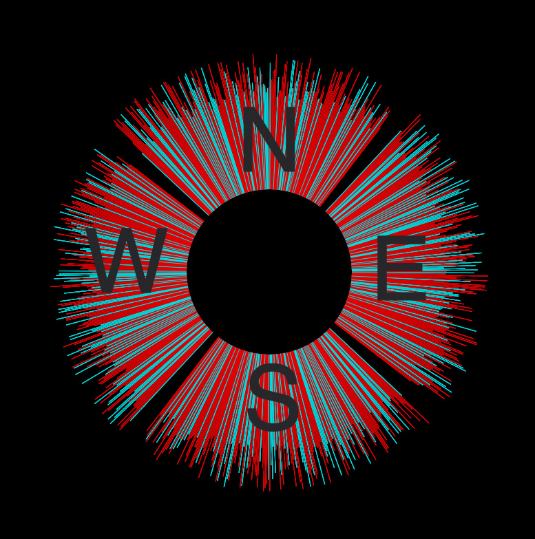
Great interaction design. Would be really engaging if you could interact with the projection. Not sure how important the North, South, East, West information is. If you could somehow relate it more to sentiments in particular neighborhoods it would be more enlightening.
*Yea that would be awesome
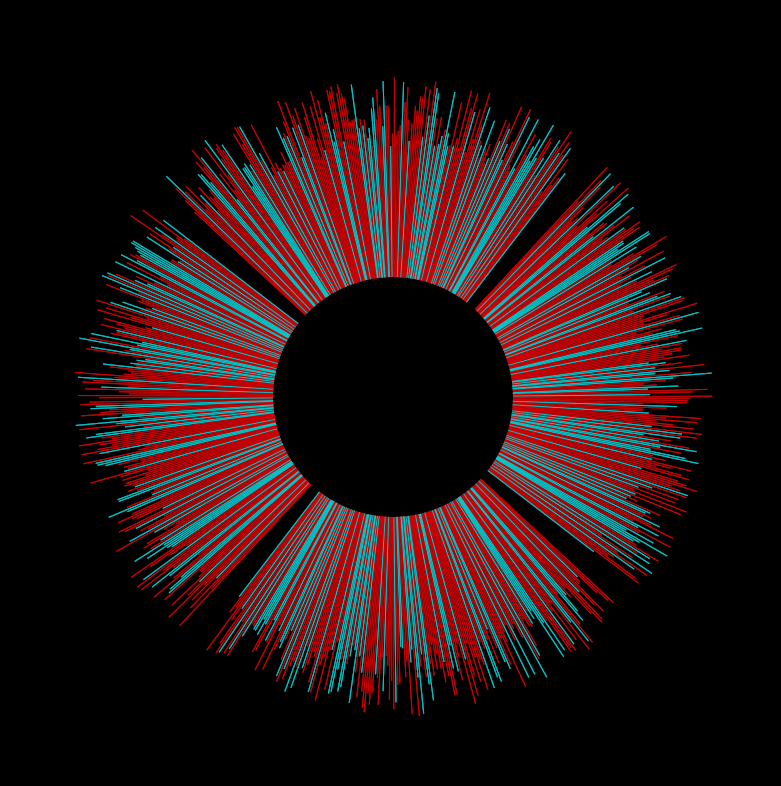
So blue represents positive sentiment? The concept here is very strong, I like everything you cited re: adventure, urbanism. The final product is a bit underwhelming given this scope. I would have liked to see some video maybe, to get a sense of the city’s pulse. A static image can’t provide this. I really like the decison to segregate things by cardinal direction, it gives plays into the urban theme really nicely. It makes me feel like I’m somewhere. ‘m thinking if the sentiment analysis was realtime, that would solve the problem of pulse.aa
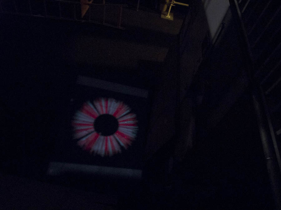
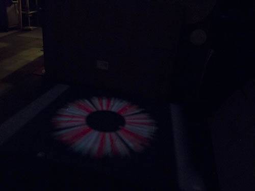
Are you saving the central black area to project text in? Why do 4 seperate queries based on points NWSE with a radius? Why not just query everything around a single point by radius and then plot based on the direction from the center point… This would also show where the tweets are coming from… There might be big gaps of black but these would indicate that not a lot of activity was happening around there… Super concept–I’d love to see this when the location data improves even more, you’re just ahead of the times a bit.
Yeah, need better documentation photos … maybe outside at night as well …
It maybe better to have more variation in colors
Great Idea, It could easily turn into a great interactive project. Projections hold the key to the visualization.
I like the way the compass looks like iris-like … an eye into your locale +1
the alternating red and blue lines are too evenly distributed in length and position to really get an idea looking at the compass, could it be scaled? also, would like to see more experimentation with graphing etc aka other representations
I like the concept of your project, but I kinda wish to know how you documented data.
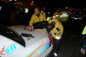
Is that you getting handcuffed? Nice work on the device. More lumens! Also shooting onto a white target would help. I feel like you could reiterate the whole piece one more time and have a really nice artwork.
Kinda looks like the eye of sauron. (with blue streaks)I can feel it… This is pretty neato though! I like how there is a lot of depth in the interaction and information that you are displaying. It’s quite commendable to have done so much with so little time. I wish we could actually see it working. I bet due to the focus of the projector the colors may overlay into some interesting range of purples, reds, blues and such.
I wonder if data from Twitter is skewed. In the same way that people (anecdotally) seem less inclined to write reviews of products and places if they had a good experience, but a bad experience is highly motivating, I wonder if people have a tendency to tweet negative things more than positive.
Pretty. Also curious what are the actual tweets behind the data and sample mappings of sad to happy or whatever the colors are supposed to correspond to. What are sample phrases of positive / negative? What algorithm did you use to classify that?
What does the lamp have to do with anything? I’m confused.
I like how well the data forms into even shades of blue and red that are spread out uniformly across the circle. It’s also really cool that the data can be projected from a street lamp to make the location feel even more meaninfull – especially how you have a hole in the middle for people to stand in.
I think its pretty cool. And its an interesting way to visualize this.
I really like the idea of extending your visualization into physical space, but at least in the examples, the red and the blue seem very balanced. I’m interested in your extension to allow people to view the actual tweets, because I’m not sure how much sentiment can be extracted from the colors alone.
Your intro images are a little random.
**agreed. I don’t immediately see the correlation between the two emotions you are trying to convey in the beginning photos.
Hmm so the graphic is length of tweet and mood? The aesthetic is very well done, but it doesn’t tell you too much about the actual dataset, since it looks relatively random/evenly distributed.
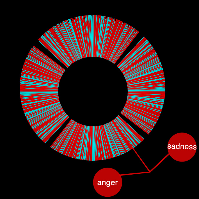
I like the resulting visualizaton. I do think that that if you could show the negative tweets that were sad vs. mad, it would give the user a better perspective.
I love the installation idea. I think bringing the cardinal direction data to the physical world makes it much more meaningful.
The viz is beautiful! Also liked how you setup the atmosphere beforehand.
**agreed
**yeah good presentation. great visual aesthetic.
I like the radial/directional representation of sentiment, i.e., “relative to me”. That’s smart. I also admire that you attempted a combined software + hardware approach — writing a text analyzer, and building a custom housing for it — ambitious!
In your presentation you gloss over some important technical details — your use of scraping, your use of the LIWC. We’re curious about that! These contribute significantly to our understanding of your project, and how “legitimate” (vs. ‘faked’) your visualization is.