EliRosen-Project2-CivilWarVis
For this project I chose to visualize the battles of the civil war. Aside from the fact that I have always loved to study the civil war, I found this to be an interesting data set because it has so many different dimensions: battle names, geographic information, dates, commanders, casualties, et cetera. The data was scraped using a python script from the website www.civilwar.com. Thanks to Asim Mittal for all the help with python. I thought at first to visualizes the data on a map as a kind of animation of the civil war but found that that had actually already been done.
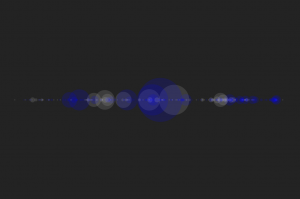
My next intuition was to use a timeline. I used this early processing sketch as a way to see what the data would look like on a timeline with the battles sized by total casualties;
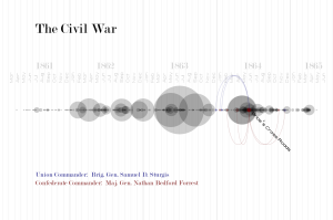
I liked this direction but decided I had to add a second element to make the project more interesting. I toyed with the idea of having an animated chronological visualization where as a playhead reached a battle it would explode, scattering two colors of particles that would represent the casualties on each side. Instead I decided to focus on the commander data to try to show where commanders had fought throughout the war. I drew connections for all commanders to all their battles. I found this to be much too cluttered and decided instead to introduce a selection mechanism so that only one battle and set of commanders was in focus at any one time. The user can step through the battles with the right and left arrow keys. Below is the result:
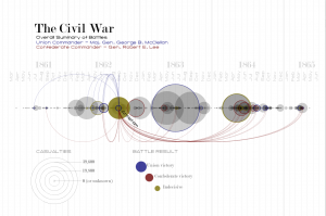
At this point I just added the legend to finalize the piece:
I’m pretty happy with the result. I think it provides some interesting high-level information about when commanders fought and how they fared. It also reveals some instances where commanders faced off in multiple battles. It is also interesting to see how the war escalated and then petered out. The visualization does not however give good insight into individual battles. The exact number of casualties is hard to discern and there is no information on the size of the armies that faced off. The areas where many battles occurred in rapid succession become very difficult to read and the dense areas do not read as being as dramatic as a single large battle even though the total casualties may be greater. It might be nice to have a supplemental tool to target a span of time and see the total casualties on each side.
Here is a video of the visualization as I step quickly through the battles of the war:
[youtube http://www.youtube.com/watch?v=zaA2Px_29dc&w=640&h=360]
Here is the live processing applet:
Select the applet and use your left and right arrow keys to step through the battles.


========================================
8. Eli Rosen: CivilWarVis
speak up a bit
could use some more info on the backstory, why did you choose civil war data? cause the civial war is flippin’ sweet
nice to see you process and experimentation with demo pics as tried things out
I could not tell how meaningful are those circles, but it is good looking
It’s really great that you learned so much from the process, but the circle area should be switched (easy enough)
You could probably have used tick marks instead of month names in the Timeline. The month names don’t look so good, especially because (1) they’re large and (2) they’re in a modern wide typeface which is very unlike the 1864 typeface. If you don’t like tick marks, then you could use the standard letters, J F M A M J J A S O N D.
Its a beautiful visualization which has such diverse dimensions represented into one and seamlessly.+1
I think the visualization straightforwarrd and easy to understand, but I wish clear timeline or darker text color.
nice typography (sans is a bit too Halo/Star Wars, could be more german like DIN) and visual design, but some problems with clarity of information, as mentioned by Golan. Looks almost ready for print, high quality layout. Maybe show all connections at once and print at high resolution as another variant
I think this is one of the most polished looking visualizations I have seen. +1 There are some issues with how the data is displayed though, too much variation in typography.
How about a line that represents the initial number of troops on each side that slowly goes down as there are casualties?
Eli, it looks awesome! ^_^>
Great work, Eli. I would have appreciated 2 timelines, one for the North & one for the South.
I love how you were able to talk about why you chose your dataset and process.Also your visual design skills are really great. I think you did a great job in taking a good dataset and coming up with a set of interactions and visualizations to show important relations. I really liked how you you show the battle result. I don’t know: I like your color choice.
As much as you geeked out over why you think the Civil War is awesome. Your visuallization is much more serious. I wouldve liked to see your sense of humor involved. Its pretty 1 to 1 in your representation of a timeline.
I like the idea of having multiple renditions of the data: one that is pleasing visually and one that is more informative. I should have done that. One question I have is how victories are determined, mainly because I want to know if a victory for the south means they had fewer casualties than the north and vice versa. To help clarify which battles a general commanded when you’re highlighting that, it might help to fade out some of the unrelated circles so that it’s easier to see. For generals like Lee and Grant, the lines become a little hard to follow.
My uncle is a civil war historian who publishes/edits a book about every ten years. His books suck as far as illustration goes. This may be useful to him, and the massive cult of C.W. historians.
Uncle = Tom Nanzig: http://www.amazon.com/Badax-Tigers-Surrender-Wisconsin-Volunteers/dp/0742520846
^^wohoo, collaboration!
The visual design of the interface is simple and informative. It’s a pretty nice visualization that is easy to understand. I wish you approached the data in a couple different ways to see progression of process.
Love the fonts you’re using and where you use storytelling to reveal aspects of the data! Could totally see this as part of a trendy highschool history class of the future. Smart and clear use of color! one of the most furthest along projects presented so far. good job!
I really like the way that you rendered the image – all of the lines, circles, and connections are very clear. Like Golan said, some of the sizes are misleading and the fonts could use some adjusting, but the layout is very nice.
This kind of visualization is presented and exampled in Shiffman’s “Nature of Code”. Were you able to use that?
I think this timeline is beautiful, and I like the fact you chose a topic out of history .
The interaction looks fun and interesting to explore.
The way its formated now puts more emphasis on the command chain and power behind the war and less on the casualties. I think if you formatted it more along the lines of what Golan was suggesting
it would shift the attention more to amount of losses which makes it more emotional.
once quick note:
you should adjust the kerning on the heading “casualties” because it is currently reading “casual ties”