Nir Rachmel | Final Project

by nir @ 3:22 am 11 May 2012

This visualization, of temporal rhythms in public bus occupancy levels, examines 27 million data points from the Pittsburgh transit network — the activities of every bus in Pittsburgh, captured every eight seconds, for two months.

The bus stops here

Overview

Pittsburgh busses have a device installed that monitors each bus and records parameters such as speed, direction, location and passenger occupancy. A record entry is created every 500 feet or less, resulting in a tremendous amount of data. The data set that I hold, has the information collected from these busses over two months, for all bus routes, resulting in some 27 million entries. For my project, I was curious to see if I can visualize temporal rhythms in the bus occupancy levels: Is there a trend in the time and location where the busses are full and how can I visualize it in a compelling way which will be both intriguing, interactive and insightful.

What did I make?

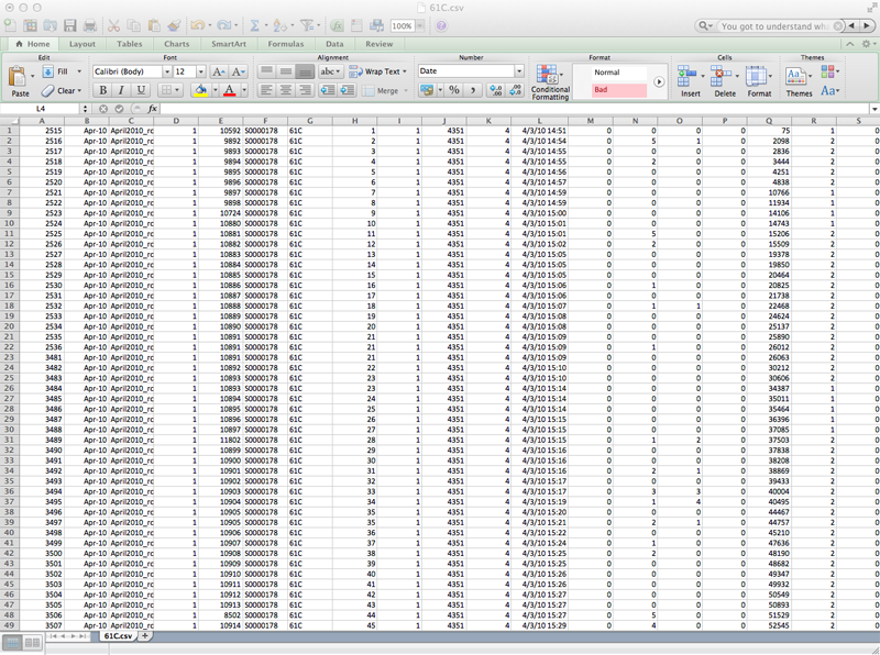
I decided to focus on several popular Pittsburgh bus routes that the CMU community uses on a regular and heavy basis: The 61’s, 71’s and 28x (to the airport). I extracted from the database all the entries that belong to these routes and used them to form my own customized database. Just to get a sense of the magnitude of the data, the 61C has more than 700,000 entries alone.

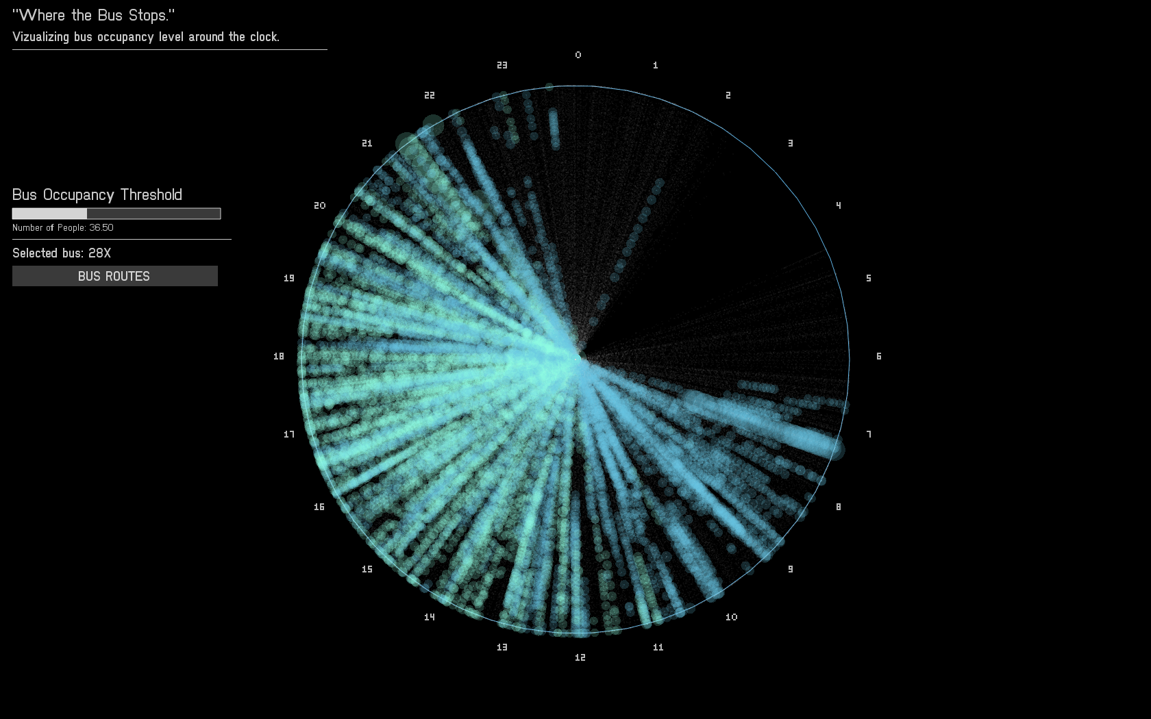
The data was plotted in the following manner:

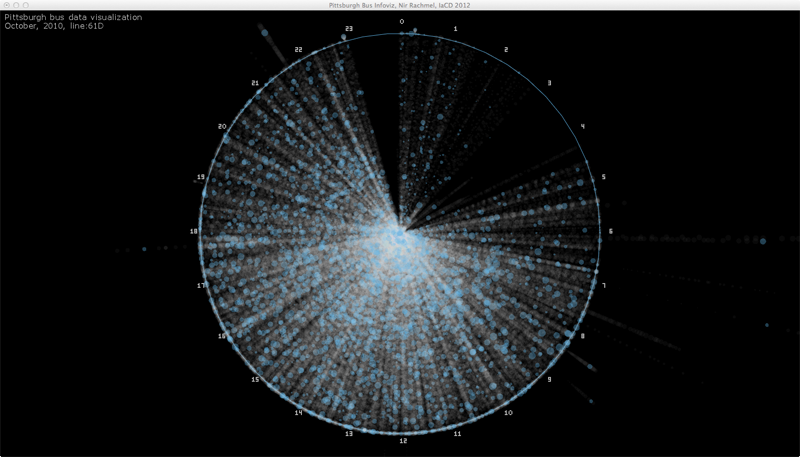
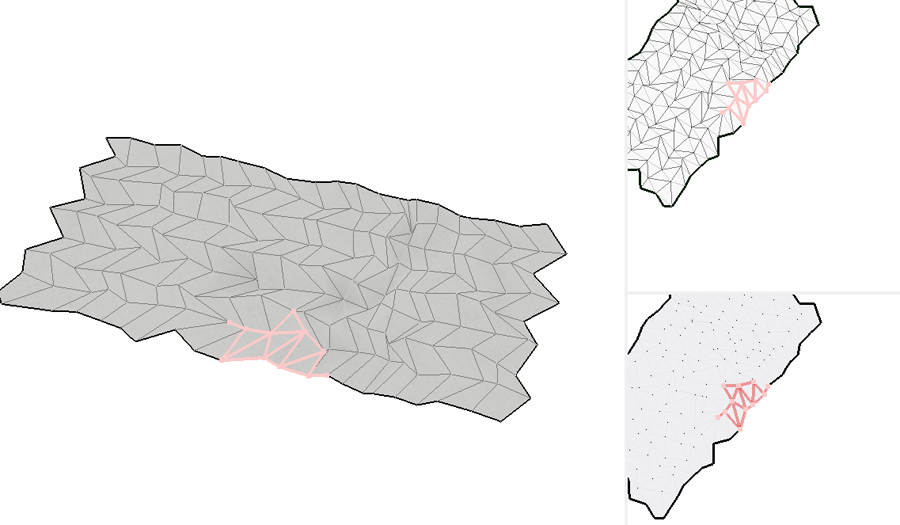
Each bus trip was plotted along the radius of a circle, from the center to the circumference. The angle relative to 12 o’clock is computed according to the time when a trip started. All 24 hours are covered in this diagram.

Each stop was represented as a circle whose area correlates with the number of people on the bus at that stop. To avoid clutter (remember, 700k trips!), I added a threshold of people requires to have a circle drawn. If the number of people is below the threshold, only a dot is printed. This allowed more significant patterns to be seen rather than just a clutter of overlapping circles.

Each bus route has different flavors. The more straightforward ones are inbound and outbound, but there are also five others which I have no data explaining their nature (but are also less significant). Each of these flavors was colored differently so the viewer can distinguish if patterns differ between these flavors.

In terms of interaction, the user can look at the different bus routes and alternate between them. In addition, for each chosen route, the user can adjust the threshold to see the impact of low vs. high threshold on the clarity of the data visualized in front of him.

Project’s value

During the exhibition I have witnessed two common responses to my work. First, was “… How did you get your hands on this data?…”, second was “.. This is pretty cool!”. For me, my mission was accomplished. My work has transformed a boring and inaccessible database sitting on a server at CMU to something available to the public in a way people can understand and see. The interactive portion of my application alongside my choice of popular lines encouraged visitors to explore and see the busses they use everyday in a way they have never seen before.

On another note, busses are part of the public transportation system. I am a strong believer in mass transit as a system the reduces pollution and traffic and acts as a social tool that allows all people to exercise their freedom to move, to work and to reach any service they require to lead a good and healthy life. I enjoyed working on something I care about and has a meaning to society rather than just be fun, cool or aesthetic.

 Process

I made up my mind to do a data visualization project for my final piece and spent a significant amount of time until I came across the Port Authority database of buses. I was looking for a database large enough to challenge me and fit the scope of a final project, to hold the potential to answer intriguing questions and to be interesting to the general public.

It took me time to get hold of the data for technical reasons, but I knew beforehand, qualitatively, what kind of information is in the database. I was curious about bus occupancy, given the very unpleasant experience of standing at the bus stop and having been skipped by a passing bus more than once. I wanted to see if I could find patterns in bus occupancy and learn where and when does it occur.

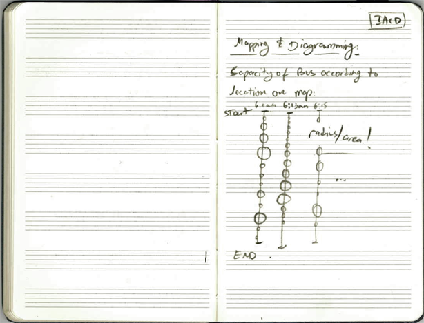
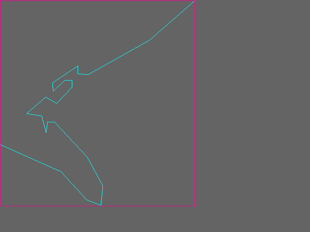
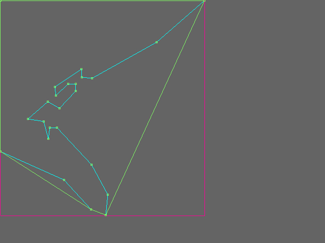
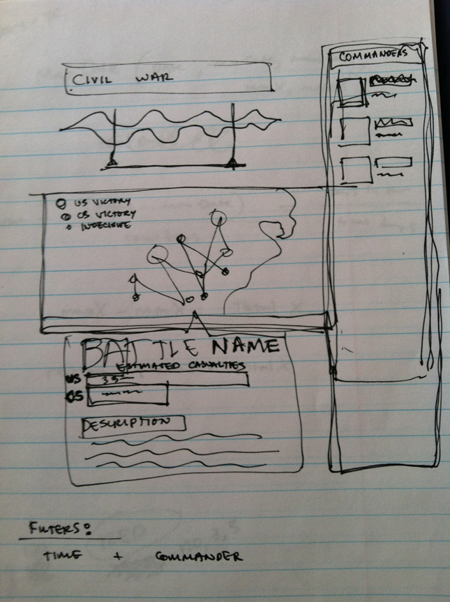
I developed sketches of the data visualization I would like to make:

At first, i thought about visualizing the data in a linear way. Once I learned how big the database is, I dropped this idea.

Next, with the advice of my professor, I developed the circular visualization which I actually used for my project.

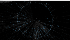
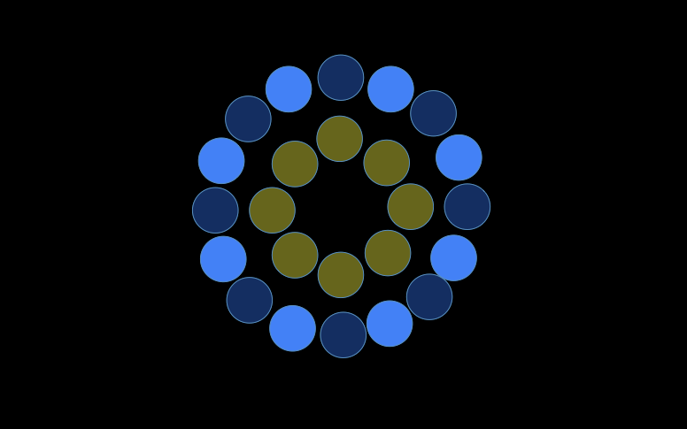
I used open frameworks, and started playing with randomly generated data to test my infrastructure and see what would be the best way to visualize this dataset:

I then switched to using the real data and experimented with color and shape sizes. I realized that color should be used sparingly and only when it serves a purpose, following are some of my experiments:


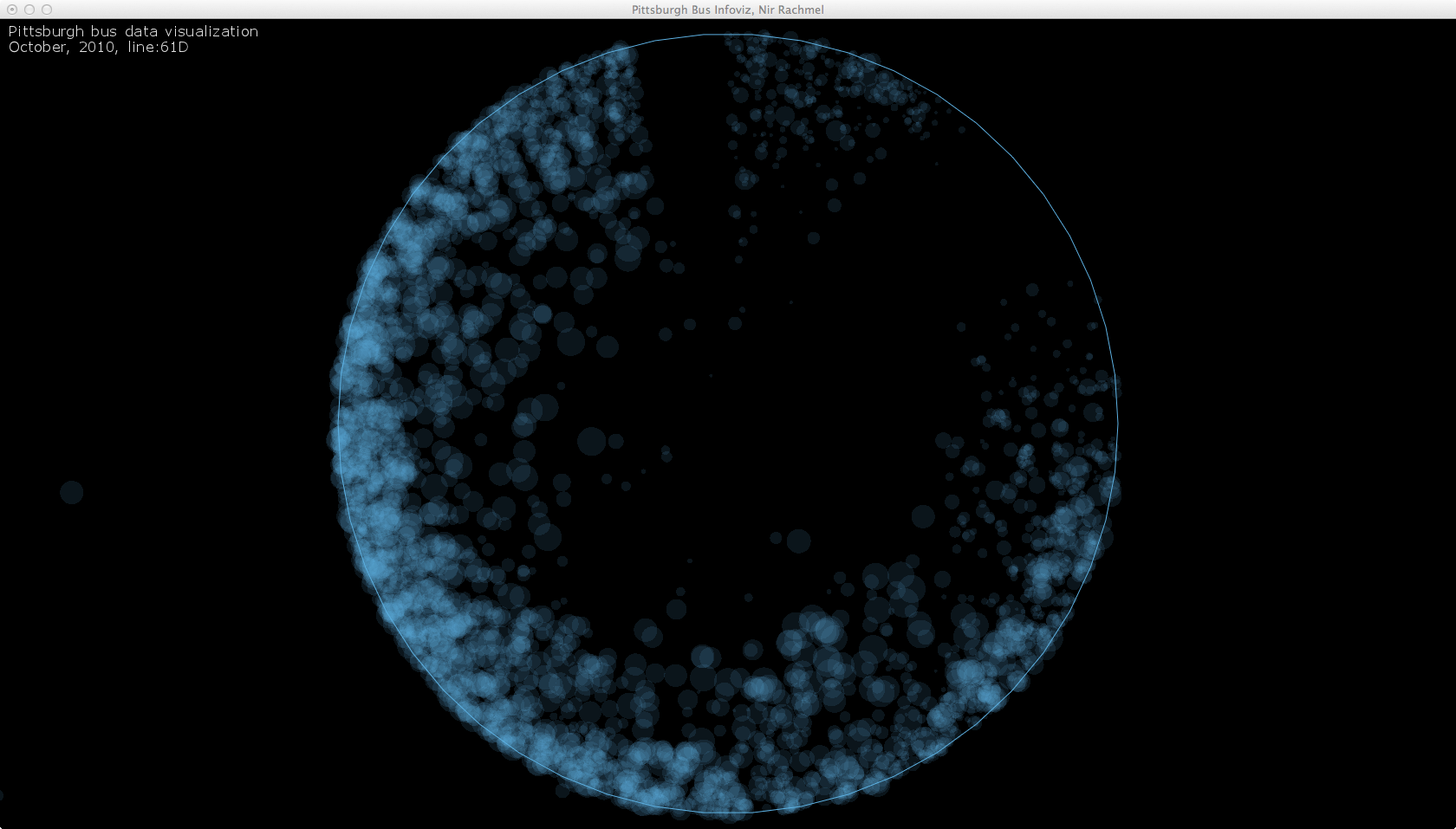
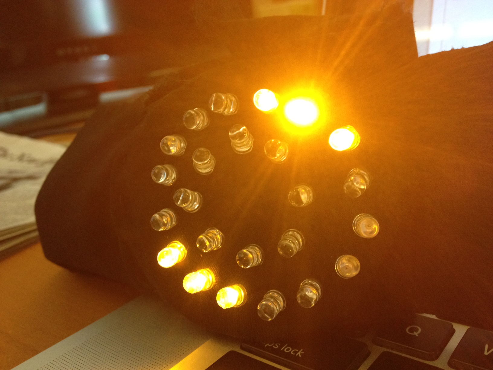
At this point I realized something is wrong. Looking at these visualizations, it seems as if the busses get full near the end of their trip, while I know that most of these busses get full somewhere in the middle of their trip.

Carefully examining the data and my code, I made some changes, and then this beautiful accident happened:

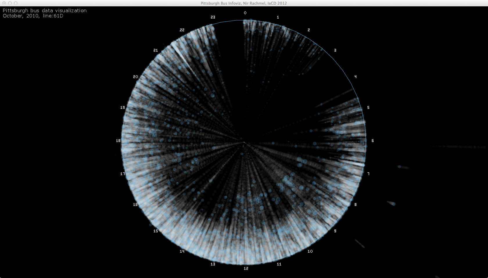
Finally, addressing these issues I came up with a reliable and working system that I can trust and experiment with.
In the following image you can see only the busiest stop colored and all the rest of the stops rendered but grayed, which still looks cluttered:

The following image shows only stops where the bus had more than 50 people on it in a blue circle. Every other stop is represented by a single, white pixel:

After playing with the rendering threshold, I realized that each bus route has a different volume of passengers. I also found that playing with this parameter can be fun and engaging for users. My final step towards completing this project was to add a slider so the users can control the threshold dynamically and a drop-down list to select which bus route to observe.

Before the final video, just a reminder of where we started from, and how the data “looks” like:

Kaushal Agrawal | Final Project | Snap

by kaushal @ 4:01 am 10 May 2012

OVERVIEW


A picture is worth a thousand words. Today pictures have become popular means to capture and share memories. With the presence of high end cameras on mobile devices sharing pictures have become even faster and convenient. However clicking pictures still requires pulling out a device from your pocket.

Snap is built on the idea of allowing people to click pictures on the go. It uses a camera mounted on the glasses to click pictures and store them to your hard drive. A person can simply click a picture by creating a ‘L’ shaped gesture. It is similar to a person making a frame with two hands, instead Snap uses one hand and fills up for the missing point in the frame. The project makes uses the concept of skin segmentation to separate a hand from the background and uses hand gesture recognition concepts to identify the click gesture. Once the gesture is recognized it captures the region of interest contained within the half drawn frame.

VIDEO


[youtube http://www.youtube.com/watch?v=rJ8hy1Xfs6s&feature=youtu.be; width=600; height=auto]
MOTIVATION

The project idea was driven from the video called the “Sixth Sense”. The project uses a camera + projector assembly that hangs around the neck of a person and is used to take picture and project images on a surface. The person has radio-reflective material tied to their fingers. Whenever a person wants to click a photo, they create a virtual camera frame with their hands which triggers the camera to take a picture of the landscape contained in the camera frame.

[youtube http://www.youtube.com/watch?v=YrtANPtnhyg; width=600; height=auto]

IMPLEMENTATION


Snap is an Openframeworks project and uses OpenCV to achieve this goal.

Original Image

The video stream from the camera is polled 5 times per second. The captured frame from the camera acts as the original image. The video resolution is set to 640 X 480 to test and demonstrate the concept.


YCrCb Image

The image is then converted from RGB color space to YCrCb color space. The Y component describes brightness and the other values describes the color difference rather than a color. In contrast to RGB, the YCrCb color space is luma independent, resulting in a better performance.


Skin Segmentation

The YCrCb image is then thresholded between minimum and maximum values of Y, Cr and Cb to separate skin colors from the non-skin colors in the background.


Morphological Operations

The resulting skin segmented image is further cleaned by using morphological operations, erosion and dilation. This reduces the noise in the image and sharpens the image.


Contours

The morphed and cleaned image is further processed using OpenCV to find out contours.


Hand Gesture Tracking

The largest contour is selected and a convex hull is created for that contour. The contour and convex hull are then used to find out convexity defect which are the local minimums in a hand. The resulting convexity defects and the contours are searched for the largest perimeter between the start and the end of the convexity defect. Also the angle created by this defect is filtered between 80 to 110 degrees.


Frame Creation

Once we successfully filter the criteria for a gesture, a frame is constructed using that recognized defect. The image is rotated so it is easy to crop it. The three yellow circles form the vertexes of the resulting image.


Final Image

The original image is then cropped to produce the final image that is stored on the computer.

Final Project – Luci Laffitte – Intersecta: Pollination Wall

by luci @ 2:26 am

Intersecta is an experimental exhibit, currently being developed for the Carnegie Museum of Natural History, which explores the connection between insects and people. The project uses Kinect technology to allow visitors to discover what insects do for us — by highlighting the human foods for which insects are crucial pollinators.

[youtube http://www.youtube.com/watch?v=AVHvlhy3rsk&w=600&h=335]

Overview:

Intersecta is an experimental exhibit being developed for the Carnegie Museum of Natural History that explores the connection between insects and people (as part of my senior design capstone course). The exhibit will use kinect technology to allow large white walls to be interactive. For my project I am prototyping the Pollination wall. This piece of the exhibit allows visitors to explore what insects do for us by showing which foods that we eat insects are crucial to pollinating. An interactive gigapan image will show the different aspects of an insects’ anatomy that contribution to it’s role as a pollinator. In the second section, lights will illuminate which the fruits and veggies the insect pollinates. In the final section, visitors will see recipes made from the foods that the insect makes possible, and save specific ones to their bug block.

Motivation:

I wanted to do this project so I could display an example of the work my design teammates and I conducted over the course of the semester and prove that the technology is possible and affordable.

Process:

I struggled with deciding on my exact set-up for this project because our design in full-scale calls for a 5’x12′ wall with an advanced short throw projector. However using the one kinect I had access to did not allow me to sense users across the entire length of the wall. That being said, I decided that I would try a slightly scaled down version of the wall (about 7 feet long) with the kinect at different angles to try to get the best touch detection. I tried positioning the kinect above, to the side, and from behind. After several days of experimenting, and considering that my ultimate goal was the present this in a large open room at the museum, I settled on setting up the kinect from behind.

Method:

From there I used synapse for kinect and Dan Wilcox’s git hub example to track the skeleton of a user. By defining where hotspots are located on the board, and entering into the program the location of the four corners of the wall according to the kinect, I was able to reliably allow a user to interact with an interface.

The Interface:

The Setup

Images of User Interaction:

This image shows a friend interacting with the program with the Kinect from behind and a low-quality projector from behind. This is why part of the interface is projected on his hand. The green circle shows where the system thinks his hand is! Wooo!

HeatherKnight — Expressive Motion

by heather @ 10:29 pm 9 May 2012

Designing Expressive Motion for a Shrubbery… which just happens to be a lot like designing expressive motion for a non-anthropomorphic social robot AND an exploration of theory of mind, which is when you imagine yourself in another agent’s place to figure our their intention/objective!

Turns out we’ll think of a rock as animate if it moves with intention. Literally. Check out my related work section below! And references! This is serious stuff!

I’m a researcher! I threw a Cyborg Cabaret! With Dan Wilcox! This project was one of the eight acts in the variety show and also ended up being a prototype for a experiment I want to run this summer!

[vimeo=http://vimeo.com/42049774]

Here’s my fancy-pants description:

What is the line between character and object? When can movement imbue a non-anthropomorphic machine with intent and emotion? We begin with the simplest non-anthropomorphic forms, such as a dot moving across the page, or a shrubbery in park setting with no limbs or facial features for expression. Our investigation consists of three short scenes originally featured at the April 27, 2012 Cyborg Cabaret, where we simulated initial motion sets with human actors in a piece called ‘Simplest Sub-Elements.’ 

[vimeo=http://vimeo.com/41955205]

Setting: A shrubbery sits next to a park bench. The birds are singing. Plot summary: In Scene I, a dog approaches the shrubbery, tries to pee on it, and the shrubbery runs away. In Scene II, an old man sits on a park bench, the shrubbery surreptitiously sneaks a glance at the old man, the old man can’t quite fathom what his corner of eye is telling him, but eventually catches the bush in motion, then sequentially moves slowly away, gets aggressive and flees. In Scene III, a quadrotor/bumblebee enters the scene, explores the park, notices the shrubbery, engages the initially shy shrubbery, invites her to explore the park, teachs her to dance, ending in them falling in love.

As continuing work, I want to invite you back to participate in the recreation of this scene with robotic actors. In this next case, you can help us breakdown the desired characteristics of expressive motion, regardless of programming background by describing what you think the Shrubbery should do in three dramatic scenes using three different interfaces. These include 1) written and verbal descriptions of what you think the natural behaviors might be, 2) applets on a computer screen in which you can drag an onscreen shrubbery’s actions and 3) a sympathetic interface in which you move a mini-robot across a reactables surface with detection capabilities.

If you would like to participate, send your name, email and location to heatherbot AT cmu DOT edu with the subject line ‘SHRUBBERY’! We’ll begin running subjects end of May.

We hope your contributions will help us identify an early set of features and parameters to include in an expressive motion software system, as well as evaluate the most effective interface for translating our collective procedural knowledge of expressive motion into code. The outputs of this system will generate behaviors for a robotic shrubbery that might just be the next big Hollywood heartthrob.

INSPIRATION

Heider and Simmel did a great experiment in 1944 (paper here) where they showed that people think moving dots are character. This is the animation they showed their study subjects without introduction:

[youtube=http://www.youtube.com/watch?v=76p64j3H1Ng]

All of the subjects that watched the sequence made up a narrative to describe the motivations and emotional states of the triangles and circle moving through the frames, with the exception of those that had lesions in their brain. This is good news for social robots; even a dot can be expressive, so Roombas have it made! The section below outlines in further detail why this is so. The experiments we wish to run will explore this phenomena in more detail and seek to identify the traits that a machine could use repeatably and appropriately.

RELATED WORK // THE NEUROSCIENCE

Objects can use motion to influence our interactions with them. In [6] (see bottom of post for references), Ju and Takayama found that they could use a one-axis automatic door’s opening trajectory affected the subject’s sense of that door’s approachability. The speed and acceleration with which the door opened could reliably make people attribute emotion and intent to the door, e.g, that it was reluctant to let them enter, that it was welcoming, urging entrance or that it judged them and decided not to let them in.

This idea that we attribute character to simply moving components is longstanding [7]. One of the foundational studies, the video of which was discussed above, reveals how simple shapes can provoke detailed storytelling and attribution of character is Heider’s ‘Experimental Study of Apparent Behavior’ in 1944 ([4][5]). The two triangles and a circle move in and around a rectangle with an opening and closing ‘door.’ Their relational motion and the timeline evoked in almost all participants a clear storyline despite the lack of introduction, speech, or anthropomorphic characteristics outside of movement.

These early findings encourage the idea that simple robots can evoke a similar sense of agency from humans in their environment. Since then researchers have advanced our understanding of why and when we attribute mental state to simple representations that move. For example, various studies identify the importance of goal directed motion and theory of mind for attribution of agency in animations of simple geometric shapes.

The study in [1] contrasted these attributions of mental states between children with different levels of autism and adults. Inappropriate attribution of mental state for the shape was used to reveal impairment in social understanding. What this says is that it is part of normal development for humans to attribute mental state and agency to any object or shape that has the appearance of intentional motion.

Using neuroimaging, [2] similarly contrasts attribution of metal state with “action descriptions” for simple shapes. Again, brain activation patterns support the conclusion that perception of biological motion is tightly tied into theory of mind attributions.

Finally, [3] shows that mirror neurons, so named because they seem to be internal motor representations of observed movements of other humans, will respond to both moving hand and a non-biological object, suggesting that we assimilate them through along the same pathway as we would use if they were natural motions. Related work on robotics and mirror neurons includes [10].

Engel sums up the phenomenon with the following, “The ability to recognize and correctly interpret movements of other living beings is a fundamental prerequisite for survival and successful interactions in a social environment. Therefore, it is plausible to assume that a special mechanism exists dedicated to the processing of biological movements, especially movements of members of one’s own species…”  later concluding, “Since biological movement patterns are the first and probably also the most frequently encountered moving stimuli in life, it is not too surprising that movements of non-biological objects are spontaneously analyzed with respect to biological categories that are represented within the neural network of the [Mirror Neuron System]” [3]

RESEARCH MOTIVATION

Interdisciplinary collaborations between robotics and the arts can sometimes be stilted by lack of common terms or methodology. While previous investigations have looked to written descriptions of physical theater (e.g. Laban motion), to glean knowledge of expressive motion, this work evaluates the design of interfaces that enable performance and physical theater specialists to communicate their procedural experience of designing character-consistent motion without software training. In order to generate expressive motion for robots, we must first understand the impactful parameters of motion design. Our early evaluation asks subjects to help design the motion of a robot without limbs that traverses the floor with orientation over the course of three interaction scenarios. By (1) analyzing word descriptions, (2) tracking on-screen applets where they ‘draw’ motion, and (3) creating a miniaturized scene with a mockup of the physical robot that they move directly, we hope to lower the cognitive load of translating principles of expression motion to robots.These initial results will help us parameterize our motion controller and provide inspiration for generative expressive and communicatory robot motion algorithms.

ADDITIONAL IMAGES

Surprised Old Man gives the shrubbery a hard look:

Sample scene miniatures displayed at the exhibition:

REFERENCES

[1] Abella, F., Happéb, F., Fritha, U. Do triangles play tricks? Attribution of mental states to animated shapes in normal and abnormal development. Cognitive Development. Volume 15, Issue 1, January–March (2000), pp 1–16.

[2] Castelli, F., et al. Movement and Mind: A Functional Imaging Study of Perception and Interpretation of Complex Intentional Movement Patterns. NeuroImage 12 (2000), pp 314-325.

[3] Engel, A., et al. How moving objects become animated: The human mirror neuron system assimilates non-biological movement patterns. Social Neuroscience, 3:3-4 (2008), 368-387.

[4] Heider, F., Simmel, M. An Experimental Study of Apparent Behavior
The American Journal of Psychology, Vol. 57, No. 2. (1944), pp. 243-259.

[5] Heider, F. Social perception and phenomenal causality. Psychological Review, Vol 51(6), Nov, 1944. pp. 358-374

[6] Ju, W., Takayama, L. Approachability: How people interpret automatic door movement as gesture. International Journal of Design 3, 77–86 (2009)

[7] Kelley, H. The processes of causal attribution. American Psychologist, Vol 28(2), Feb, 1973. pp. 107-128

Alex Wolfe + Mahvish Nagda | Waterbomb

by a.wolfe @ 4:11 pm

For our final project, we completed a series of studies experimenting with soft origami in the context of creating a wearable. Kinetic wearables are often bulky, with incredibly complex mechanical systems driving them. We wanted to create a simpler lightweight system without sacrificing the drama of global movement, by capitalizing  on the innate transformative qualities of origami.

We developed several methods of creating tessellations that cut normal folding time in half, and were simple to create in bulk and at a huge scale. These included scoring with a laser cutter, creating stencils to use the fabric itself as a flexible hinge, and heat setting synthetics between origami molds. We also examined the folds themselves, writing scripts in Processing to generate crease patterns that either focused on kinetic properties or being able to control the curve and shape of the final form.

These studies culminated in a dress that took advantage of the innate kinetic properties of the waterbomb fold to display global movement over the entire skirt structure with a relatively lightweight mechanical system. The dress moves in tandem with a breath sensor, mimicking the expanding/contracting movements of the wearer.

Inspiration + Background

(images from left to right: Tai + Nussey’s Pen Nib Dress, Intimacy 2.0 by studio roosegaardeOrigami Hemisphere by tactom)

When we began this project, Mahvish and I were really interested on how we could get a garment to move in an interesting way. Most electronic wearables focus on lighting up using LEDs (since they don’t require much power and it is an instantaneous noticeable effect) and we really wanted to move away from that. As two women who like dressing up a lot, there were not many scenarios where we would want to be blinking or emitting light (several amazing jackets for cycling/safety, and those sneakers that light up when you walk aside). However, kinetic pieces with really impressive/dramatic movement, like the Pen Nib Dress above, require equally impressive electrical systems underneath to make it move that really discourages daily wear. Magnificently engineered ones that don’t, like the Intimacy collections, relied on custom e-foils that were inaccessible and out of our price range.

We wanted to create our own fabric, similar to the efoils, that had some sort of innate property that would allow us the global movement we desired, without having to connect an individual motor to each moving element. Our shared interest/past experience with origami stared us down the ridiculously long and meandering path documented below.

Prototypes

Paper/Cardboard

Really the key to beautiful origami is precision, one thing computers are great at, and humans are not. For our initial explorations we created by perforating the crease patterns into various materials, eliminating the hours of pre-folding usually needed to create these tessellations. Initially we split each design in two, and etched one side of the material where we wanted mountain folds, and the other with valleys. However, despite much time wasted fiddling with settings, the etchings proved to be either not deep enough to be useful, or cut all the way through the material. It turned out to be much easier to have perforated vectors that could be folded into mountains or valleys. Using Processing scripts (and ToxicLibs libraries), we then generated known folding patterns, focusing on those with interesting kinetic properties. Once we had the scripts written, it was easy to tweak the angles and intersections of the patterns in order to produce different overall curvatures and behaviors.

screens from our generative miura ori code. We generated the pattern based on the points in a user controlled spline to control curvature in the final piece. We can also add noise to the patterns and export .dxf files for prototyping in Tactom‘s freeform origami simulator

Heat Setting

One of the most interesting curvatures we found was the Origami Hyperbolic Parabola. As you tween between an equilaterial  triangle and a square, the simple pattern transitions from being completely flat to a perfect parabolic curve. We decided to use it as a base for our studies in heat setting.

While researching various shibori techniques, we discovered that synthetic fabrics can be melted and then quickly cooled in order to retain very complex shapes relatively robustly. We placed synthetic organza between two parabola moulds and heated it. We explored steaming and baking the moulds.

We steamed for 15 minutes. We found that steaming deteriorated the moulds and the final creasing wasn’t as strong.

Baking was much more effective but needed at least 30 minutes at 170 degrees. However, the folds were quite durable and could withstand any pulling/tugging and even washing we threw at it. We also used thicker paper for the moulds with tighter creasing.

Stenciling

Earlier in the process, we had planned to actuate the dress with nitinol, and decided to use thermochromatic dye for our fabric which would react to the heat it generates. However, nitinol was far too weak to create the movement we wanted, though the dye worked surprisingly well as a stiffening agent.

By stenciling in the dye into the non-crease areas and leaving the creases un-dyed, we were able to effectively pre-crease the fabric, and create bi-directional folds that didn’t need to be refolden/broken in. We used the generated crease patterns to laser cut stencils, and used them to silk screen the pattern onto muslin fabric. The parts that were un-dyed were more pliable and because of this combined with the fabric being more accommodating than paper, we were able to cut down the folding time to about half an hour (from 3 hours). We started with a smaller prototype  waterbomb tesselation and then made a skirt using a larger crease pattern. Because stencils that we got from the laser cutter can only be so wide, we silk screened smaller sections and then stitched them together. To strengthen the folds, we ironed the creases. We also found that stiffener (Stiffen Spray) was inflammable and ironing it on made the creases stronger post folding.

Mechanical System

Once we had the waterbomb fabric, we looked at different mechanical systems that we could use to actuate it. We finally decided on monofilament truss system that we threaded through eyelets that we laser cut and hand sewed onto the vertices of the waterbomb valleys. We used these to control the movement we wanted from the dress via 3 cords made up smaller connections from the wiring in the dress. One string controlled the front vertical movement of the dress, the other the back vertical movement and the last one controlled constricting horizontal movement.

Electrical System

Mahvish and I are both software kind of girls with experience in small scale robotics, so we were super excited to jump in and …learn some basic electrical engineering. We designed the system to be relatively straightforward with that in mind. We anchored most of the heavier elements to the incredibly sturdy zipper of the dress so we wouldn’t need crazy boning/corsetry to hold it up.

One of the most exciting elements of this project for us (and ultimately, the key to our doom), was the fact that we built the key elements of the electrical system ourselves. We hacked some basic hobby servos Mahvish had for continuous rotation by removing the pentometer and replacing it with two 2.2kohm resistors. We also built a voltage regulator so we could power our initial design, which required 5 normal servos, off of a single 9volt that we ended up scrapping, but were immensely proud of. Lastly the breath sensor built into the collar took advantage of the thermochromatic paint. When the wearer breathes on it, the paint changes color which is picked up by a light sensor and sent to the Lilypad.

(parts from top left clockwise: diy continuous rotation servo with bobbin, battery packs x2, diy voltage regulator, breadboard prototype for the breath sensor, slightly more buff diy continuous rotation servo hot glued to laser cut mount)

Kinetic Waterbomb Dress


Eli Rosen – Final Project – Civil War

by eli @ 3:40 pm

Civil War

This interactive data visualization allows for self-directed exploration of the battles of the American Civil War.  The aim was to facilitate an understanding of the conflict on multiple scales from the entire war to a single battle.  The interactive data visualization is live at www.elibrosen.com/civilwar.  Here are a few screenshots of the web application:


Here is a video of the web application:


Inspiration

The American Civil War is to this day the costliest (in terms of casualties) of all American conflicts.   The records of the war have been scrutinized and documented extensively by historians and the events of the war have inspired countless novels and films.


Amongst some, there is an almost cultish obsession with the history and personas of the Civil War.  Maybe it is a romanticized notion of war and bravery that stirs people’s passion, or perhaps it is an understanding of the war’s profound impact on our nation’s history.  Whatever the reason, people seem to want to relive and recreate the war in vivid detail.  It is this desire that has spawned projects like Ken Burns’ 11-hour documentary, the iPad app The Civil War Today (which delivers daily Civil War news 150 years late), and annual live action reenactments.


I wanted to tap into this existing desire to understand the events of the war by creating a visual tool that would allow users to explore the battles of the war chronologically, geographically, by the victories, and by the number of casualties.   I had come across this visualization by Gene Thorp for the Washington Post (http://www.washingtonpost.com/wp-srv/lifestyle/special/civil-war-interactive/civil-war-battles-and-casualties-interactive-map/) and felt that it could be strengthened by including some of the other dimensions of information available about the battles.  For example I had captured information on which side won each battle and who the commanders were.


First Iteration

My first attempt to visualize this dataset focused on the commanders.  I plotted the battles chronologically on a timeline and for a selected battle I drew connections between the current battle and all other battles that the commander fought in.  This tool provided some insight into the record of a commander across the war but the result was messy and a bit hard to interpret.  This version was also built in processing which made it more difficult to share.  Here is a screenshot and video of this first prototype:


Redesigning the Visualization

Here are a series of sketches and screenshots as I redeveloped the design:

I wanted to keep the timeline element but transform it into a navigation tool.  The timeline I decided should be a way to focus in on a battle or portion of the war that was of interest to the user and should also give the user a quick impression of how the war unfolded over time.  Instead of plotting the battles as circles along the timeline I plotted each as a bidirectional bar graph, pairing the casualties for the Union and the Confederacy for each battle.  This gives an impression for the scale of the battle and for how evenly casualties were distributed.  For a method of selection and filtering the data I arrived at the design of a dual slider.  The dual slider acts as a range selector, and as it is adjusted the changes to the data are reflected.  This allows for an interaction where the changes in the data can be digested over time as an animation.


To the timeline I added a map where the battles are plotted geographically.  Here I colored and sized the battles as I had in the first iteration of the visualization, with color indicating who won the battle and area indicating the total number of casualties in the battle.  Hovering over the battles provides summary information, while clicking on the battle opens a new window with a brief description of what happened.  This allows a user to search for battles in an area of interest and answer questions like, “what was the furthest north the war went?”


For the final panel of information I wanted to provide summary statistics about the selected range of battles.  Statistics include how many battles are fought, the total casualties on each side, and the victories on each side.  These statistics allow the user to understand who was winning the war across a range of selected battles.  A list of selected battles is also provided if the user wants to read about a specific battle.  When hovering over a battle in the list the battle is highlighted in the timeline view and its summary information is displayed on the map.  Clicking the battle name again brings up a window with a battle description.


Ball Pit Visualization

I also toyed with the idea of an alternate view where each individual battle in range would be visualized as a physics object.  In this view, which my friend Evan Sheehan has termed a “ball pit visualization,” each battle would have been represented as a pie chart dropped into a “pit.”   Each pit would correspond to who had won the battle.  The idea behind this approach is that it would provide a fun (if slightly unscientific) way to show the victories on each side normalized by the importance of the battle (where total casualties stands in for importance).  In the screenshots below you can see the Union victories on the left, inconclusive battles in the center, and Confederate victories on the right.  In the final version the circles would have become pie charts showing the percentage of casualties on each side.  The pie charts would have been selectable, allowing a user to dig through the ball pit as a form of navigation.  As the timeline sliders were adjusted battles would have popped into and out of existence so that the balls in the pits would have been shifting constantly over time.


How it was Built

I was able to parse the data from www.civilwar.com using a python script.    The data was pushed into an XML document.  I used HTML5, jQuery, JavaScript, and the Google Maps API to create the web application.  The website features custom built widgets drawn on the HTML5 canvas, including a double slider, a scroll bar, a pie chart, and animated bar graphs.


Future Direction

I had some performance issues in integrating feedback into the Google Map.  Ideally I would have the battle highlighted in every one of the views (map, list, timeline, graphs) no matter where it is being selected or hovered over.  This is a functionality I will have to explore further moving forward.


Although I want the visualization to be a tool for exploration rather than simple data retrieval, after seeing how users interact with the application it is clear that many people want to validate their existing knowledge of the Civil War.  People often wanted to find Gettysburg or Antietam in the data but were not sure where to start.  Addressing this issue will mean providing more convenient ways of retrieving information on a specific battle.  The solution is probably as simple as providing an option to sort the list of battles alphabetically, but this is a feature I would like to implement in the near future.


I would also like to incorporate the narrative of the commanders more fully.  Adding a filter for individual commanders would provide another layer of interest to the application.  Seeing the number of casualties inflicted and suffered under a particular commander could prove to be quite interesting.  The same goes for looking at victories and defeats on a commander-by-commander basis.  You could identify the commanders with the highest winning percentage or isolate instances where an experienced commander was defeated by an upstart.  Finally, you could plot a commander’s route through the war (or a rough estimate of this route) by connecting a commander’s geographically plotted battles in chronological order.  This is a functionality I would love to add to the application to provide opportunities for more nuanced insight.

KelseyLee-Motion in LEDs

by kelsey @ 1:10 am 8 May 2012
What is Motion in LEDs?

Motion in LEDs is a project about movement visualization.

I began by creating a bracelet, which can be worn on the ankle and wrist. It is made from an Arduino Nano, LEDs, and an accelerometer and continuously blinks through a preset pattern. The faster the movement detected, the more quickly the cyclic LED pattern blinks. If the user is moving very fast, and reaches a specified threshhold, the bracelet will briefly flash blue. The wearer can also switch through the three preset patterns when achieving a high enough X-tilt.

I then took long-exposure photographs of people wearing this bracelet. I asked them to walk, dance, jump or do whatever they felt like and then tagged each photo with that action. The resulting photos are then records of their movement in the form of light.
Sources of inspiration

[youtube=http://www.youtube.com/watch?v=cxdjfOkPu-E&w=500]

[youtube=http://www.youtube.com/watch?v=6ydeY0tTtF4&w=500]

Process
Materials Used Include:

  • Arduino Nano
  • 16 super bright yellow LEDs
  • 8 super bright blue LEDs
  • wire
  • accelerometer
  • black fabric
  • velcro
  • Duracell instant USB charger

I first started to design the bracelet. I was originally thinking of linear patterns, but later realized that cyclic patterns would be more interesting. I decided upon 2 concentric circles of different color LEDs and used powerpoint slides to prototype what different patterns would look like.

I then bought supplies to build the actual bracelet.Based on the properties of the Super Bright Blue LEDs and Super Bright Yellow LEDs, to be able to power the 36 LEDS that I originally envisioned (24 outside, 8 inside) I would needs to wire the outer LED circle as 8 pairs of LEDS in serial, and I would need to wire the inner LED circle as 4 pairs of LEDs in parallel. I would loose some freedom in controlling the lights, because i would have to light up pairs of lights at once, however this was a better compromise compared to using less LEDs or making an even more complex circuit to work with. Since the design was cyclic, I decided to wire the LEDS that were in serial, diagonally across from each other. This resulted in a lot of crossed wires and potential for shorts due to all the wires crossing over the circle’s center. After soldering all the wires and LEDs in place I made sure to use hot glue and insulte the connections so they would not touch.

I then worked on the fabric bracelet that would hold the LED circle, arduino, accelerometer, and wires. The bracelet has a pocket to hold all of the electronics and closes with a piece of velcro so that it’s easy to be put on. With the flexible design it could also be worn on the wrist and arm.

Finally, all that was left was to take long-exposure photographs of people moving with the bracelet on. Photos ranged from about 3 seconds to 20 seconds long and were taken in mostly pitch black rooms for maximum impact.

Sample Photos

Motion in LEDs Video?
[youtube=”http://www.youtube.com/watch?v=nMa3lzXvga8&feature=youtu.be&w=500″ title=”Motion_In_LEDs” width=”549″ height=”332″]

Evan Sheehan :: Final Project :: Be A Tree

by Evan @ 3:53 pm 7 May 2012

Be a Tree is an interactive installation wherein the viewer is transformed into, well, a tree. While standing in front of the piece with arms raised, the viewer’s body forms the trunk, and the arms form large boughs, as branches sprout from the viewer and eventually grow blossoms at their tips.

Be A Tree

My final project is an interactive installation wherein the viewer is transformed into a tree while standing in front of the piece with arms raised. The body forms the trunk, and the arms form large boughs, as branches sprout from the viewer and eventually grow blossoms at their tips. Built using openFrameworks, the piece uses OpenNI to detect the viewer’s pose and place branches along the torso and arms.

The source is available on github.

How It Works

The tree branches are simply stored in a binary tree (see what I did there?) structure; each node contains a length and angle. Drawing the branches is then simply a matter of traversing the binary tree in a depth-first manner and, at each node, applying a translation and rotation to the canvas before drawing. I used ofxOpenNI to set up the kinect and detect the user’s skeleton. I attached branches to various limbs on the skeleton such as the shoulder, humerus, and head. The entire branch structure is generated when the user is detected by OpenNI, and growth is simulated by progressively drawing deeper in the tree structure. Once a limb has reached its terminus, blossoms are added progressively to the end of the limb.

The silhouettes were drawn simply use the user masks provided by ofxOpenNI. Initially (as seen above), the silhouettes were drawn using vertices added to an openFrameworks shape. But this approach resulted in jagged, noisy silhouettes. To smooth out the noise in the silhouettes, I ended up using ofPaths instead.

Inspiration

I don’t really recall from whence this project idea came. I set out to continue my previous project by creating beings that constructed dwellings that were destroyed by viewers of the piece. At some point it changed in my imagination to a piece where the viewers were trees providing the habitat for forest creatures to appear. Eventually I dropped the creatures entirely, and here we are.

Preliminary Tests

Below you can see some of my preliminary tests where I had abandoned the human silhouette entirely. It was through conversations with the Professor’s 5-year-old son that I realized it was important that the people remain identifiable in the piece.

Speck and Afterimage — Luke Loeffler

by luke @ 5:21 pm 6 May 2012

My main goal for the final project was to get my feet wet in iPad development so I teamed up with Deren to work on a system for creating lenticular images. She has already documented the project on the blog, so I’ll mainly discuss some of the additional issues related to development here. Additionally, I created a second app which I describe further below.

The biggest difficulty was getting the lenticules to line up with the pixels on the screen. Unless you have a screen and a lenticular sheet that share a common DPI, there is going to be some degree of “optical beating.” I was able to overcome this somewhat by creating an interface to pinch-scale a calibration image until all you saw was the same color. The image was simply a series of stripes that stepped through the color spectrum repetitively, repeating every 13 columns. When everything was scaled correctly, you’d see all red, or all green, etc. at any given angle. If it was slightly off, it would cycle through the spectrum multiple times in an interference pattern.

Aside from the difficulties of getting resolutions to match, the interface was the second hurdle. We wanted it to be a fun way to combine numerous still images as seen in the documentation video, but this came at the expense of making subtle stereoscopic images. Golan suggested having a continuous recording mode so that the screen could be slowly, carefully, and slightly rocked. If we continue development, we may add this feature possibly by a double-tapping gesture on the screen.


Speck

Recently I bought my first iPad and have been addicted to it. The paper-resolution screen, form factor, and apps like flipboard make it the ultimate content consumption device. Consequently, it has found much use and the situation got me to thinking about consumption, distraction and attention.

In response I created an app, Speck, that is the extreme opposite; a meditative experience that excavates your own thoughts and content. Each time you load it, a small hazy dot is drawn in the middle of the screen for you to stare at. Through the struggle of staring at the speck on the screen, a new awareness of your internal thoughts is generated. The longer you look, the more things you see as your mind grows weary and drifts, tired of focusing.

Although the project is critical of consumptive culture and technology, and its simplicity may lead it to be seen as only a joke, there is also sincerity in its intent. It is a reference to an idea of William James, notable Victorian psychologist, in his Talks to Teachers series about attention.”Try to attend steadfastly to a dot on the paper or on the wall. You presently find that one or the other of two things has happened: either your field of vision has become blurred, so that you now see nothing distinct at all, or else you have involuntarily ceased to look at the dot in question…” [ p. 104 ]. He suggests that the only way to maintain focus is to study it intently, ask questions about it, and try to understand what it is.

But through this process, the mind takes various tangents and creates new stories and narratives which tend to break associative ruts. The tiny, hazy, abstract speck is surprisingly effective as it elicits various trains of thought which often collide with other things I’m thinking about and send them in a new direction.

After submitting the app for review to Apple to be placed in the store, the following response was received which only proves my position:

We found that the features and/or content of your app were not useful or entertaining enough, or your app did not appeal to a broad enough audience…

The original text for the app store:

With the proliferation of content consumption devices there is scarcely a moment when we are not willfully inundating ourselves with noise. Introducing Speck, a meditative app designed to elicit your own internal content. Through the struggle of staring at the speck on the screen, a new awareness of your internal thoughts is generated.


Final Project – Puzzling: An AR Puzzle Game

by Joe @ 11:46 am

The game, Puzzling, uses fiduciary markers attached to the participants to project virtual puzzle pieces at a designated distance. The players must, through any sort of bodily contortions possible, fit the projected images together to form a unified whole. No cheating!

The Gist of It
Puzzling is a creation born from a simple idea – Why do most augmented reality projections have to live so close to their associated markers? What happens when you toy with the spatial relationship between the two? How real can these virtual entities feel, and can they bring people closer together, physically or otherwise?


The game uses fiduciary markers attached to the participants to project virtual puzzle pieces at a designated distance. The players must, through any sort of bodily contortions possible, fit the projected images together to form a unified whole. No cheating!


Testing, 1,2,3
There was an unusually grueling process of ideation involved in selecting a concept for this assignment. I knew I wanted to do something with AR and Open Frameworks… but what? After tossing around ideas ranging from digital masks to a sort of lilly pad-based frog game, I settled on the current puzzle design.


Testing proved to be an enjoyable sort of chore, constantly adjusting variables until something resembling an interesting puzzle emerged. Due in part to time restrictions and in part to the maddening experience of learning a new library, programming environment and language all at the same time, a few features didn’t make it into the final version…
• Detection of when the pieces actually align
• Puzzles with more than 1 piece per person
• Puzzles for 3+ players
• Puzzles that encourage specific physical arrangements, like standing on shoulders or side-hugging.
• Mirroring and High-Res support


Opening Night
The final version of the game is relatively simple, but thoroughly entertaining. Despite the technically frustrating lighting conditions of the final presentation space, visitors stuck with the game for quite some time, a few even managing to successfully match the pieces!


« Previous PageNext Page »
This work is licensed under a Creative Commons Attribution-Noncommercial-Share Alike 3.0 Unported License.
(c) 2024 Interactive Art and Computational Design, Spring 2012 | powered by WordPress with Barecity