Brett Victor’s Bio
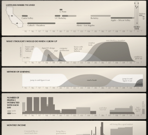
Brett Victor is awesome! Check out all of his work. The first thing I looked at when I visited his page a while back was this awesome Bio. Something like that one guy who charts pieces of his life, brett uses a simple timeline to show both the quantitative, like where he has lived, and mostly the non-quantitate like his certainty. I think its cool he is able to tell you a story about him using 6 graphs, most of which are hardly scientific.
The Billion Dollar-o-Gram
http://www.ted.com/talks/david_mccandless_the_beauty_of_data_visualization.html

I really liked most of the visualizations McCandless’s presented in the video. The one I’ll talk about is presented early on. The Billion Dollaro-Gram shows various economic spendings using tightly packed colored rectangles. The proximity and size of rectangles opens the door for users to make a multitude of interesting points. The effect of the financial crisis was actually tangible in comparison to all of the other expensive above it. I found it funny that Walmart revenues in that year were greater than the entire African debt. This reminded me how big our nation really was.
When Sea Levels Attack
http://www.informationisbeautiful.net/visualizations/when-sea-levels-attack-2/

As a whole this work can serve as to explain the effects of global warming. That is not what makes it special. What I like about this work especially is the number of variables of change it conveys without confusing the reader. There is data about time, water height, elevation of cities, An ever changing world map, and information about what caused the sea level change. All of this data is important in understanding each other. I think this article is able to compress this material perfectly with little loss.