Category Archives: Looking-Outwards

Andre Le

18 Feb 2014

[vimeo=http://vimeo.com/52192606]

Seismo

Seismo was a data visualization project developed by oblong industries, an interactive design agency that was behind the interfaces for the 2002 movie Minority Report. Here, they demonstrate the power of their Greenhouse SDK by allowing the user to freely interact with the data using purely gestures. They demonstrate both macro movements to move around, as well as micro movements for selection of data points. Finally, they show off the ability to seamlessly switch to smartphone interactions.


[vimeo=http://vimeo.com/79290868]

Calderan – Hyper Island

Calderan was a project developed by students from Hyper Island in Stockholm. Hyper Island is considered a boot camp for digital media artists. For their final presentation, they built a “holographic” display in which users would interact with using gestures. The holographic illusion is performed using an old optical trick called “Pepper’s Ghost.” In this instance, they project images on to four sides of a pyramid to give the illusion of a truly 3-dimensional experience.

[vimeo=http://vimeo.com/55599700]

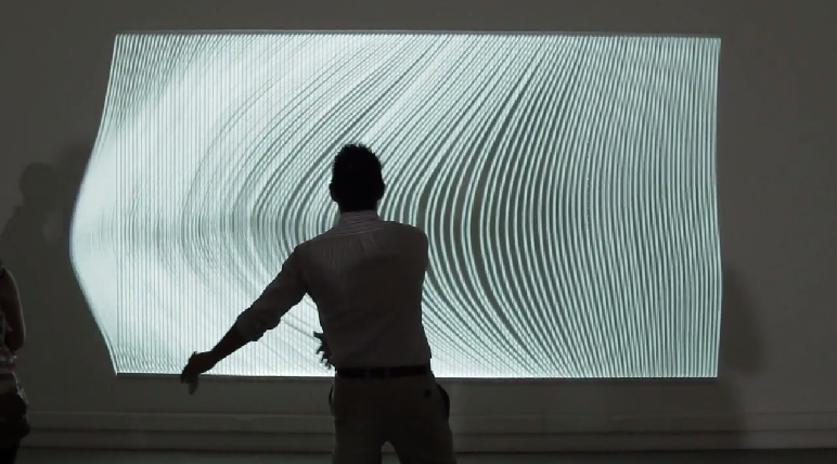
Lamps: Dumb things, Smart Light

In this video, Berg has taken on Google as a client to discover how to help people interact with the physical world. In this interaction design experiment, they toy with the concept of using “dumb” object with no technology built into them, and augment them using projection and camera tracking to create a dynamic interaction. This reminds me of another project seen in a previous IACD class where users could draw an interface and a projection of the actual interface would be projected on top.

Afnan Fahim

18 Feb 2014

Interactivity

1 – Webcam based interactivity with RevealJS

http://revealjs.herokuapp.com/

This project is inspiring because the creator thinks about how a commonplace document – the powerpoint – can be made more engaging and playful. The author uses webcam based gesture recognition to allow a user to control the flow of a slideshow. The project could have been more effective had it not just done complex computer vision algorithms but also supported rudimentary optimizations like if a finger is very close the the webcam and covers most of the view of the camera.

2 – Starfield

http://vimeo.com/36892768

In general I am a stickler for interactivity that goes beyond the desktop / mobile screen and stretches into the physical world around us. This project really took that liking to a whole new level. It is simple but really gives the user an immersive experience by accelerating the stars in the direction opposite to the rotation of the swing. I think the project could have been more realistic if the swings were suspended inside domes so that the user could get a 360 degrees view of the sky. However as it is, the project is really immersive and i’d love to try it out.

3 – A Louer

http://www.youtube.com/watch?v=skpS_C0HVik

This project signifies the social impact that interactivity can have. This application, built on openframeworks and featured on creativeapps, uses computer vision to detect location of passers by in the street, and then moves a commonplace “rental” sign board alongside the passers by as they walk. This is inspirational for me because it takes something really ordinary and makes it interactive for normal people walking on the street. These normal people get to experience something new, enjoy, and move on with their lives hopefully undistributed. This simple but engaging experience is what the makes or A Louer really got right.

Emily Danchik

18 Feb 2014

Aireal

This project was done at Disney Research on the CMU campus. Using a small device that shoots air at the participant, the project can simulate the feeling of pressure on one’s hands, such as blocking a soccer ball or feeling a butterfly fly up and down one’s arm.
Tactile feedback is still in its infancy, and this is a good solution, given the technologies we have available.


The Evolution Door

This project takes an everyday object and reimagines it in a way that is novel, but still practical. Instead of opening and closing like a typical door, this one rolls to the side in two sections in one graceful motion. The interaction is no more difficult than opening a traditional door, just different. The design is elegant and functional.


Make Like a Tree

In this project, as viewers move in front of the installation, their shadows are recorded and replicated further and further back in the forest, in a kind of delayed, reflective interaction.

MacKenzie Bates

18 Feb 2014

Ghost

Given the kind of weather we have been  having I thought this project was rather fitting. It is an interactive installation of a snow storm, raging within an abandoned, barren landscape. Using OpenFrameworks with OpenNI, OSC and custom shaders visitors become a part of the installation as their bodies are recorded and they are placed  within the storm in a line with their peers as they try to find a way out.

Weather Worlds

Thought it was an interesting compare/contrast to see two OpenFrameworks interactive weather-themed pieces side by side. Weather Worlds is an interactive installation that grants children weather controlling superpowers. Once again a camera and projection is utilized to allow visitors to become immersed in the environment. But instead of being a passive view who is scanned and then deposited, storms can be conjured with your hands, tornados twisted, you can literally make it rain (and in a far classier way than Juicy J’s Bandz A Make Her Dance interactive game).

Enra

This amazing projection augmented performance project has the goal to become the first single performance of “enra”. Enra is a new style of dance performance that combines video and physical expression. 

Not sure what they are using to accomplish the augmentation but it is quite impressive.

It is currently a Makuake project (Chinese version of Kickstarter I believe. Here is the page translated to english: here

Breeze

An Interactive L-System generator to design trees.

DevArt

Sama Kanbour

17 Feb 2014

Usable: Celebrating every minute spent outside

Description This website presents an interactive timeline that shows how different people spend their time minute by minute on a daily basis. The timeline integrates images along with captions. People can be tagged to an entry, and thus can be tracked. A search feature allows the user to find specific entries by the time they took place. The timeline animation is very pleasant.
Tools and resources the timeline was generated using JavaScript

ScreenShot002


Useful: Interactive design

Description what I liked about this interactive website is not the idea or content, but rather the animated transition between the different layouts. I find this example of interaction useful for my own project as I am gathering ideas about how I can visually organize my information for the Quantified Selfie.
Improvement looking at the source code, it appears that the developer used JavaScript to create animations, which I don’t think is ideal. Given how powerful CSS3 is today, I am confident there is a way to recreate these animations using CSS only.

ScreenShot003


Desirable: Express your musicality!

Description: this is a web app that allows you to make a human miniature beatbox. To me, this app is more related to a cappella music than beatboxing. Given that cappella music is à la mode, this app in my opinion is very entertaining and fun to play with. It could almost reproduce Mike Tompkins’ exceptional vocal art!

ScreenShot005

Wanfang Diao

17 Feb 2014

This is a project by Disney Research. It use simple circuits embedded in cards to help children build interest to physics knowledge and understand these knowledge by hands-on experience. I believe people learn from doing. In this project, the technology is not complicated, but it prove that simple idea can also be significant and fun. There are lots of way to interact with objects and explore the world, not only clicking the mouse or typing on a touch screen. That’s also one thing this project try to tell children.


This is a project from a CIID student. Her idea is to use color drops produce notes. I think there is more potential in this project. There is several question to think about: Why does her mapping colors to notes? Which color map to which note? Lights and sounds are all waves. So what’s happened to the notes when colors are mixed together as a new color? Can interaction be more rich besides using the dropper? Anyway, this project is simple, but it is a good inspiration.


I like this project because it is so beautiful! The author used the changing of capacitor when wood be touched to control the led lights under the wood as an interaction. It is so natural and smooth. I believe there is more interesting interaction patten the author can explore. What’s more, the documentation is great.

Crossman-LookingOutwards-6

Tongueduino
http://www.theverge.com/2013/2/21/4014472/trick-out-your-tongue-taste-the-world-with-tongueduino
[youtube=https://www.youtube.com/watch?v=zUyoVHjXF3A]
Tongueduino is an interface to the tongue that allows for small electrical impulses to be applied to the tongue as input to a human. Having never tried it, the tongue apparently is highly receptive to input at a fairly high resolution. Higher than the 3×3 interface shown in the video above. While this looks like a novelty, there is research showing this technology as a way to help blind “see”. But I am sure there are some fun uses for this as well.

Papa Sangre
http://www.papasangre.com/
This is an iPhone game from a few years ago that used stereo audio as a replacement for video. Meaning there was no video output to help the user navigate the virtual world. Instead the player had to listen in order to figure out where to go and what to do. This is probably not the first game to do this, but I remember hearing about it a few years ago and thought it was a cool idea that did something unconventional for a game.

Racer
http://www.chrome.com/racer
[youtube=https://www.youtube.com/watch?v=17P67Uz0kcw]
I’m not sure what it is with games for this post, but this is another game from last year. This Chrome Experiment allowed the multiple devices to be used together to create one game board. What is most interesting about this project is that it takes these typically very personal devices, cell phones and tablets, and makes them something that is shared. Typically each user plays from their own device, and usually not is the same physical space as their counterparts, but this game brings back a nostalgia with playing with neighborhood kids when I was younger.

Collin Burger

17 Feb 2014

Sweet Pads by France Cadet

‘Sweet Pads’ is an experiment with cognitive dissonance in interaction design.  The installation consists of a multiplayer game of the first person shooter Quake 3 Arena with custom controllers.  The game is known for fast-paced violence but the custom controllers require that players slow down and caress the pad in order to control their character.  Interaction design that evokes examination of the content with which the user interacts is often more interesting than modes of interaction that are very novel, seamless, and/or useful.

MegaFaces by Asif Khan and iart

MegaFaces: Kinetic Facade Shows Giant 3D ‘Selfies’ from iart on Vimeo.
MegaFaces is an installation at the MegaFon Pavilion at the Sochi 2014 Winter Olympics that displays three dimensional self-portraits, or selfies, into 8x6x2 meter monumental sculptures. People visiting the pavilion enter a photo booth in which they position their faces and photos are taken, then they choose which photo they would like to be displayed.  The installation queues the faces of the visitors and displays three of them at a time like a giant, colored PinPressions toy shown below.

The purpose of the installation is to reacquaint the participants with the concept of the self-portrait and examine their connection to their own face.  In the era of digital surveillance and identification, this sort of examination is necessary.

The Manual Input Workstation by Golan Levin and Zachary Lieberman

There are a number of reasons why The Manual Input Workstation makes it to my list.  I have yet to see anything else quite like it. The use of anachronistic technology in conjunction with cutting-edge computer vision techniques presents a very interesting juxtaposition.  There is an element of familiarity with the physical technology present, however, the really impressive aspect of the work is hidden in the software processing.  Also, the use of negative space interests me greatly. Its use is successfully employed in many great works of other visual arts, but to my knowledge has not been utilized in new-media art to any great degree. 

Spencer Barton

17 Feb 2014

The Bean

Chicago is one of my favorite cities to visit. Part of the appeal lies in the waterfront area which hosts a number of museums and the Bean. The Bean is always surrounded by people no matter the weather (and it can get cold in Chicago). Every vantage point offers a unique distortion of your profile on the stainless steel surface. The Bean itself is large enough to demand respect and attention and curious enough to draw viewers closer. I believe that the joy of interacting with the bean is seeing yourself distorted. People love to see themselves in new and interesting ways.

“Wooden Mirror” (1999) by Daniel Rozin

This project also lets the viewer see himself through a new lens. A camera tracks the viewer and distorts the wooden panels so mirror the viewer. This creates a pixelated mirror. I find this project particularly interesting because of the material. The viewer is not simply seeing a projection, the mirror is an actual sculpture. The interaction is fairly linear but there is some delay as the wooden panels move into place. This makes the piece feel more organic.

Nike+ City Runs

This project is a nice use of gps data from Nike+. Runners using Nike+ shoes stored their run data and their runs were visualized on a map. The interaction is fairly simple in terms of mapping gps data linearly to a map. This project is more interesting because they did a nice job with the mapping and creating a clean visualization. Run paths are the purpose of the visualization and this shows clearly with a clean map that really just shows the run paths. This project may serve as some inspiration for use of my gps data.

Nastassia Barber

17 Feb 2014

Nervous Structure

nervous_system

I really like this piece even though the idea is extremely simple because it’s just so believable.  It consists of physical strings as well as bands of light projected onto the same surface.  The projected lights move in response to the motions detected by a camera.  I think these piece takes a general idea I’ve seen a lot of people trying to achieve and does it really well.

Paper Circuits

This project is a setup with several loudspeakers on which participants can draw on a piece of paper with a pencil.  After placing contacts on different parts of the drawing, the participant will hear the sound that results from their drawing.

Cloud Ceiling

It’s interesting to see interactive art in a normal public space, a bar in this case.  Project Bar in Chicago has a large light installation that lights up paths in response to patrons moving through the bar.  I think the artists did a really good job of integrating the piece with the space and I wish this kind of installation was more common.