Out of Sight, Out of Mind by Pitch Interactive

http://drones.pitchinteractive.com/
I found this narrative visualization strong in terms of its dataset as well as its presentation. It’s been put out in such a way that the numbers speak out for themselves. This visualization illustrates the outcomes of drones attacks in Pakistan, from 2004 to 2013. It explains how using drones is ‘politically much easier to maneuver’ and is ‘cheaper than deploying soldiers’ but its success rate is very low. The most important fact that says it all is that out of all the people killed, only 2% are high profile targets, the rest are ‘civilians, children and alleged combatants.’ This visualization does not speak for or against drone attacks, but only presents information about them in the most effective of ways. It even allows to browse thorough the victims of each attakh, and to learn more about the prominent ones.
Americans Get Fatter, Drunker by Scientific American
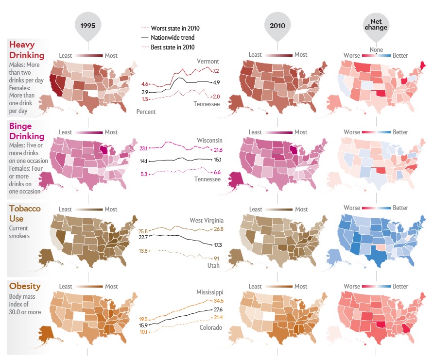
http://www.scientificamerican.com/article/americans-get-fatter-drunker/
This visualization compared how the average American’s habits have changed from 1995 to 2010. It examines Drinking, Tobacco use, Obesity and Exercise and the results are rather alarming. Generally, the use of tobacco has decreased while drinking and obesity are still on the rise. This visualization is static (primarily designed for print media) but still presents its point very clearly- I liked the ‘Net Change’ column. It examines a topic that everybody would be interested in.
PaperScape by Damien George and Rob Knegjens
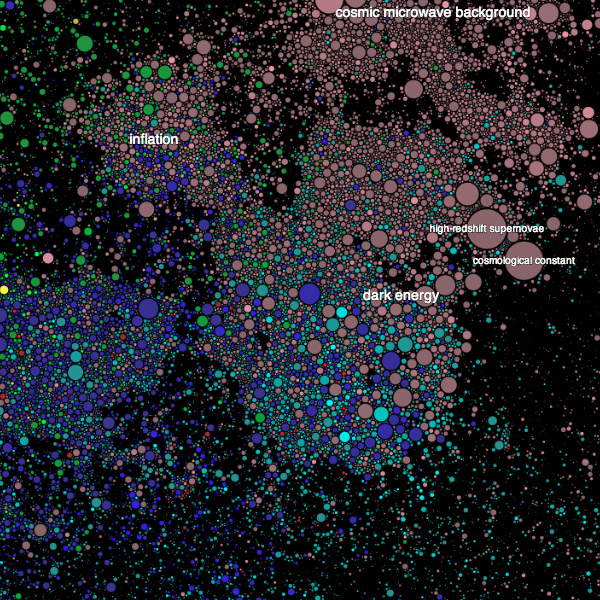
This visualization is actually an interactive map that provides a visual overview of all scientific papers submitted at arXiv. The thing I liked most about it was its Key- The more the paper is cited, the bigger its circle becomes. Along with that, older papers fade into a different color eventually while latest submissions start fresh. I consider this to be a great tool for students looking into doing a thorough literature review in a particular field. I wish the concept can be built upon and every scientific journal can present its publications in this manner.
Additionally I found this very interesting in terms of its interactivity:
100 Years of Rock by ConcertHotels.net
