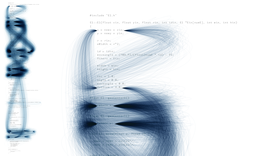
Interesting: Deprocess by Ben Fry
Description Ben Fry communicates through esthetic means the presence of code redundancy. He identifies patterns through the code and connects repetitive code with a blue line.
Message Emphasizing redundancy in code can serve as a good method to evaluating the clarity and cleverness of a code. Indeed, a clever programmer follows the DRY principle—Don’t Repeat Yourself. Thus this design not only visually communicates redundancy, but also cleverness of a code.
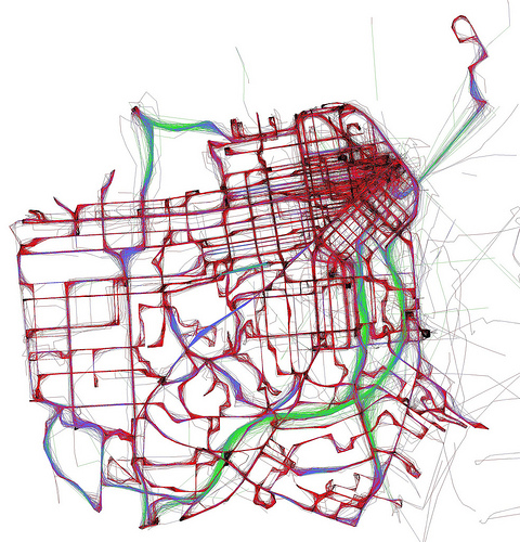
Well-crafted: A Day of Muni by Eric Fischer
Description The designer communicates through geographical means the average speed of Muni, a public transit, on a typical day, in San Francisco. Black lines represent movements under 7 mph, red less than 19 mph, blue less than 43 mph and green depict speed above 43 mph.
Honesty and Clarity Using a GPS to track down the speed of the vehicle for a period of 24 hours, the data gathered appears honest. In fact, the city of San Francisco is clearly defined and an American citizen would not hesitate on figuring out the location upon which this graph is based. Data is summarized but not modified.
Message The designer does not use a single number in his graph, except in the legend. Yet, the information is clearly conveyed: in the center of San Francisco, Muni’s speed is minimal, whereas on the periphery, its speed is maximal. This graph, with minimal information, conveys a lot.
Visual Techniques The designer makes effective use of the color wheel: warm colors to represent low speed and cooler colors to represent higher speed. The overlapping lines effectively communicate Muni’s path.
Improvement The designer could include data summaries—for instance, the average speed of Muni. He may also include reasons why Muni’s speed fluctuates in the different parts of the city.
Disappointing: What We Die of by ONS
Description This hub-and-spoke design illustrates the causes of death for 2011 in the UK. It includes 17 official death causes, excluding old age, as the latter may be driven by one of the 17 causes.
Meaning The purpose of this info-graphic is to compare and contrast causes of deaths and identify their fluctuation since 2010. It appears that cancer was the first cause of death in the UK in 2011.
Visual Techniques Playing with figures, colors and relationships, the designer aligns his data-set to facilitate comparison.
Improvement The presence of multiple subsets may cause a clarity problem, as their relationship with the main hub is unclear. The fact that data is repeated in every node, for instance the number 316 that represents the number of deaths caused by swine flu, is also contained in respiratory diseases and in the root node, can lead to confusion. Perhaps this hub-and-spoke is trying to convey too much information, such as the different categories, sub-categories, their respective numbers and percentages.
