Hi! I am Yingri Guan, a first year candidate from the MTID (Master of Tangible Interaction Design) . With background in graphic design and mathematics, I love to visualize our daily life phenomenon through mathematical theories and equations.
I hope to sharpen my programming skills and experiment with new ways to visualize massive data sets and develop a new perspective on understanding phenomenon around us.
My portfolio website yingriguan.com and I will be using twitter and Github too.
Work
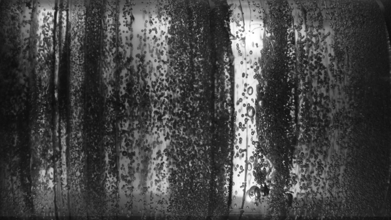
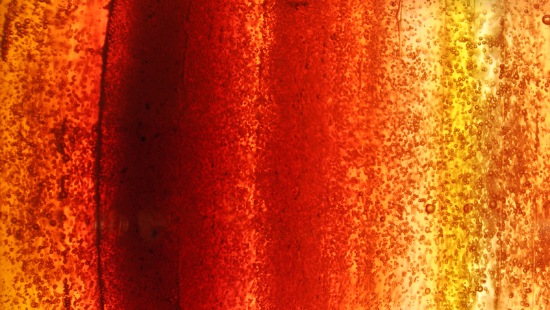
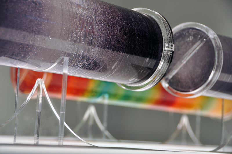
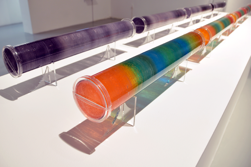
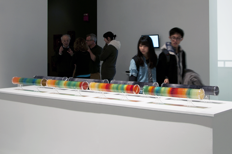
One of my work is “Ice Core”.
“Ice Core” brings together the aesthetics of layers of ice with the immense amount of weather information core samples contain. It features eight acrylic tubes filled with layered gel wax, with each layer denoting the average data contained within eight thousand year sample. The gray scale tubes indicate the different carbon dioxide levels in the ice core layers.The darker the layer of wax, the more carbon dioxide that was produced during a particular thousand years.The colored tubes demonstrate temperatures variation by using the colors associated with a standard weather map. For example, red denotes the highest temperature and blue indicates the lowest temperature.These tubes, shown side by side, provide an insightful comparison between carbon dioxide level in relationship to global temperature changes during the last four hundred thousand years.