Psychogeographies
An installation created by Dustin Yellin and commissioned by the New York City Ballet to create 3d-esque figures of dancers using glass layers and cut out pieces of books, magazines, trash, etc.. Its about the weather and the way it impacts the human body, our blood and bones are affected by the surrounding environment. He jokes and claims that he makes “window pane sandwiches”, they are made of 3000 pound microscope slides. He also says that bone marrow can tell a story and this is the way of visualizing that experience. I feel this piece is an interesting visualization, and very calculated as they need to design each layer of glass, but you cant determine exactly how it will come out due to the random assortment of media they use to create color. I wonder how it looks from the back side of the sculptures and if they consider the mood looking from the opposite perspective (in the video only the front seems to be highlighted). This may not be programed, but the visualization tells a powerful story I wish his process of how he chose each one was explained better. I appreciate the reinterpretation of the memory of a body frozen in glass. It is emotional, but also has a view think about how their body feels throughout the day based on weather and changes.
A million digits of pi visualized
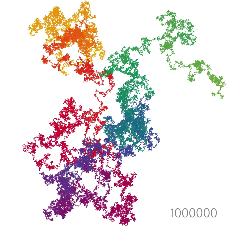
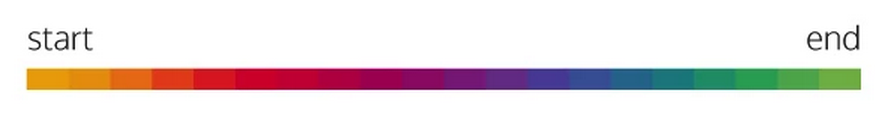
This is a data visualization of 1 millions digits of pi. The colors scale from the first number of pi until the 1 millionth number, below is the color key to understand beginning and end of the sequence. This visualization was created by an astronomer named Nadieh Bremer.
 The direction of the line indicates the current number of pi, and steps to then create the next line determined by the number in pi. See below.
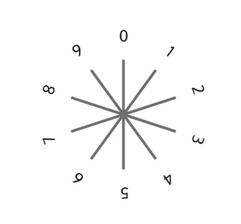
This visualization isnt an original idea, but inspired by the 1888 book “The Logic of Chance” by John Venn a mathematician. In this book his suggested the first “walk” of pi as the numbers 0-7 represent the 8 different directions on the compass. Other works which integrate pi include those by Martin Krywinski and Cristian Vasile. Visualizations are meant to show information in a new means, or medium. I feel that this is an interesting way to see what pi represents and how much 1 million digits represents outside a list of numbers. Its hard to tell what each number is and itd be nice if you could zoom in, or highlight each piece to what they are. Even allowing a video of the image as it forms a tree like formation. The description doesn’t make it clear of how the program truly jumps from one the the next number and how they could cluster the way they do.