Category Archives: LO-2

mileshiroo

22 Jan 2015

Screen Shot 2015-01-22 at 5.18.37 AM

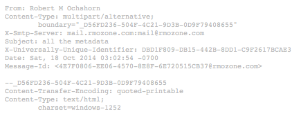
Robert M. Ochshorn has one of the most conceptually inventive artist websites I’ve seen, despite its technically simplicity. The website is a static page of text and images divided into what appear to be real email correspondences between Ochshorn and others. Above each email is its full header, which includes items like Content-Transfer-Encoding and X-Smtp-Server. You can get a sense of Ochschorn’s work by reading these correspondences and viewing the embedded images and videos. He gives off an enthusiastic and critical tone: “You’re right to identify an irony in the situation: I showed you interfaces that are supposedly preoccupied with new modes of visibility, and yet they are nowhere “online” to be found.” While many artist websites strive for clarity, Ochshorn’s strives to be oblique. The chosen form (with the inclusion of the full email headers) communicates both his technical and artistic preoccupations. He seems fully aware of what he’s doing, in one email he says: “yes, everything is online somewhere, but I’d better compile the links for you…Apologies for my incoherent web presence.”
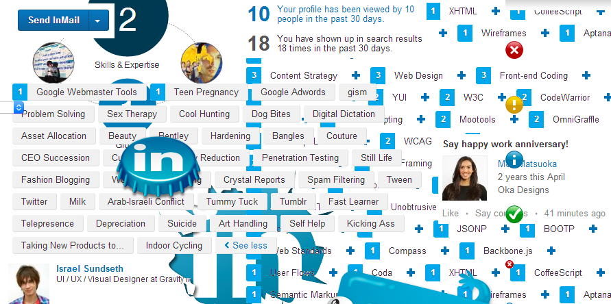
Screen Shot 2015-01-22 at 5.27.03 AM

cloaque.org” is an online gallery curated by Claudia Mate and Carlos Sáez, who describe it as an “exquisite corpse” and “diarrheal stream” where artists can collage all the digital trash they find on the internet. The site is in fact a Tumblr, which wasn’t immediately apparent to me. On the left of the page there is a “browse me” dropdown that lets you choose from a selection of collage pages by different artists. You explore collages simply by scrolling down on the pages. They seem to be stitched together from static images, which means that the artists’ description of the site is more conceptual than technical. I appreciate the site’s alignment as a place to organize trash, as well as the sheer breadth of aesthetic exploration. One entire collage focuses on the graphic design of LinkedIn, while another is a cityscape contained in an iPad.

JohnMars—LookingOutwards—2

Spring Spree from the MIT Senseable City Lab

Explained: All of the transactions in Spain during Easter week 2011.

Chosen: Beautiful visualizations. I appreciate the presentation of data, but that analysis is left to the viewer to discover.

Critiqued: So what? As much as I appreciate the data presented, why does it matter?

Related: Spring Spree was born out of collaboration with Spanish bank BBVA. They claim that research will continue, but there hasn’t been a peep since 2012.

Mapnificent from Stefan Wehrmeyer

Explained: How far you can travel with public transportation in a set period of time, overlaid on a map.

Chosen: APIs are so cool — the implementation with Google Map’s database of locations in combination with the “intersect” option from the video above seems like an incredibly useful thing. Overall, the concept behind the application is poignantly relevant.

Critiqued: I would like to see actual bus and subway routes overlaid as well, and possibly even opportunity for user input to adjust results according to real-life use.

Related: There are other applications with duplicated functionality to Mapnificent — Mapumental is one. The app utilizes a bunch of APIs from cities around the world to work.

John Choi

22 Jan 2015

3D Virtual Creature Evolution, by Lee Graham (2008)

3D Virtual Creature Evolution is a free software package created by Lee Graham.  It was heavily inspired by Dr. Karl Sims’s computer generated evolution from 1994.  More or less an improved version from Sims’ demonstration, here “creatures” evolve to achieve certain goals a player can set, such as height, distance traveled, and ability to catch spheres.  The user can also set the terrain in which the creature performs activities on, such as bumpy or flat,  Creatures also have evolving “brains”, which are a sets of mathematical operations that determine the creature behavior.   In the video link, we can see a worm-like creature that evolved over several hundred generations that moves in a pinwheel fashion.  Critically, I think the graphics need to improve.  Karl Sims’s work was done in 1994, while this was done in 2008.  I understand that the focus is on the evolutionary algorithms, but I think the forms could be that much more lifelike if instead of using multiple sharp rectangular prisms, a single soft body comprising of the entire body was generated.  This way, the creatures will look more like evolved organisms rather than mere robots.

Species: Artificial Life, Real Evolution (Work in Progress) by James Schumacher

This project is also like Karl Sims’ evolution demo in 1994.  Except that it comprises of an entire ecosystem.  With an environment able to support several thousand creatures at any given time, every single creature is affected by a wealth of attributes that lead to some fascinating results in evolution.  Its not only that each individual creature possesses a unique set of genetic data competing with every other creature simultaneously, but the environment also possesses a myriad of factors that can cause mass extinctions within minutes.  By simply changing the temperature a few notches down and the water level a few notches up, creatures are forced to fight harder against each other and the elements to survive, or die out in the process.  A very nice feature of this game is a cladogram that can be accessed during any point in the game.  In other words, the game records every single species that has ever evolved in a clean, uniform tree.  A few things can be noted about the evolution system.  Everything starts out as little sausage worms, and over time, oddly enough, the most successful species are often evolved into things shaped like butts, pants, or male genitalia (out of pure natural selection?).  The greatest thing about this game is that it neither conflicts with the ideas of intelligent design or evolution.  Things can evolve naturally in accordance with Darwin’s ideas as the player simply observes the ecosystem.  Or the player can intentionally accelerate evolution with “divine interventions” such as keeping some organisms alive, gene splicing and mass extinctions.  In any case, this game looks like one heck of a fun.

Here is the link to the game’s site.
http://www.speciesgame.com/

Sylvia Kosowski

22 Jan 2015

Fragmented Memory

http://infosthetics.com/archives/2013/08/fragmented_memory_weaving_a_computer_core_dump_as_a_tapestry.html

In this project, a pattern for a tapestry is designed out of a translation of a computer’s physical memory. Groups of 6 bits in memory are translated into RGB color values for that position in the cloth. This project is inspiring to me because it is taking a physical object (physical memory chip), and using the data encoded in the physical object to create a new, completely different physical object. So, the data serves as a map or bridge between two different real world objects, which I think is a cool concept. Additionally, the end result pattern in the tapestries has an old 8-bit game sort of feel to it, which is an aesthetic I like. I think this project could be better if there were also some extra side-by-side comparison, where you could see what parts of memory align to which parts of the cloth. For someone familiar with the workings of computers, it could be interesting to see how exactly particular computer commands correlate to different patterns in the cloth, and would provide more real-world context for the patterns which emerge. It appears that the creator, Phillip Stearns, creates a lot of “glitch textiles” artworks, and is interested in exploring the computer glitch aesthetic in many of his works.

Whale Sound Visualization

https://medium.com/@dealville/whales-synchronize-their-songs-across-oceans-and-theres-sheet-music-to-prove-it-b1667f603844

This project discusses how humpback whales create organized songs using the sounds they make. These song patterns are repeated over and over by the whales, so it’s not just a random collection of noises. The various whale noises used in the songs were given stylized visualizations according to how the soundwaves of each noise look like. Then these stylized notes were arranged on a music note sheet. What I like about this visualization is that the whale notes look very interesting and pleasing to the eye. Additionally, I think exploring the concept of alternate ways of displaying music notes for noises beyond our current understanding of music, and thinking of how to represent visually the language of animals, is a very interesting concept. After all, the alphabets that humans use are just visualizations for the noise information that humans make. So the attempt to codify animal noise information in the same way as human noise information is codified is really intriguing to me. I think the project could be improved if the songs were presented in a way that would give them more context. For example, it would be cool to have a map interface, where the user could see where in the world the data for each of the whale songs was recorded. It would also be cool to be able to compare different whale songs side by side, and see if there are any overarching trends to the songs depending on the geographic region that the whale composer inhabits.

LValley

22 Jan 2015

One Human Heart Beat

one_heartbeat2

One Human Heart Beat is a project by data scientist and communicator Jen Lowe.

Basically, a person’s heart beat and blood flow are measured. Then, Lowe is able to take in certain factors and project how many days said person has yet to live. Everything is shown in the form of a large red graph, and with each heartbeat, the person can see his or herself creeping closer and closer to the “expiration date” that Lowe has set.

My favorite thing about this project is how removed everything seems. Lowe chooses to deal with touchy subject matter in a sterile way, which is able to achieve an effect that is equally satiric and foreboding.

Crop Circles

For some, its hard not to look up into the night sky and deny the possibility of life beyond earth. Aliens have been a topic in media for decades—radio, books, movies, etc— so when an intricate crop circle appeared in a field in Britain, it was able to capture the imaginations of many. But beneath it’s appearance, the crop circle wasn’t just a design, it was actually a chart visualizing the first few digits of pi.

cropcircle1