Shows you how much of a given land mass is taken up by each type of thing.
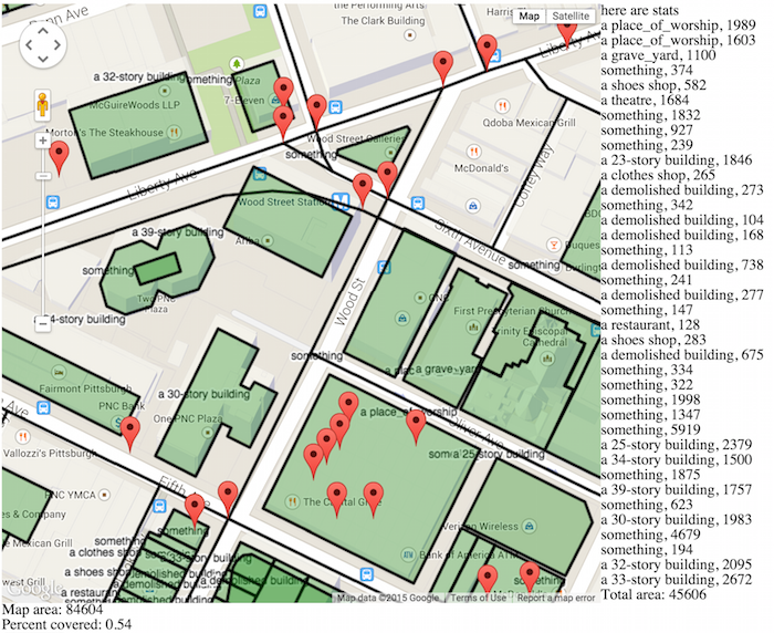
Work in progress, go easy! The total is at the bottom, and the interesting thing is the “percent covered” – 54% of this chunk of downtown is used by buildings. (Data from OpenStreetMap.)
Now, this also assumes that each place is a “good” place that we want. I hope to add the ability to click on each thing and reclassify some as “good”, “bad”, or “neutral.” Then we could see “percent of this map that is covered by good things.” (where “good” means useful buildings, parks, etc; not parking garages or roads.)
Other directions: I’ve been looking into satellite images like this: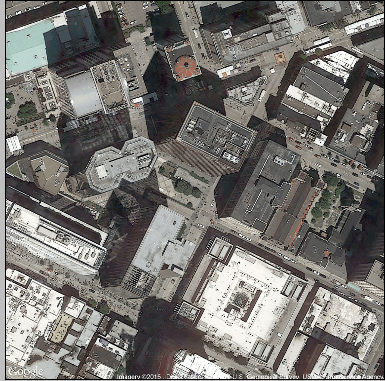
and then thresholding, blurring, etc, to figure out where buildings are or whatever else:
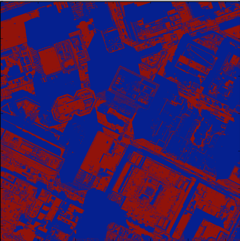

I mean, as is, this is such garbage, but maybe there’s something here? I thought it’d be cool to, say, find the cars in the image, but after trying it I think that is actually very hard.
Things I would like to know:
– is this interesting at all? do you care what portion of your city is used by what? if so, why?
– do any of these rorschach blobs make you think of some interesting thing that you’d like to see out of a block of city info? maybe there is something more stylistic, like these Mapsburgh cut paper maps, and less utilitarian that I should be doing?
– if this is interesting, would you take the effort to customize this? like you see in the top map, at the top right, there’s a qdoba/mcdonalds that’s not listed on OpenStreetMap so it’s not drawn as a box here. Would you draw that in yourself, in the interest of this map?