I collected data on each location of the top 100 chain restaurants in the US. It contains all kinds of information, such as the food type, location, whether it is wheel chair accessible, its rating, and whether it serves alcohol. The last one was very interesting to me, so I dug around and realized that even places like Dunkin Donuts server alcohol, albeit in very few locations. Hence, I decided to visualize and find out patterns about all the fast food restaurants that server alcohol.
Sketch:
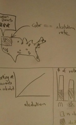
I found many news articles mentioning the rise of this phenomenon, but there are no visualizations on this. However, the CDC does list the alcohol binge rate per state, which I plan to use in my visualization.
http://usatoday30.usatoday.com/money/industries/food/2011-06-30-fast-food-restaurants-offering-alcohol_n.htm
http://www.cdc.gov/alcohol/images/binge_drink_prev10.gif
https://alcoholpolicy.niaaa.nih.gov/Underage_Drinking_Maps_and_Charts.html
Some of the maps in D3.js would be very helpful. Maybe not the spring force one though….