M is the first letter of my first name. I would either be using M or K, and M came first (in my name, not the alphabet). This is all of the basis for my decision. I considered a few different approaches. Due to the snow and a brief speck of inspiration from the movie How the Grinch Stole Christmas (2000), I went with something which reminded me of the Christmas light cannon seen where Martha May Whovier uses a cannon to place lights accurately on her house.
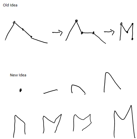
These are my sketches.
This is my final version.
This is my sourcecode.
/**
 * Register your submission and choose a character
 * For more information check out the documentation
 * http://anitype.com/documentation
 */
Anitype.register('M', {

 // Enter your name
 author: 'Matthew Kellogg',

 // Enter a personal website, must have http
 website: '',

 // Make your animation here
 construct: function(two, points) {

 // Reference to instance
 var anitype = this;

 // Create a Two.Polygon
 var polygon = anitype.makePolygon(points);
 polygon.subdivide(10);
 // Set an initial state
 //polygon.scale = 0;
 var verts = polygon.vertices;
 var lerp = function(i){
   anitype.addTween(verts[i],{
     to: {x: verts[i].x, y: verts[i].y},
     from: {x: 0, y: verts[0].y},
     easing: Anitype.Easing.Elastic.Out,
     duration: 0.35,
     start: 0.2 + 0.5*((1.0*i)/(verts.length-1))
   });
 };

 for (var i = 1; i < verts.length; i++){
   lerp(i);
 }

 // Return your polygon wrapped in a group.
 return two.makeGroup(polygon);
 }
});
I did not achieve my intended design, but found that I liked this one more. The design I first had in mind involved making an N turn into an M. I decided it wasn’t great, so I thought I would make a straight line fold into an M (keeping the lines consistent lengths and bending at joints). I found that that was a bit harder than I’d have liked, and after a long while of fiddling with the code I ended up with my final result.
My favorite Anitype I found was the S by Sam Ticknor. I liked it because it flows very well and doesn’t seem too intrusive. I also liked it because unlike many of the other anitype letters including my own, it did not seem rubbery.