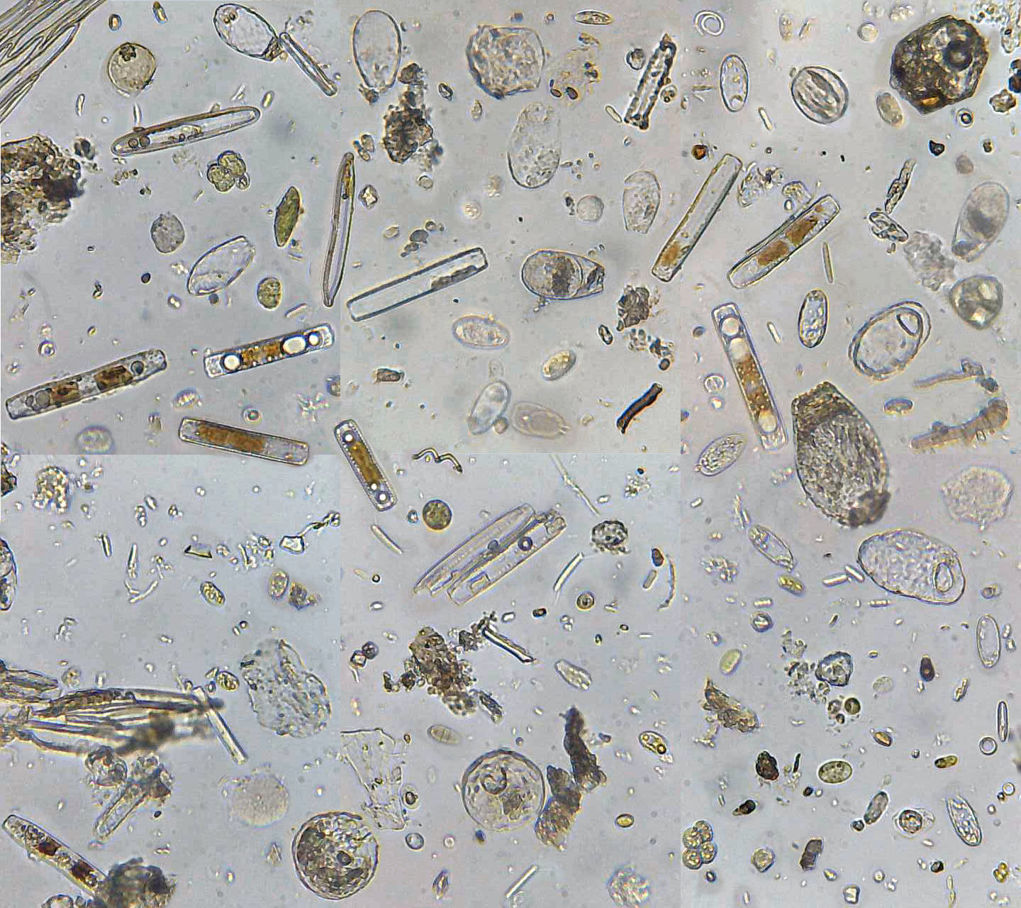
This week I spent some time thinking about the data visualization of building footprints. As I sketched the infoviz assignment I struggled with two concepts: ranking and micro-organism dispersion. In other words, a more objective classification of building and a a kind of visualization in which these footprints moves in a fluid, taking their out of their context and orientation.
Anyway, I decided not to look for generative/parametric stuff this week. Instead, I investigated some data visualization projects that combine some individual diagramming of the sample with an dynamic system of classification.
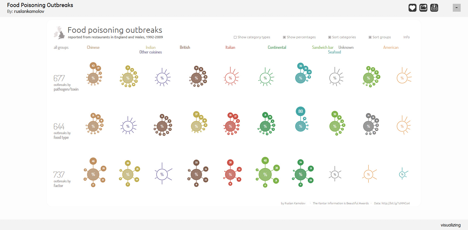
The first project is Food Poisoning Outbreaks (Ruslan Kamalov) that evaluates the food from restaurants in England. Each kind of food is represented as a centralized graph whose nodes grow or shrink to quantify some factor or classification related to intoxication. The interesting thing is the ability to customize the visualization of each graph maintaining the overall ranking from left to right.
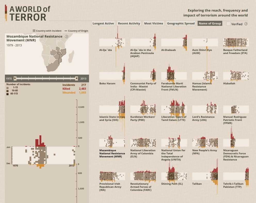
World of Terror (periscopic) explores the “reach, frequency and impact of terrorism around the world”. Each terrorist group is represented by a rectangle overlapped by bar charts, that associate the number of victims of attacks with the year, like a compressed time line of its impact on the world. Besides the internal information – that can be seen in detail in the left menu -, the rectangles are associated with a map and they can be classified dynamically according to topics.
I believe both projects are interesting and successful in dealing with these different “scales” of data visualization (object x ranking). However, World of Terror’s rectangles are a very stimulating way to synthesize and contrast the groups characteristics and at the same time to create identifiable objects in a ranking system.