Tweetable Summary: Who are the 4.5m people buried in US National Cemeteries? @SciutoAlex makes a graph about it. Hint: They’re almost all WWII privates.
Online Home: http://sciutoalex.github.io/va-grave-visualization/
Github Repo: http://github.com/sciutoalex/va-grave-visualization/
Introduction
War often defines a generation. The rise of the term, “Greatest Generation” for those who served in both World War II and Korea, highlights how war, especially ones with wide participation, binds a group of people who are similarly aged. I’ve always been curious about generations, and those who don’t fit neatly into a pre-defined group. This project visualizes generation based on their war service.
Inspiration
Lee Byron’s Stream Graphs
NYTimes Federal Reserve Comparison
Cubism JS Library
3d Topographic Maps
Process
My general process was sketching, data cleaning, and implementation.

I had hoped that the data cleaning would not take long, because the data appeared pretty good, but I found that the data was very poorly recorded, and there were many factual errors. For example, veterans were recorded to serve in wars they had not yet been born. Or veterans birth dates didn’t contain century indicators—”01/03/07″ could refer to 1807, 1907, or 2007. I tried heuristically fixing errors, but in the end, I removed a lot of data that was clearly incorrect.
Dealing with 4.5 million records was a challenge for me. My options to deal with this were either to subsample if I wanted to investigate individual veterans or aggregate if I wanted to look at trends. BUT I WANTED BOTH. I had wanted to tell individual veteran stories while showing how they connected. In the end, I dropped the individual strain, and instead focused on trends.
If I were to to do this again, there are a few changes to my process I’d make. I wish I had more fully thought through my ideas and selected one to do more sketching. My sketches were nuggets of ideas, but when implementing it, I found I had a lot of blanks. I filled in the blanks, but it took a lot more time. Another change: Data is hard to sketch with. My ideas for how the data would look didn’t fit reality. I think that I would split up implementation into two steps. The first step is making the raw visualization as quickly as possible and seeing if the form of the data matches the sketch, then sketching more based on that.
Insights
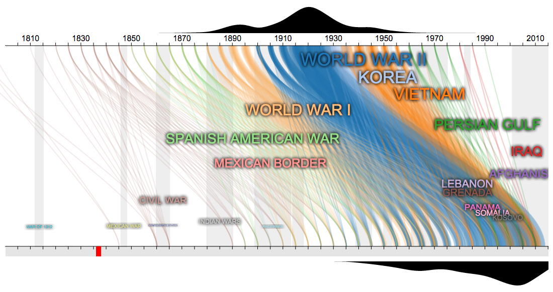
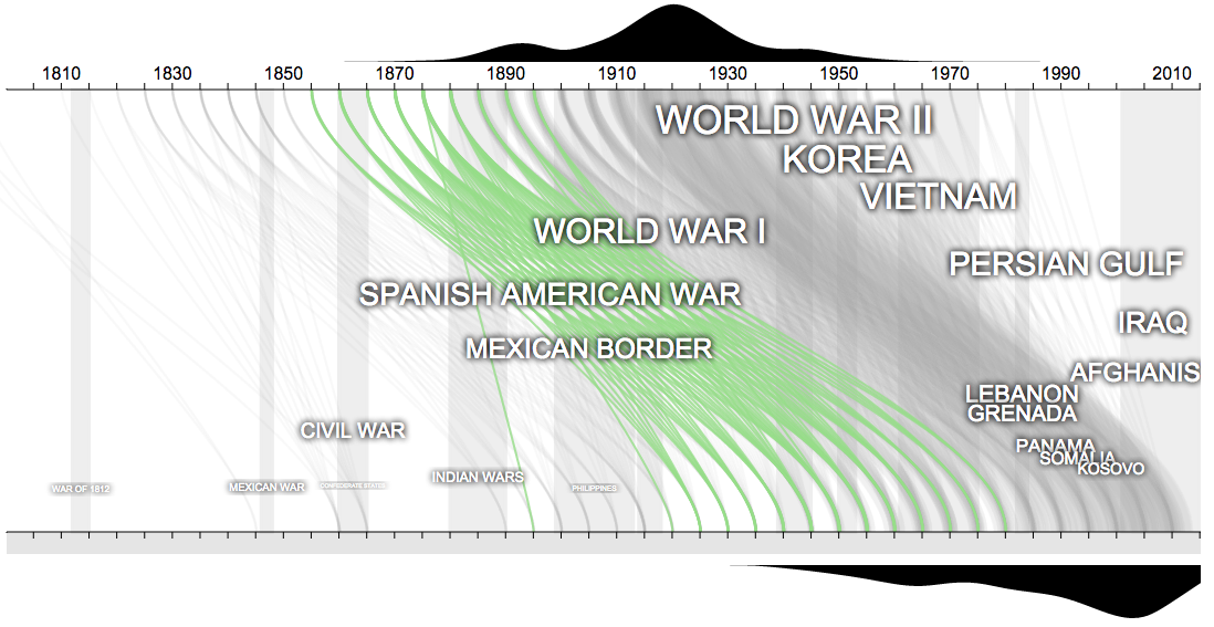
- Note how the first part of the twentieth century was really an outlier in terms of wars. World War II, surrounded by Korea, World War I, and Vietnam, were huge wars, unlike anything the US has seen
- Notice when the records start. Beyond the Civil War dead, the first dead are Civil War veterans starting in 1890. Before the Civil War, it appears few people were buried in National Cemeteries. This is confirmed by noting that Congress created National Cemeteries in 1867.
- Notice the years where wars have equal weight. If you were born in 1900-1905 you were equally likely to fight in WWI and WWII. 1925-1935 birth years are likely to fight in WWII, Korea, and Vietnam
- Notice how we have more wars from 1950-present, but they are smaller. Partly this is better record keeping, but it also notes the changing role of the US in global politics.
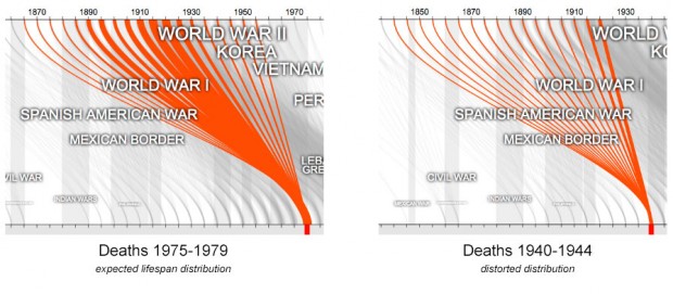
- Notice how WWII disrupted the normal death distribution for 1940-1944. No other war had such a large effect on the data.