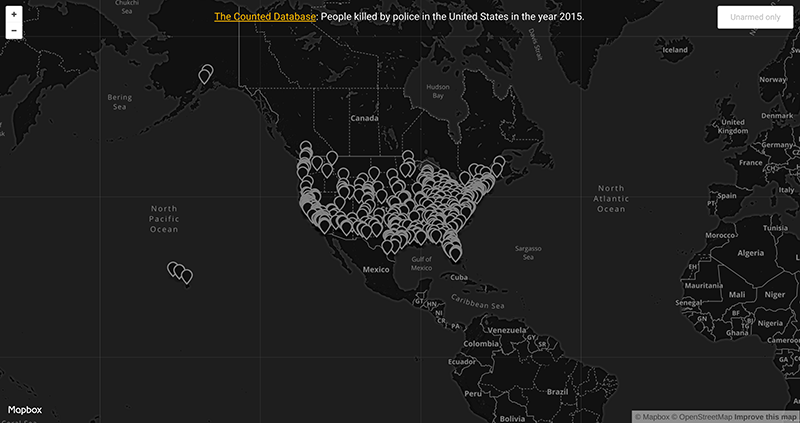
For my first visualization, I used Mapbox to visualize The Counted database of people killed by police in 2015 which runs on Node.js (which was not entirely necessary until Mapbox tries to open the locally hosted csv file and complains profusely) and is hosted on Herokuapp. The CSV file proved to be rather annoying to convert into something readable by Mapbox; in the end I ended up using this janky geocoder to convert addresses into latitude longitude coordinates. For some reason, when the geocoder was unable to find addresses, it filled in the coordinates with a pointer to a unnamed road in Kansas, so I promptly filtered those results out.
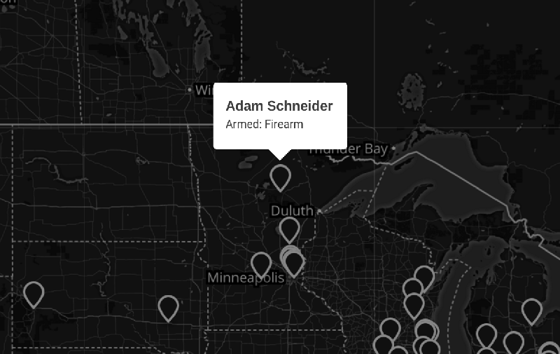
The visualization itself is a very simple black and white map, centered on the United States and zoomed out enough so you can see Hawaii and Alaska. You can filter out deaths by looking at only unarmed deaths, and clicking on a pointer will center the map on the location and show a popup with additional details. I was not entirely sure what I wanted to do with this project; mainly my goal was to format some given data and show it on a map — nothing too special. Given that the data choice is rather dark and serious, I made sure that, aesthetically, the map reflected the subject material.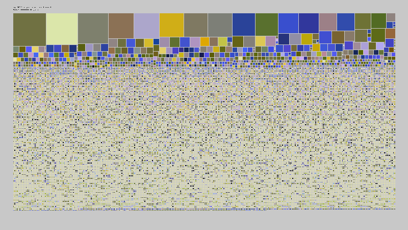
My second visualization, I used vanilla openFrameworks to visualize meteorite data and show size distribution of known meteorites. To do this, I sorted the meteorite data by mass to fill the chart (I’ll explain later) and I used 2D squares to visualize each meteorite. Said squares were then placed into a grid using a very naive algorithm (think double for loop, fill in first available slot). Later I decided that instead of randomly assigning colors to each meteorite, I would write a script that locates the meteorite on Google Maps, sample a patch of satellite data and writes the hex value to the csv.
I thought a lot about the way I filled in the meteorite data; this resembles a very similar computer science problem: malloc. Malloc is a C function that searches your computer’s memory for a contiguous piece of unallocated memory that can fit whatever data you want to store — quite a lot like my naive algorithm. I also implemented a version of malloc in another class that uses a bunch of bins that sort open locations into different sizes which increases performance and space efficiency. So I was pretty much set on implementing some variant of malloc with my meteorites, but it turns out that everything just sort of works out when you sort the input data by size (phew, writing malloc was the worst!!)
I don’t think my map visualization is really too insightful; it was sort of a “lets see if I can make something show up” project. The meteorite visualization was pretty cool though! I think when initially looking at the data, seeing the massive differences in mass between the first couple of meteorites can definitely skew people’s perceptions of how massive these meteorites were. In reality, the size of the meteorite is actually proportional to the cube root of the mass so the squares more accurately represented the data.
The google map script for the meteorite data didn’t turn out to be that insightful–it was more of a lets see how much I can flex for this project sort of thing and didn’t really provide besides nice earth toned colors. Perhaps something that I would have liked to have done is extend the squares into the 3rd dimension to more accurately represent the size.
Github – The Counted
Github – Meteorite