It’s easy to find maps that are pretty, seductive, and (purportedly) explanatory. Find a map that interests you — and then find a problem with it. (Or at least, identify something about it that concerns you.) Write a Looking Outwards blog post about it. Be sure to include an image of the map, and a reasonable citation (creator’s name, link to article and/or original project). Be sure to explain the failure/flaw/concern/ineffectiveness.
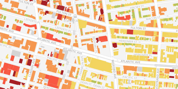
BKLYNR: Mapping the Age of each Building in Brooklyn by Thomas Rhiel is an interactive map that displays the age of each building in Brooklyn using color; older buildings are represented by lighter colors and more recently developed buildings are darker. What is interesting about this visualization is that it quickly reveals, from an aerial glance, sections of Brooklyn that have remained unchanged next to sections that have been built up more modernly. One thing that concerns me about the map is that it aggregates the date of an entire building. However, many historical buildings require that certain aspects of the building remain intact while the rest of it is renovated and made more modern. As such there are many buildings that have multiple ages based on the times of the different renovations. How does the author make the decision as to what time to encode for the visualization?