Inventing Abstraction 1910-1925
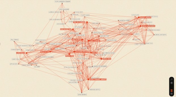
The MoMA (Museum of Modern Art) in Manhattan created a map called Inventing Abstraction 1910-1925. This map tracks the birth of abstract art and connects artists who seemed to influence one another at the time. The map was created as a collaboration project between this exhibition’s curatorial and design team along with Professor of Business, Paul Ingram and Columbia Business School doctoral candidate Mitali Banerjee. (The title and image are linked to the interactive map itself.)
I love the concept of this map. A lot of the maps that I have looked at deal with population size, or general information about our current world; which is very relevant and relatable, but not quite as abstract as this one. Gaining the knowledge to build a map like this could take years. Drawing concrete parallels between artists and their influence on one another is not an easy task. I can definitely appreciate how much careful research went into putting together this map.
As much as I love the content of this map, there are a few things I would add/change about the implementation. First, the only thing connecting these artists on the map is an orange line. I wish there was a short explanation with every connection telling me how the creators came to the conclusion that those two artists were connected. I would like to be able to click on a connection and be able to see one or two sentences outlining specific ties between the two artists. Also, the placement of the artists on this map seems to have no clear order. Maybe if they had laid out the artists geographically there would be some purpose to the placement of the artists.
Overall, I do love this map and the information it presents, but I think the implementation could have been more organized and comprehensive.