You are Here Maps
You are Here is a project from the Social Computing Group at the MIT Media Lab. They’ve developed a visually elegant template with which they publish a map a day, each of a different city and topic. The goal of the exercise in the team’s own words is to:
“Aggregate of thousands of microstories, tracing the narratives of our collective experience. We will make maps of the little things that make up life — from the trees we hug, to the places where we crashed our bikes, to the benches where we fell in love.”
The project is compelling to me because I think’s its particularly hard to trace stories in maps. Data tends to be aggregated in a way that only presents one or two dimensions. A story requires a beginning, some action, and a resolution. A story would convey something, not just present information. How do you do this with a map?
Where do they get the data? From all sorts of places. Google Street View, census data, city-level data from police reports, zoning ordinances, web APIs. Each map is unique.
Tools? From the source code, I can see that the maps were built using D3. The team has also created a custom tool for comparing between 2 or more areas within a city or pairs of cities based on census data. The documentation is pretty light, but the code can be found here: https://github.com/jjjiia/city_comparisons.
Let’s analyze one particular map
There are five maps of Pittsburgh, for example, on 5 different topics: income disparity, school locations, food deserts, bicycle crashes, and a visualization of when people wake up. Looking at the income disparity map, one can highlight different census block groups on a map of Pittsburgh and a chart pops up showing the average and medium household income for that block.
Flaws
The data itself is simple, but not as clear as it could be. When I highlight a block, the income chart gives me an average income amount as well as a few other bars of data that are not so clear. I’m guessing that bars represent numbers of people that make some kind of income within a range, but the axes have no labels so one has to interpret.
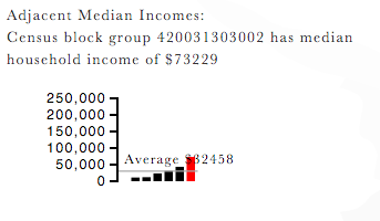
Then there’s a functionality to highlight top differences between blocks. A pretty good feature if one wants to help the user target high contrast areas. The problem is that again it’s unclear what the labels mean once the map highlights a certain area. What does “Percentile Difference: 90%” between two blocks mean?
Finally, the neighborhoods on the map are too light to distinguish. This is an easy fix, just increase the contrast on the neighborhood borders.
In general, these maps contain loads of data and information, displayed in a clear enough way to make search incredibly easy and fast. The biggest problem is that one has to be a topical expert and local expert to be able to interpret a map useful. I have to know what neighborhoods in Pittsburgh have a higher income and which ones do not in order to even begin to attempt to study this map. It would be up to chance for me to find relevant information otherwise. I think this gets to a big problem/feature of maps that we need to keep in mind. Who are we designing them for? Is it for an uninformed user? An expert data analyst? A child? We’ll only be able to tell stories through data once we understand who we’re talking to.
There are loads of other tools
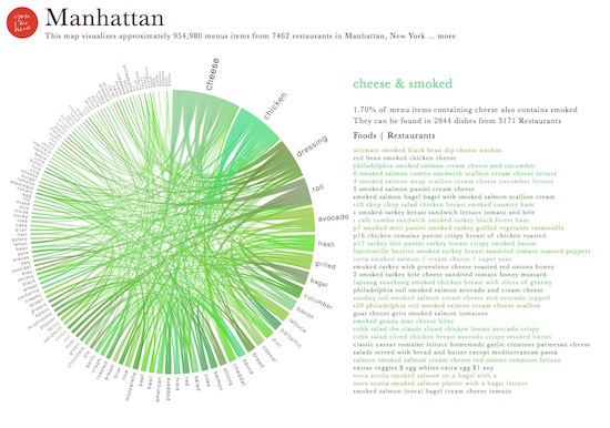
A visualization of 1M NYC restaurant menus:

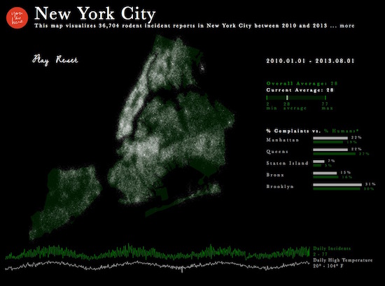
NYC rodent incidents: