Inspiration
I was really inspired by Laura Kurgan’s book Close up At a Distance. In it she describes the evolution of the Blue Marble image of the earth seen from space and how throughout the years it became in fact a composite image of many images from space stitched together.
She writes about these images, “the photographs were true, at least in the trivial mechanical sense, and then provided a platform for something more abstract or virtual, the ‘concept’ of ‘one world’. Now it is the virtuality of the data-based constructions that seems self-evident. And their basis in remotely sensed data helps us understand what has become of truth in the era of the digital data stream… the fact that they are virtual images does not make them any less true, but it should make us pause and consider what we mean by truth.”
This made me wonder about virtual spaces that could represent certain types of truth more accurately than our lived experience of that same physical space. Borders in particular are represented very precisely as a series of numbers in virtual space, namely latitude and longitude coordinates. Yet they exist within the minds of people as metaphorical concepts that carry all sorts of meanings. Borders are also usually to large to be experienced entirely by a human on the ground. In many ways I felt that digital borders captured a kind of reality that was simply impossible to experience as a human – much in the same way that the composite image of earth from space could never be truly seen by a human eye. Through explorations of the data I also grew interested in how our physical spaces remain disjoint and disconnected through barriers, walls, and other man-made structures while the digital map of the earth is accessible today by anyone with a browser and an internet connection.
Project Description
I’ve taken the satellite images of walled borders across the world (Mexico-US, Israel-Gaza, Pakistan-India) and texture mapped them into a long strip. Each border has been distorted and warped in effect to fit into a rectangular strip of pixels – each fitting into a standardized shape to be consumed, potentially, in the same way.
Process
This project took a lot of iteration. I had to learn broadly about the world of mapping, satellite imagery collection, coordinate transformations, graphics processing, texture mapping, and all sorts of curves.
I ended up creating four different tools to tackle four different parts of the project. These can all be found here: https://github.com/irealva/virtual-borders
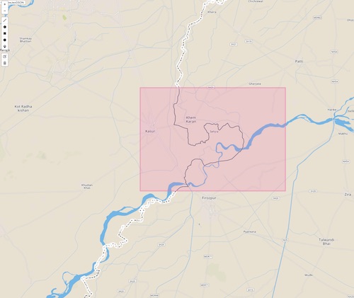
0.prune_geojson: this is a web app that loads a geojson file and helps the user trim down points of interest. You can select a geometric shape (like a square) to draw an area on which to prune the geojson points.
1.interpolate_geojson: this is a Processing application that interpolates points along the border to either add points where the data is sparse (i.e. two adjacent points are too far apart to fit into a map tile) or remove points where there is too much data (i.e. 2 or more points that all fit within the same map tile).
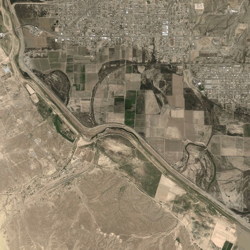
2.borders_tiles: not included in this repo. A script to download Google satellite map tiles or Mapbox satellite map tiles of a series of latitude and longitude coordinates. Each map tile looks something like this for a specific latitude and longitude pair and zoom level (In this case 29.5434699 latitude and 104.3714399 longitude at zoom level 14):
![]()

3.strip_creation: where all the magic happens. A Processing app that converts spherical coordinates into pixel coordinates, arranges a series of map tiles into one single image, creates 2 offset curves along a border, and finally texture maps the curvy border onto a long strip of pixels.
In the image below you’ll see how I have created two series of offset curves along the left and right of an inner curve representing the border.
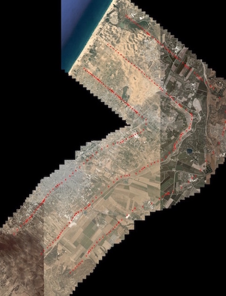
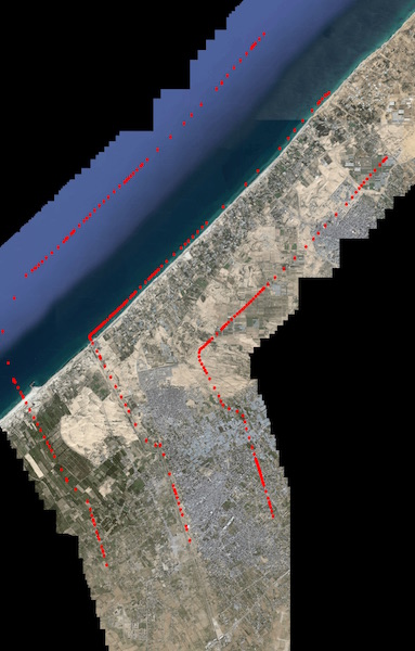
Behind the hood, there’s a lot going on. After loading images so they each align perfectly (this example contains 100 map tiles), I am loading points along the border (the middle curve), interpolating them, and creating two offset curves along the outside of border line.
Interestingly, it’s impossible to create perfect Bezier offset curves. On a first pass, you can see that approximating two Bezier offset curves creates a lot of noise (the points in red-left curve, and in green-right curve). One has to then trim the points by calculating whether lines between the points intersect to get truly nice offset curves.
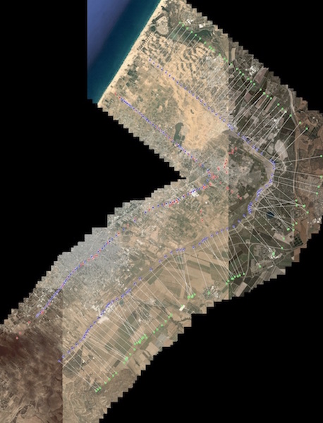
Finally, I texture mapped the points on the left and right offset curves into a long strip.
![]()
Neither github nor wordpress will allow me to upload a large file, so I’ve chosen to upload two examples of the highest quality into google drive. These are two strips that represent the border between the US and Mexico (each one 30,000×1200 pixels). The third one is a literal strip of the Gaza strip, but at lower resolution than the first two.
Examples
Lessons learned
Iteration helps: This is one project for which I can truly say I iterated a lot. There were a lot of technical hurdles to handle and each one took a good weekend or couple of days to figure out. There was also a bit of math involved (in turning spherical coordinates into 2d pixel coordinates, dealing with Bezier curves and general geometry) that I had to go back to my books and read over, as well as meet with Bryce Summers to discuss. Each step of the way, my interpolation, curve generation, and mapping improved.
Geometry is beautiful: In learning how to generate curves from scratch and diving into all the various kinds of curves (Bezier, Catmull Rom, Splines) I really started seeing the world around me and especially graphics on the screen in a totally different light. These are the building blocks of so much of the graphics that have become second nature to our digital experiences. I have a new-found appreciation for programs like Rhino which are really all about curve and surface manipulation.
Graphics processing: I certainly learned a bit more about processing graphics on the GPU. After crashing my computer about 3 times – I became much more aware of the rendering limits of my various machines. My poor 2009 laptop can’t even run the latest iteration of my program.
Unbalanced access to information: in seeing the world from afar through these satellite images, it becomes clear to the beginner observer that the world is mapped out in unequal ways. The data we have access to in western countries is of far superior quality (in temporal and resolution quality) than what’s available in Asia or Africa for example. Not only were higher resolution images at lower zoom levels more readily available say in the U.S. as compared to Pakistan (to point out a dramatic example), but the satellite companies working to collect the data had also done a better job of color-correcting the different artifacts in the data left by different satellites making their way through space.