![]()
Strava Heat Map by Strava Labs: http://labs.strava.com/heatmap
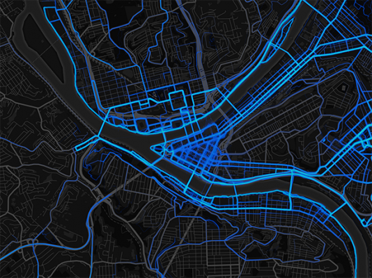
The Strava Heat Map is a representation of the roads taken by riders and runners. I think the map is beautiful and has a great toned down view of the underlying road structure of the world. Their approach to visualizing the information is very useful when using the map to quickly see where people are usually biking or running. I think that the data itself is very interesting to see especially between the running and biking maps.
However, the map itself isn’t very useful other than to display visual information. While we can see that these roads are more often taken, bikers and runners who may want to use this information cant really tell what is where. For example, only people familiar with the Pittsburgh Area may be able to tell that this is, in fact Pittsburgh, it doesn’t quite look like it. And those that are familiar enough, most likely know what routes they would take already. Users that actually want to use the map for its data in order to find bike-able or run-able routes are most likely unfamiliar with the area. The visualization also gives no specific data such as road names, terrain, or anything other than the visual framework. While it is a beautiful map, it is very one dimensional.